Learn more
→


You spent months getting the product right. The formula, the recipe, the process. Then the label got finished the week before launch, pulled from whatever template the printer had on hand.
A customer picks up two products they've never tried before and decides which one looks worth the price in about three seconds. The label is doing that work whether you designed it on purpose or not.
Package and label design should come from the same identity as everything else you've built, not a manufacturer's free template. That's where we start.
Packaging and label design is everything a customer sees, touches, and judges before they've read a word about what's inside. Depending on the product, that includes:
The specific pieces shift with every product line. What they come from doesn't. The print files behind every piece go through the same graphic design discipline as your sell sheets or signage, not a separate process.
We work with established companies launching or expanding a product line that needs to look like it belongs on the same shelf as the brands they're competing against.
You didn't cut corners on the product itself.
A label pulled from a manufacturer's template tells the customer something different than the product does.
That's the gap package and label design closes. Not with more packaging, but with one identity that actually matches what's inside.
Before we touch a label or a box, we look at the brand the product belongs to: what it stands for, who's actually buying it, what shelf or storefront it's competing on.
The result is packaging that looks like it came from the same place as your logo design, because it did.
The Ouachitas
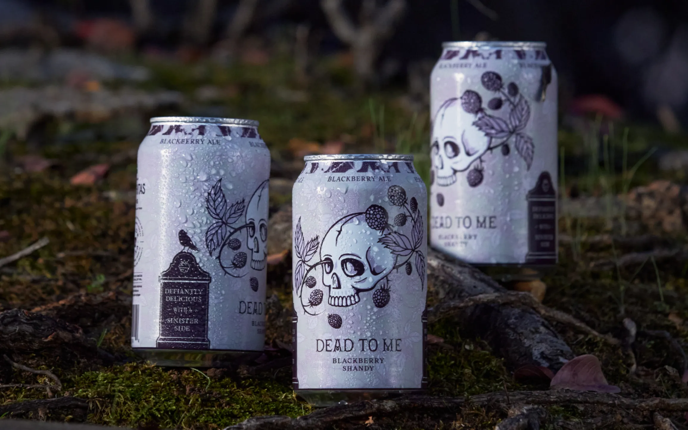
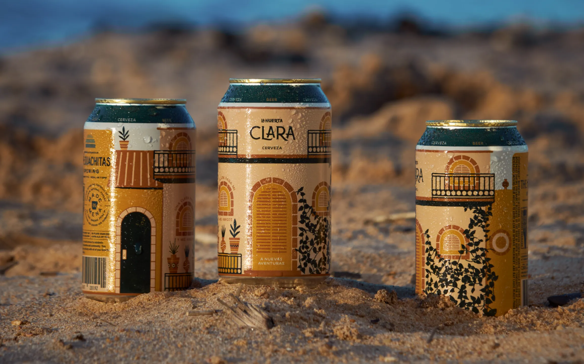
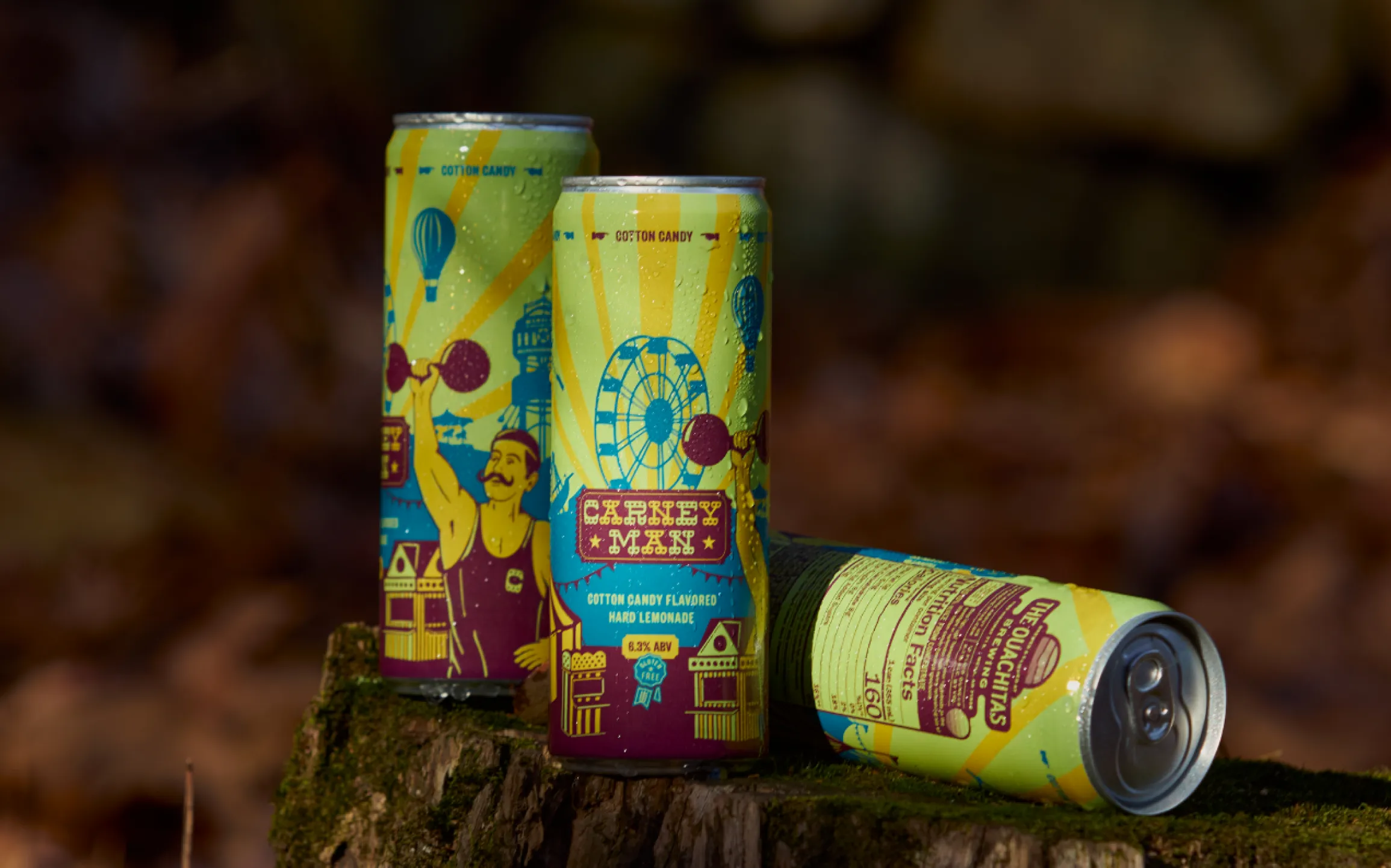
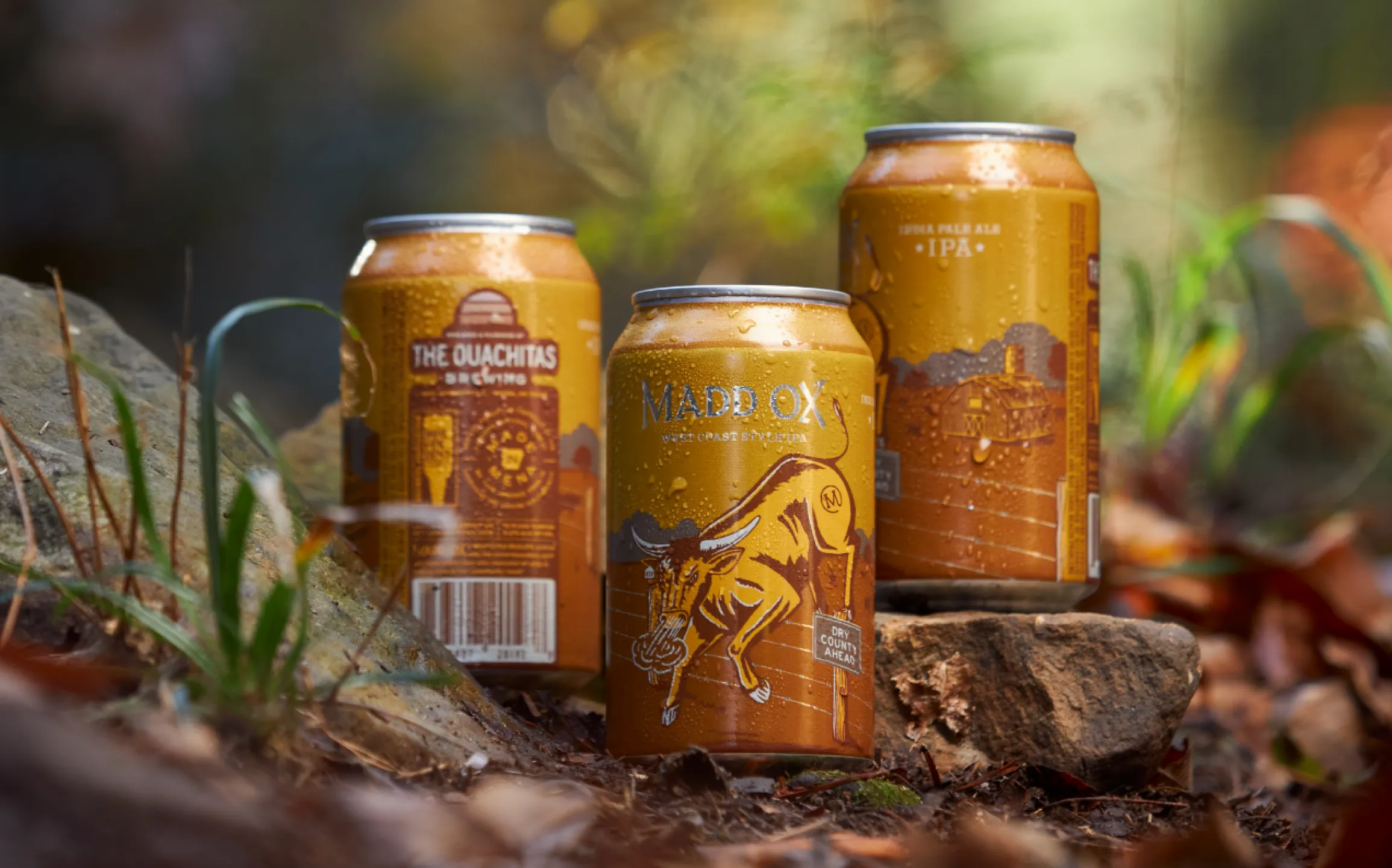
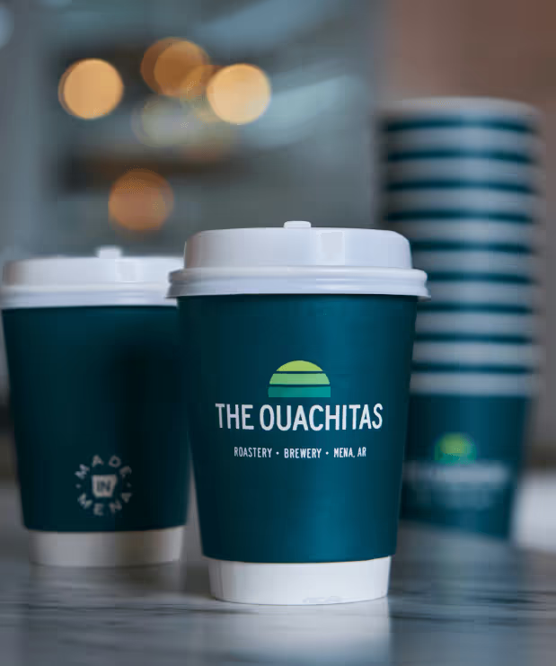
The Ouachitas needed can labels for multiple beer releases and their glass growlers to carry the same identity as everything else the brewery puts out, from the taproom to the label on a customer's counter. Unbound designed each release, including the Main Squeeze Blood Orange and Lemonade Fusion can, on the same visual system as the brand itself.


The Ouachitas
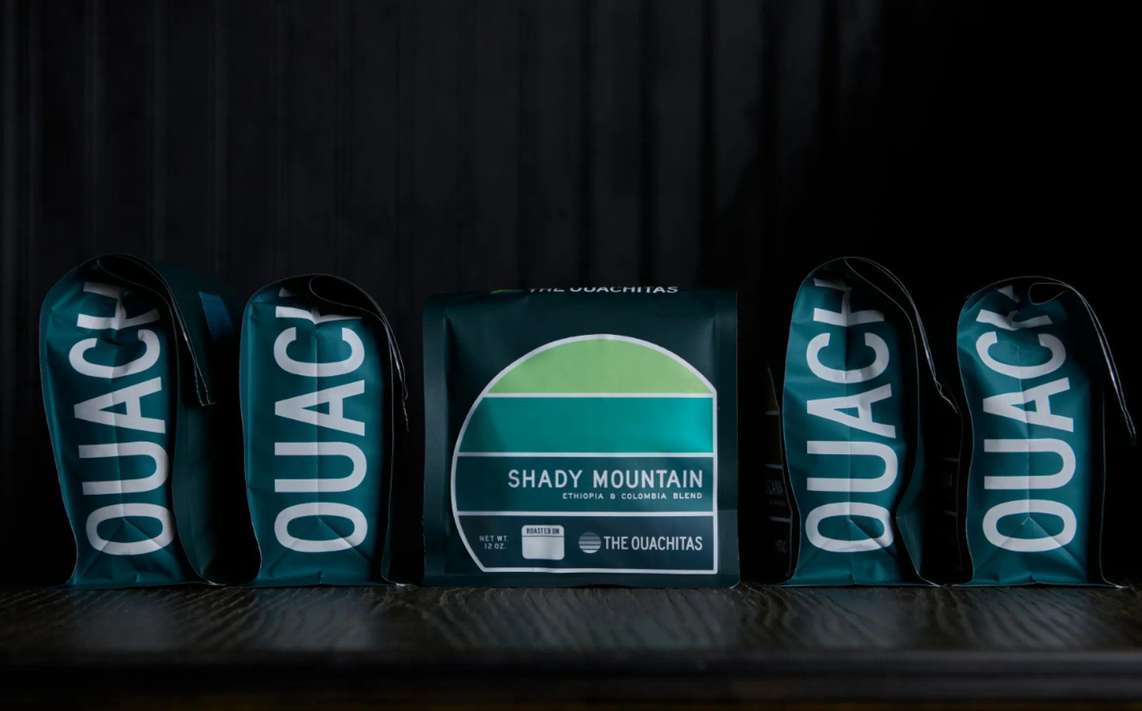
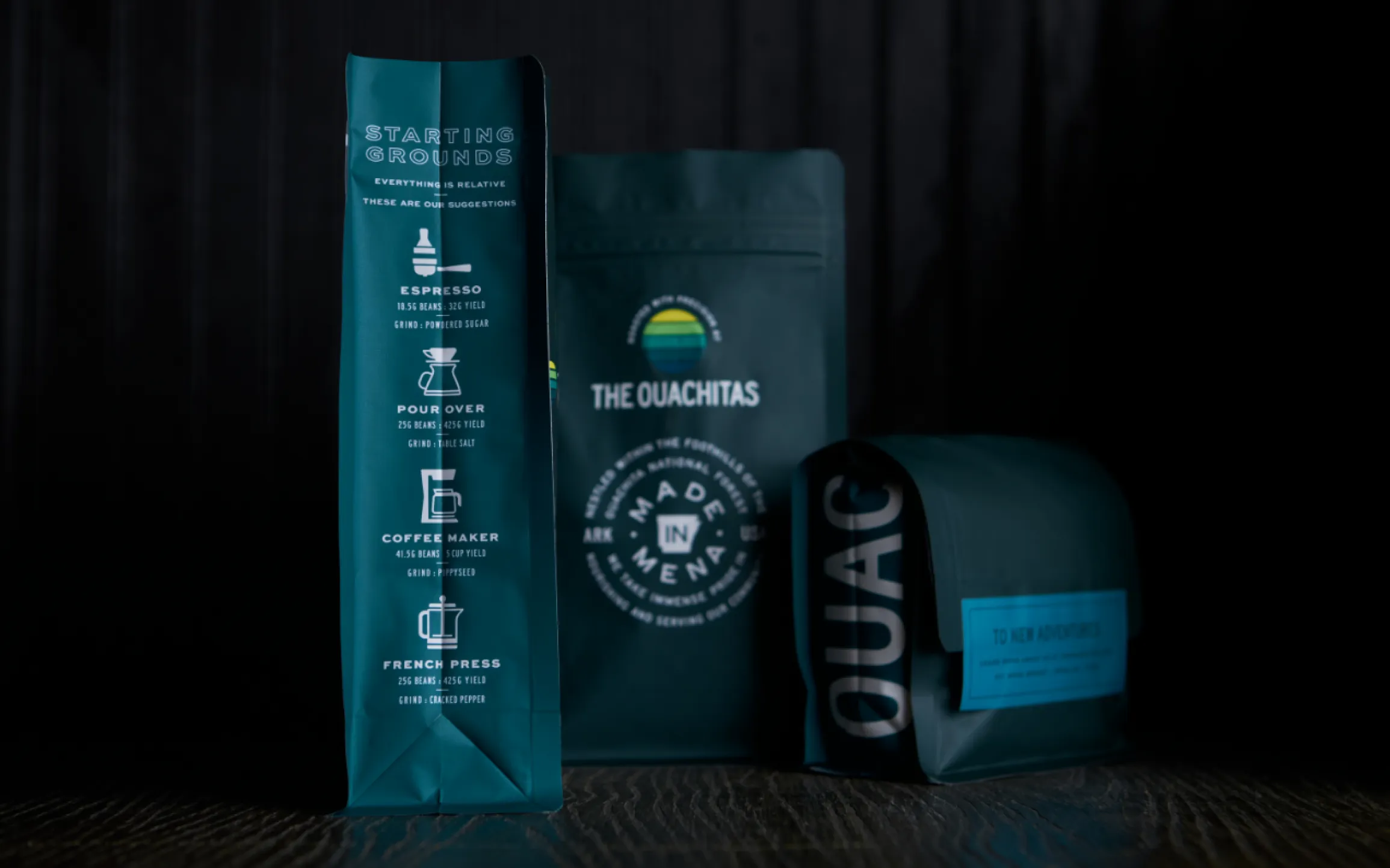
The Ouachitas needed an organized way to label more than 20 coffee roasts and blends across retail and wholesale bags. Unbound built a color-driven label system on the brand's existing palette. See the full Coffee Roast Label System results.


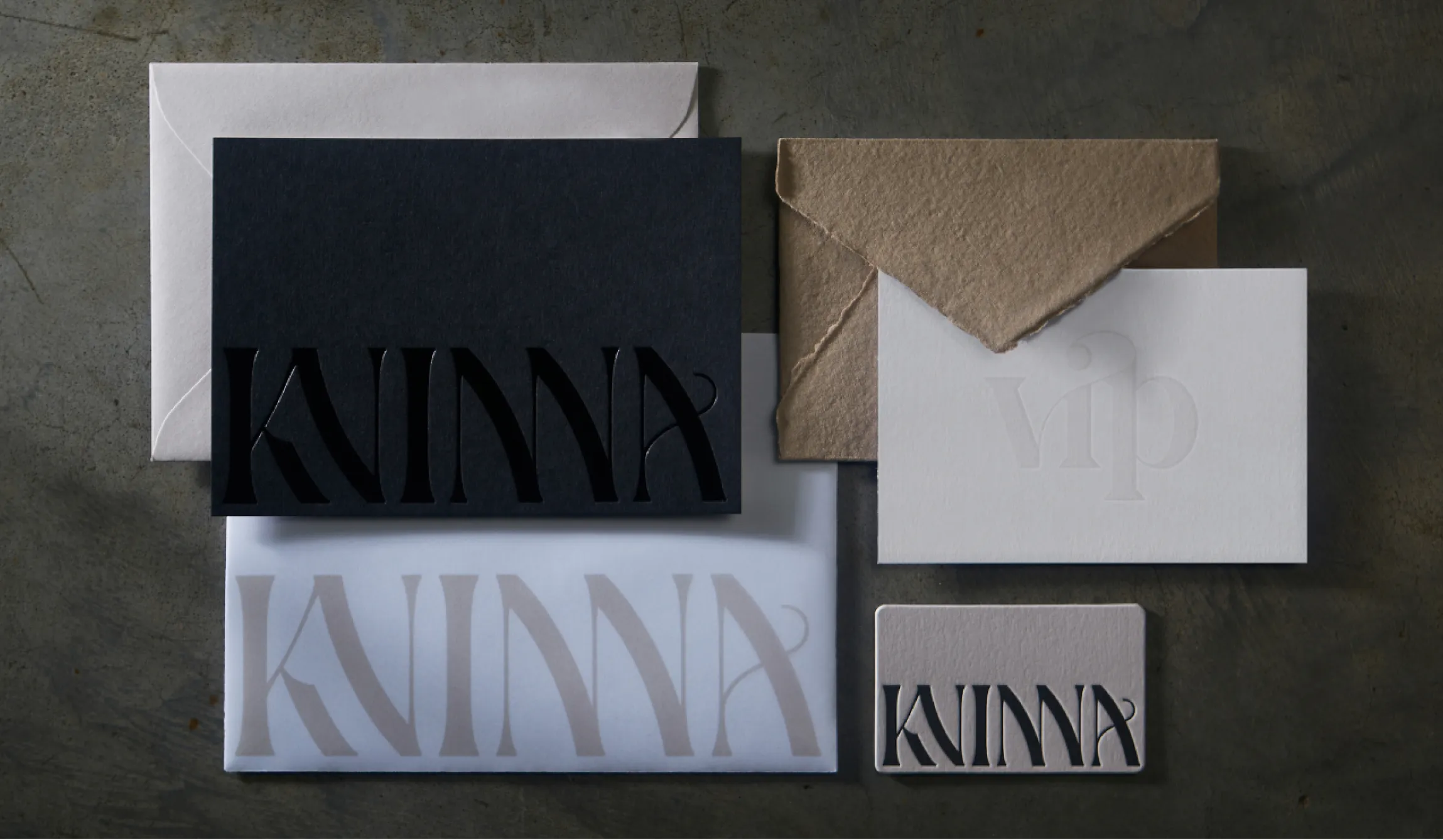
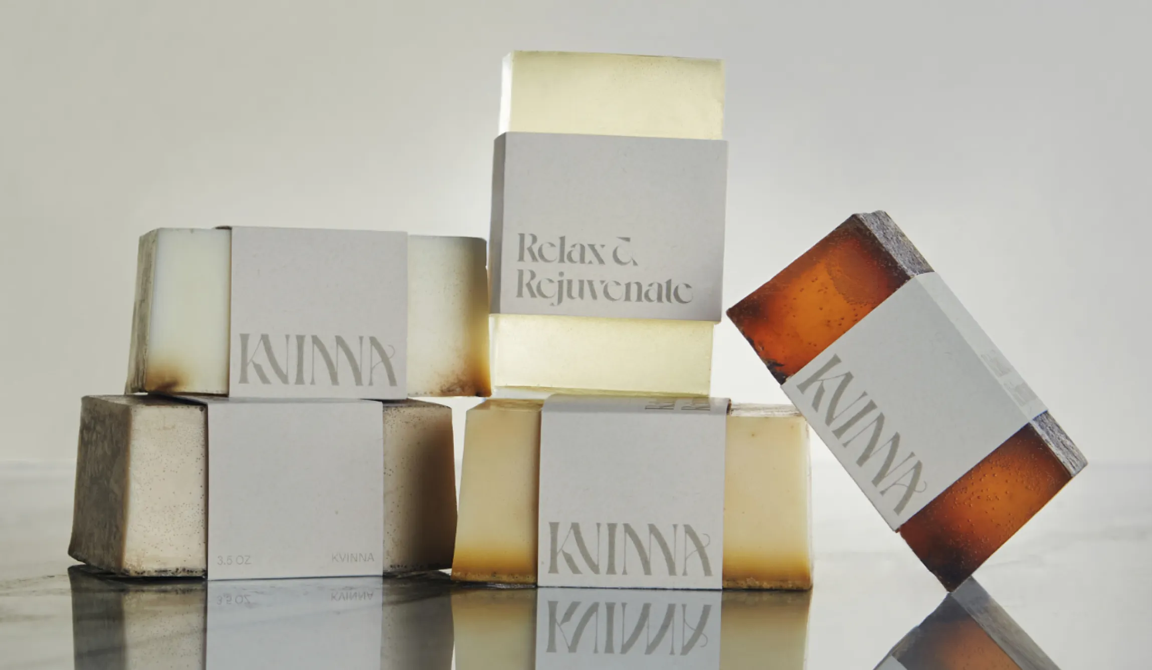
Kvinna Studio
Kvinna partnered with a local soap maker to offer a handmade product under their own name. Unbound designed the label to carry Kvinna's identity all the way down to the typography.

If your packaging is the last thing that gets designed before launch, that's the gap Compass closes first. Our Compass session builds the identity your packaging runs on before a single label gets printed.
Package and label design that actually reflects your brand starts before the print quote does. Schedule a discovery call to talk through your product line and what one identity across every package would look like.