schedule a discovery call
→


BRAND STRATEGY
BRAND IDENTITY
PHOTOGRAPHY & ART DIRECTION
NOMENCLATURE
LOGO DESIGN
PACKAGE & LABEL DESIGN
EVENT STRATEGY
Image Nº 001—Logo
Celebrating the spirit of Arkansas’s sole National Forest, The Ouachitas logotype distills the beauty of the land. This visual identity evokes belonging, wonder, and quiet strength.


Image Nº 002—Color Palette
Drawing from a carefully curated palette, the brand’s collateral maintains a consistent visual language that supports recognition and reinforces trust at every touchpoint.
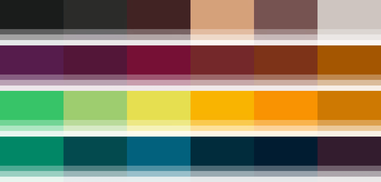
Image Nº 003—Derek Campbell
Driven by both community and creativity, Derek Campbell leads The Ouachitas with a vision that merges hospitality, local identity, and small-town charm into a brand that feels as grounded as it is aspirational.
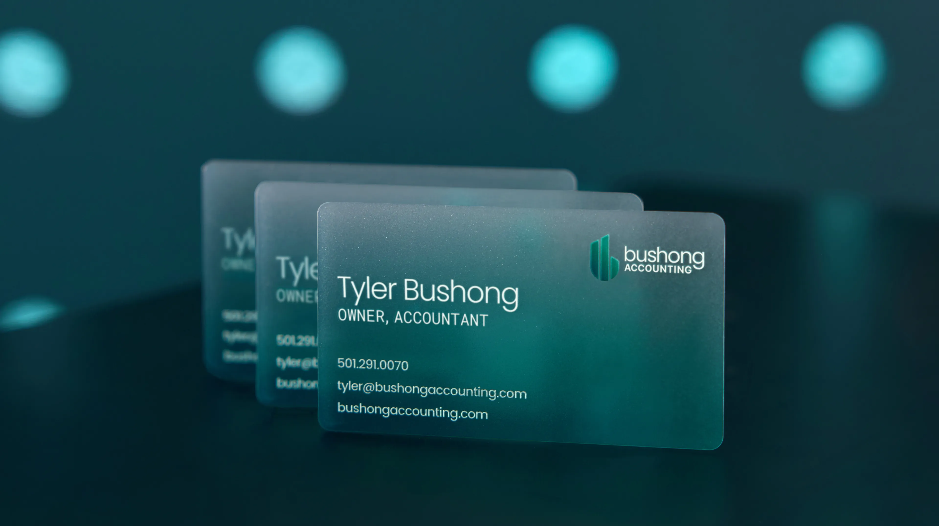
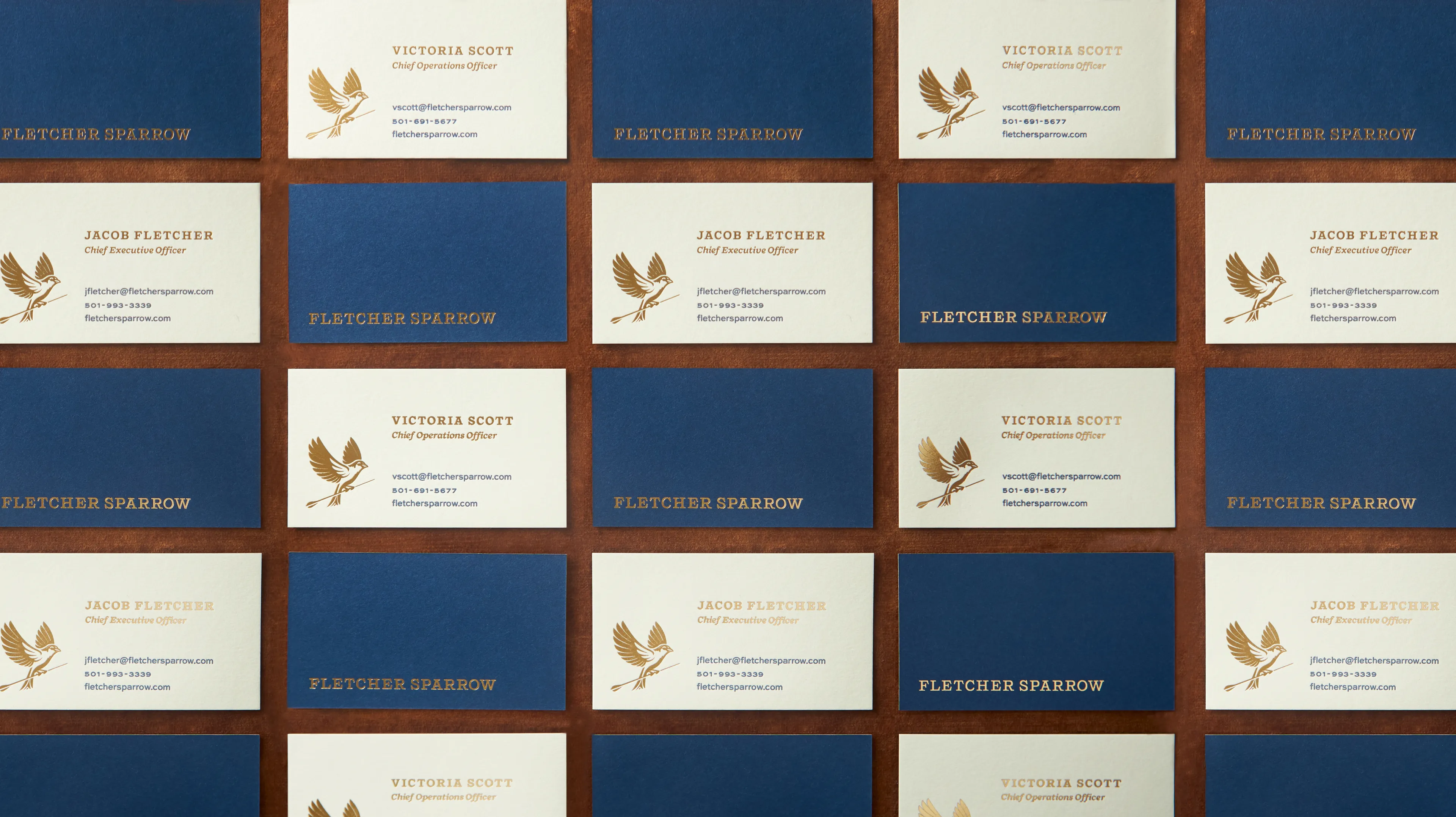
Image Nº 004—Business Collateral
With a matte finish and raised gloss accents, these business cards are designed to elevate first impressions, offering employees a high-touch, brand-aligned way to connect with patrons or prospects.


Image Nº 005—Typographic Style
With bold, Americana-inspired typography, this menu layout reflects the brand’s identity and creates a memorable first impression by blending tradition with modern character.

Image Nº 006—Intermixing Typography
Five type families establish a flexible yet unified visual language that carries the brand’s voice across marketing, digital, and print.
Image Nº 007—Made in Mena Text Badge
The preferred version of the ‘Made in Mena’ badge features a full-text statement, offering clear communication of the brand’s local roots and reinforcing its commitment to community.


Image Nº 008—Coffee Label System 01
Designed for both brand recognition and ease of production, the coffee label system uses the color palette and logo mark to create a shelf presence that scales across all coffee products.

Image Nº 009—Coffee Label System 02
Animation highlighting the coffee labels' full spectrum of color, enhancing both employee and patron engagement.

Image Nº 010—Coffee Pouch Design
Each coffee pouch reflects The Ouachitas commitment to mastery, with detailed preparation suggestions.


Image Nº 011—Coffee Segmentation Badge
This text-only variant of the coffee segmentation badge distinguishes coffee offerings for The Ouachitas brand.
Image Nº 012—Dining Segmentation Badge
Featuring both logo and text, this badge portrays the dining segment of The Ouachitas, distinguishing its culinary effort in addition to coffee.

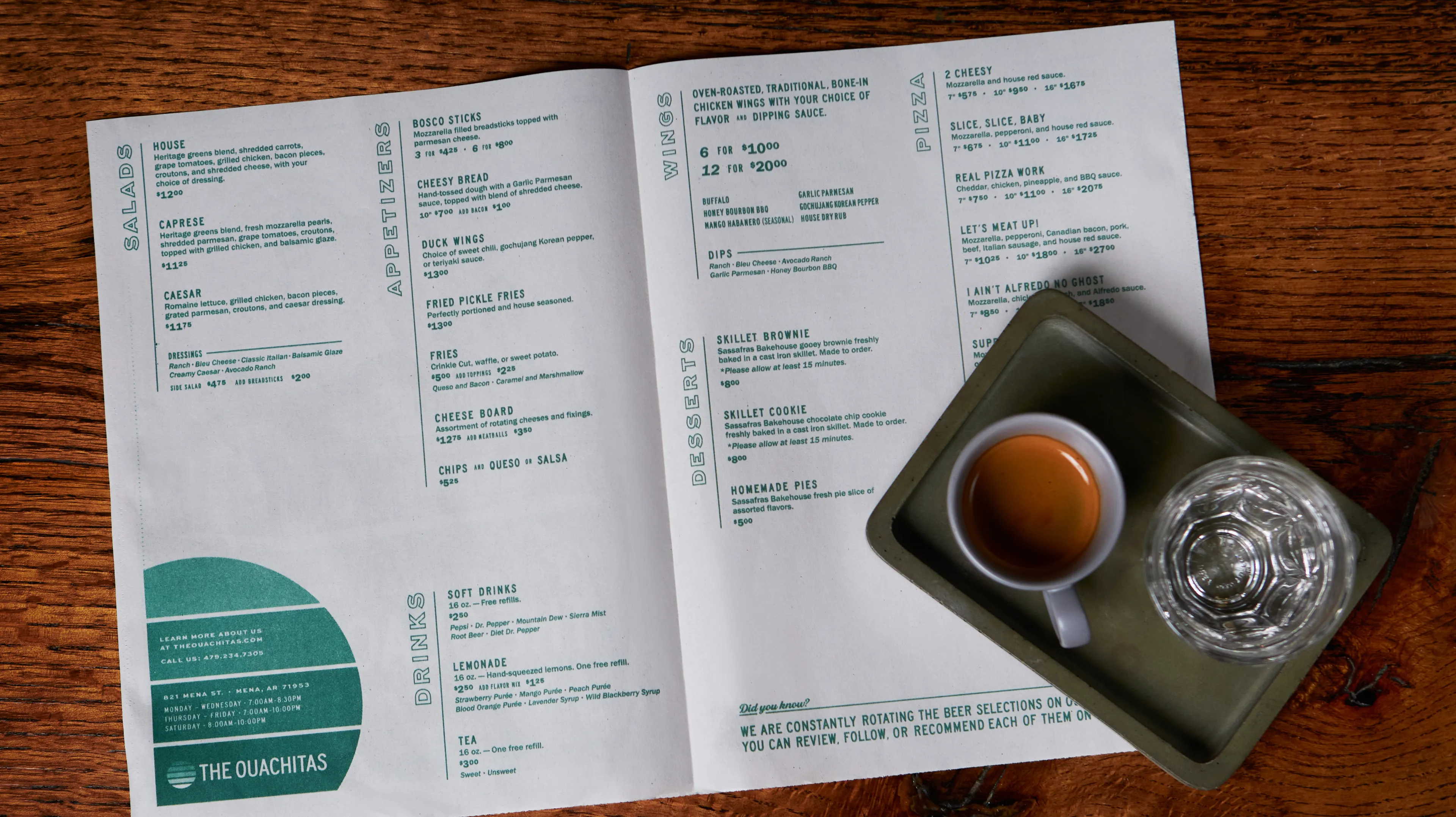
Image Nº 013—Menu Spread
The interior and exterior menu spread, presented on newsprint in monotone ink.


Image Nº 014—Coffee Growlers
Rounded 32 oz. growlers inspired by the Ouachitas’ old apothecary bottles, blending regional history with a simple modern form.
Image Nº 015—To-Go Coffee Cups
Double-walled coffee cups feature timeless branding, designed for durability and sustained use.

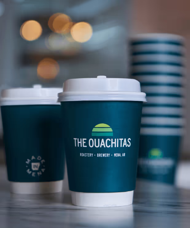
Image Nº 016—To-Go Pizza Boxes
Simple, craft 7" pizza boxes have custom-designed stickers, applied in-house.

Image Nº 017—Keg Collars
Each keg collar showcases The Ouachitas logo for quick recognition and brand visibility among distributors and bartenders.
Image Nº 018—Beer on Tap
Miscellaneous logotypes showcasing a variety of The Ouachitas' crafted brews.


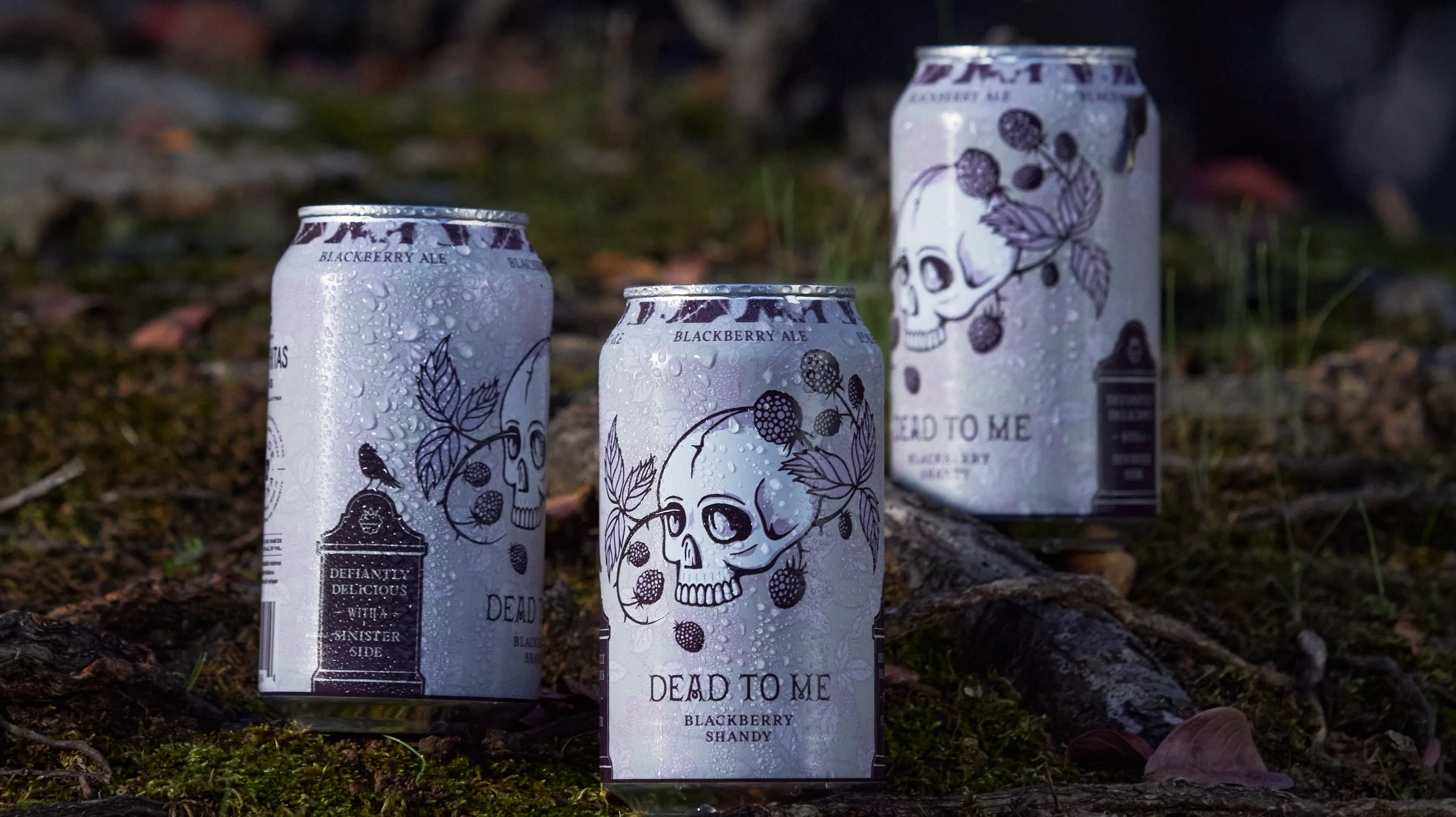
Image Nº 019—Canned Beer
Select brews were canned for local distribution, including Dead To Me, La Huerta Clara, and Carney Man.


Image Nº 020—Keg Wraps
Our keg wraps are designed with maximalist type, aiding in quick identification and enhancing the visual appeal from any angle.

Image Nº 021—Still Well Can Layout
A continuation of the Ouachitas beer can branding, displayed in a monochrome palette to communicate the light brew..

Image Nº 022—Beer Variety
The Ouachitas offers a wide selection of beers, each varying in color and style, crafted to cater to diverse palates.
Image Nº 023—Dead to Me Direction
For the Dead To Me brew, we developed a seamless blackberry pattern background, perfectly complementing the can's cylindrical form and adding a subtle elegance to the visual identity.


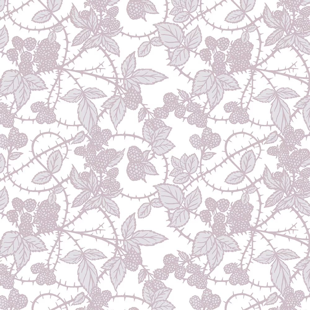
Image Nº 024—Main Squeeze Direction
Main Squeeze, a fusion of blood orange and lemonade, features a classic pin-up girl illustration, fusing vintage aesthetics with contemporary taste.
Image Nº 025—Typographic Voice
Each beer variety is given a unique typographic identity, tailored to match its specific character, while unified color and texture enhance brand cohesion.


Image Nº 026—Carney Man Direction
As with all canned brews, the Carney Man beer line features a centric brand mark complemented by adaptable vector assets, designed for versatile use across compositions.

Image Nº 027—Madd Ox Canned Beer
The Madd Ox branding is brought to life in a photoshoot that captures the product in natural setting. This resonates with the overarching brand motif.

Image Nº 028—Animated Beer Fest Promo
We designed animated social media posts for the Shady Mountain Beer Fest, capturing the festive spirit and promoting the event with visual appeal.
Below are the results that came from a Compass session. Compass is the foundation of all the work we do at Unbound.