Establishing Your Brand Typography System

SELECT TYPOGRAPHY TREATMENTS

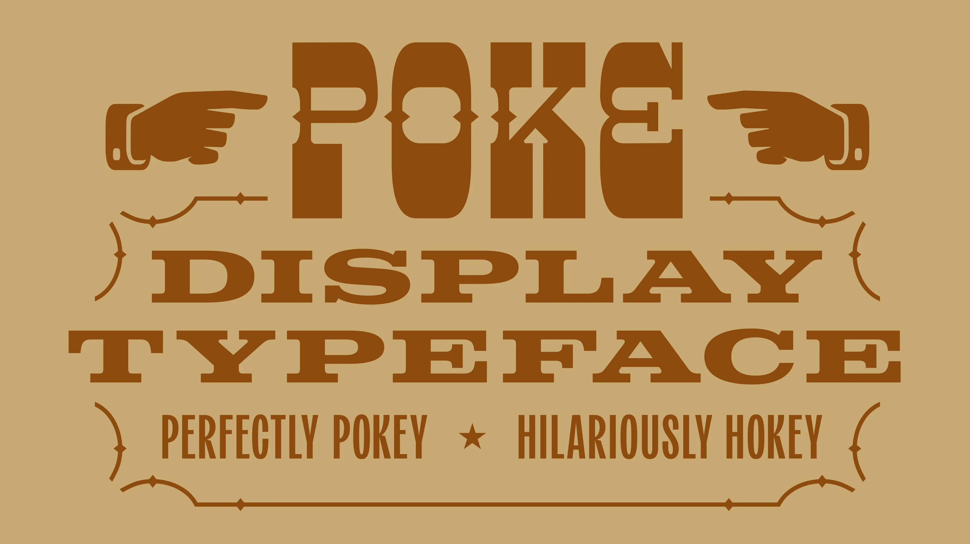
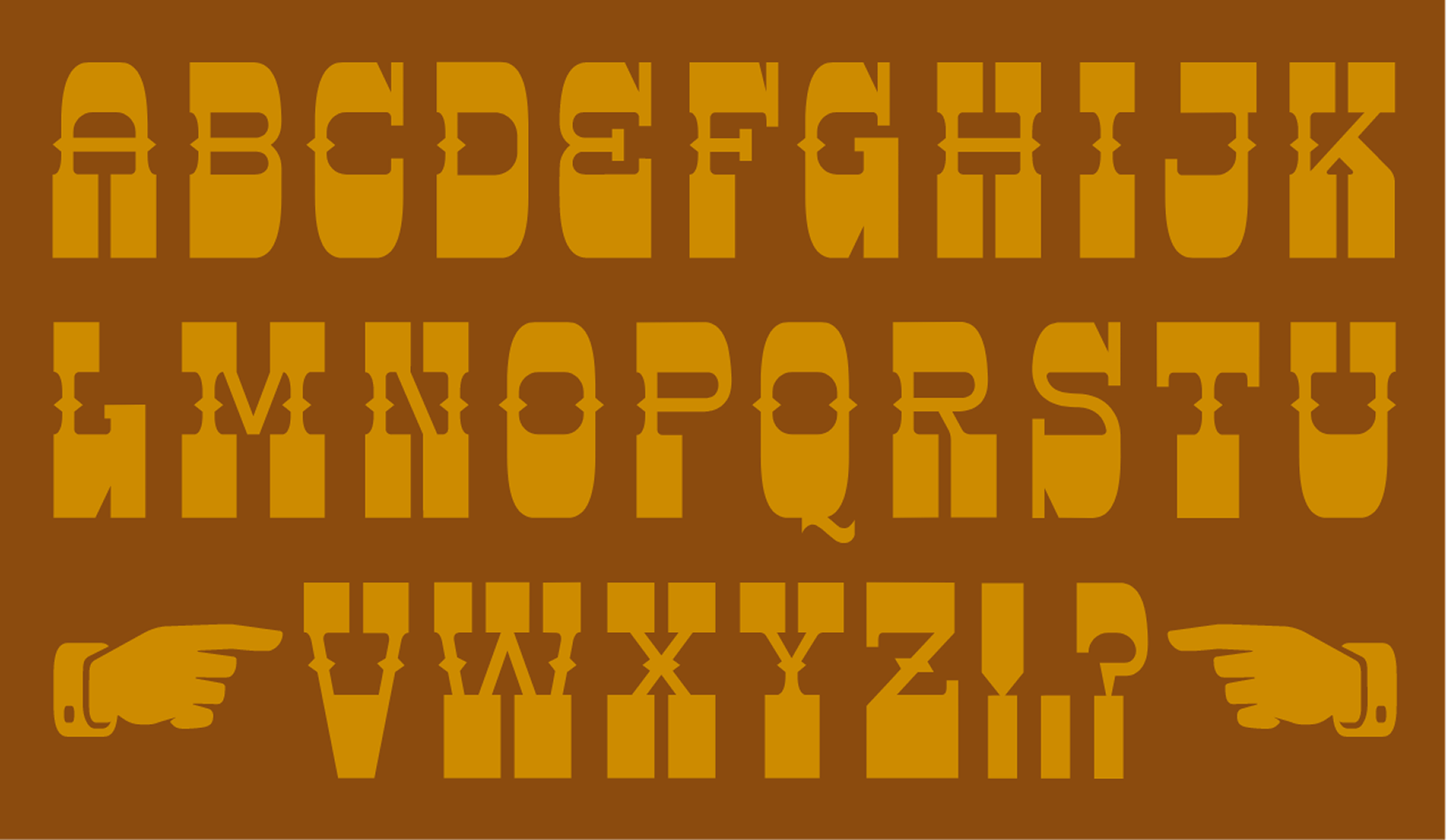
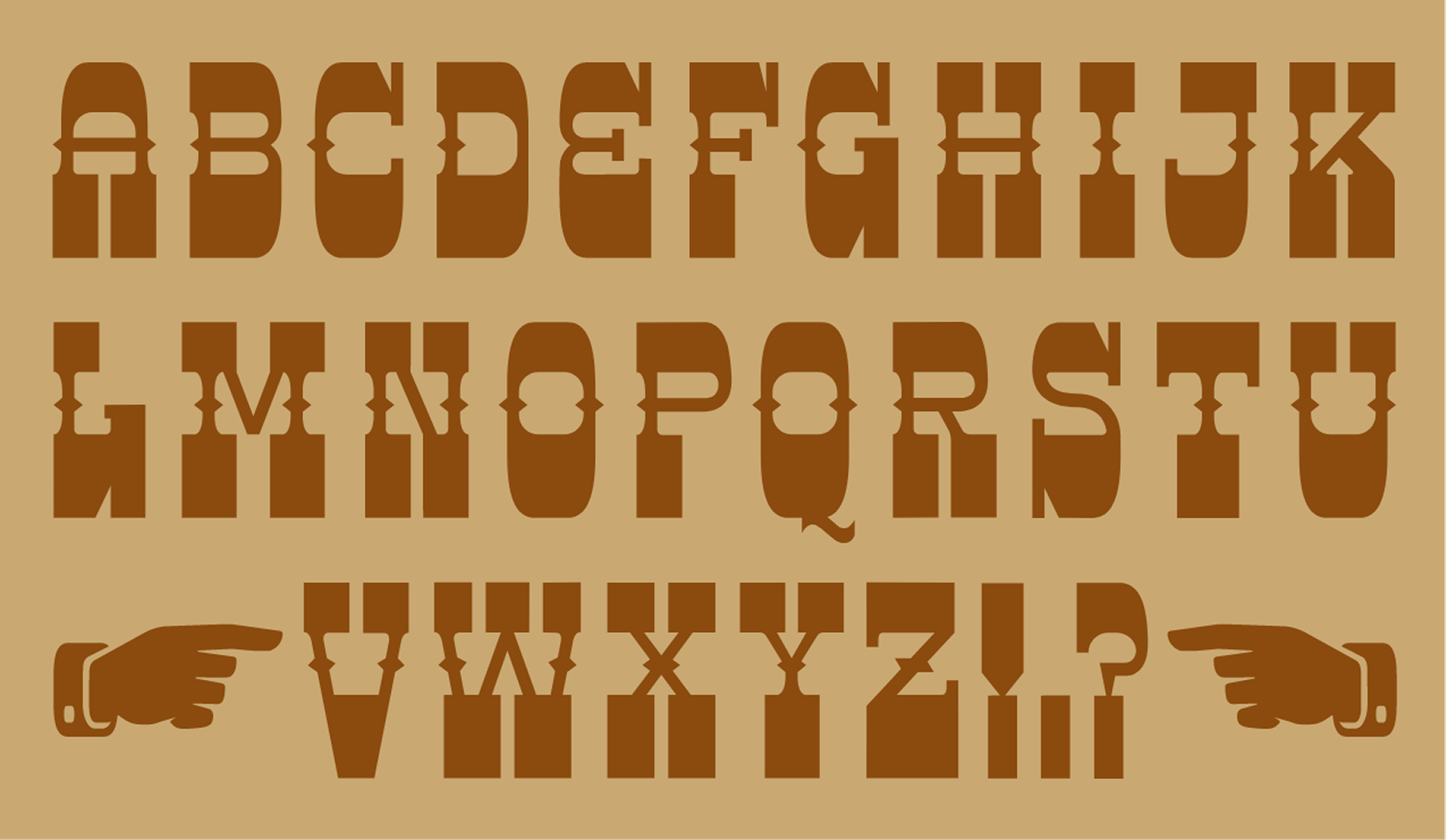
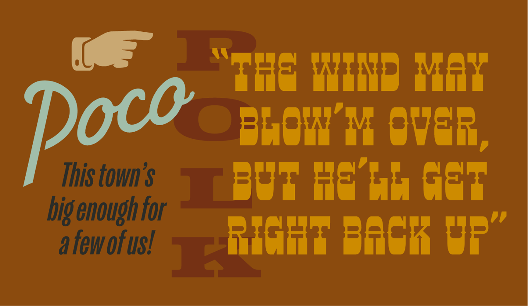
Your typography and type palette are core aspects of your Brand Identity. Typography shapes how customers see your messaging at first glance. At Unbound Collective, we craft custom type palettes to align your visual identity with typography for clear communication. An established type palette can make your brand instantly recognizable and set you apart from your competition.

Our typography services focus on curating purposeful fonts that match your business tone, audience, and industry. When you use the same fonts and visuals for your brand, they make your content clear and memorable.

Typography Design that Defines Visual Identity

When you want to grow your business, Unbound covers the areas that companies often gloss over. We design type palettes in Arkansas that add value to your identity. Our guidelines create simple applications for typography across digital and print media.

  • Primary and secondary font selection tailored to your visual identity
  • Recommended font pairings for headlines, subheads, and body text
  • Hierarchy rules to keep layouts clear and readable
  • Guidance for using type across web, print, and presentations
  • Integration of your type palette into broader Brand Identity and style guides

PHOTOGRAPHY STUDIO
TYPOGRAPHIC HIERARCHY

Kvinna Studio

This typographic framework blends expressive display faces with highly legible text styles, creating a consistent voice that performs across channels—from campaign headlines to small-scale print.

View Full Project

INTERMIXING TYPOGRAPHY

Kvinna Studio

Five type families come together in this system to establish a flexible yet unified visual language built to carry the brand’s voice consistently across marketing, digital, and print.

View Full Project

A Complex Typographic System

Kvinna Studio

Center-aligned type sets the tone for a brand experience that feels both elevated and approachable, reinforcing the narrative of quiet luxury through layout and structure.

View Full Project

DIGITAL SALES COLLATERAL

Kvinna Studio

This breakdown of session, image, and product rates is designed to communicate both the cost and value of Kvinna’s elevated service model. The layout helps clients understand the full scope of their investment.

View full project

DIGITAL SALES COLLATERAL

Kvinna Studio

The product guide walks the client through their product and service options. With supplemental photos and information, the user experience allows for simplified decision-making.

View full project

TYPOGRAPHIC STYLE

The Ouachitas

With bold, Americana-inspired typography, this menu layout reflects the brand’s identity and creates a memorable first impression by blending tradition with modern character.

View Full Project

TYPOGRAPHIC STYLE

MedTrust Health Alliance

We use intentional typographic strategies to guide readers through the template, with different styles notating areas of sequence and clarity.

View full project

TYPOGRAPHIC STYLE

MedTrust Health Alliance

This typography strategy uses bold design styles to present a purposeful, thought-provoking layout that is easily digestible for the reader.

View Full Project

Handle Sans Custom Lettering

Handle Barbershop

With nearly a quarter of the English alphabet represented in the Handle logotype, we expanded the set to include remaining glyphs for use as the primary headline typeface.

View Full Project
Handle Sans, vintage custom lettering, and type glyphs for Handle Barbershop in Little Rock, Arkansas Made by Unbound Collective

QUARTERLY DIGITAL NEWSLETTERS

Fletcher Sparrow Capital Management

Complementing our print offerings, we also distribute digital versions of the newsletters to enrich the Fletcher Sparrow archive.

View full project

A Playful Voice

Better Fellas

The brand's copy is intentionally pompous yet playful, supporting the lighthearted but effective results of the ROI Better Fellas yields in their clients' PPC efforts.

View Full Project
typographic hierarchy, including larish neue, baton, and apercu typefaces for better fellas, pay-per-click agency in Little Rock, Arkansas Made by Unbound Branding Company

POKE DISPLAY TYPEFACE

Poco’s Beer, Wine, and Spirits Logo

We designed a dramatically hokey slab serif display typeface named "Poke" as a tribute to both Poco and the classic wood type, pointing manicules we included in the set.

View full project
Custom, condensed, vintage western slab serif typeface, Poke promotional graphic Made by Unbound Branding Company

ALL TYPES OF TYPE

Poco’s Beer, Wine, and Spirits Logo

The Poco’s brand identity includes four distinct character sets, blending custom designs with digital typography to create a unique visual language.

View Full Project

WORK WITH UNBOUND

Customize Your Branding and Marketing

Create memorable experiences that drive revenue growth

Get Started Now
01
Compass
Compass Process Logo Lockup for Unbound

A FRAMEWORK FOR STRATEGIC PLANNING—ALIGNING GOALS AND METHODS FOR BUSINESS GROWTH.

More About Compass
02
curation
Curation Process Logo Lockup for Unbound

A FRAMEWORK FOR STRATEGIC PLANNING—ALIGNING GOALS AND METHODS FOR BUSINESS GROWTH.

More About Curation
03
customization
Customization Process Logo Lockup for Unbound

A FRAMEWORK FOR STRATEGIC PLANNING—ALIGNING GOALS AND METHODS FOR BUSINESS GROWTH.

More About Customization