Learn more
→


A logo goes on the truck, the sign, the website header, the business card, and every piece of collateral the company produces. Customers form an impression from it before they read a single word about what you do. Your competitor's logo has placed them at a certain level in the market. Yours is doing the same. The question is whether that level was chosen or inherited.
Most logos get chosen quickly. An online service, a freelancer who delivered fast, a designer who worked cheap. A file gets delivered, the colors get decided, and the name goes on it. Years later, the business has grown past what the logo communicates, but the logo is still on the truck.
Unbound designs logos for Little Rock and Arkansas businesses. We start with the identity behind the business before we draw a single mark.
We design logo systems for established businesses that need a mark worth building from. Every engagement includes:
We work with you to produce a logo worth putting on everything.
A logo that describes the business is not the same as a logo that communicates the identity behind it. A name in a clean font with a relevant icon describes the business. Most logos stop there.
The logos that hold up over time are the ones built on a clear understanding of what the business stands for, who it serves, and what it needs to communicate to earn the right customer's trust. That understanding has to come before the design does.
Most logo processes skip this and start with aesthetics. "What style do you like? What colors feel right?" Those are the second questions. The first question is what this logo needs to say.
Before we produce a single concept, we work to understand the business: the customer it is built for, the position it holds in the market, the competitors it needs to stand apart from, and the identity that should come through every time someone sees the mark.
That work is what the design builds on. When the strategy is clear, the design decisions become easier and the result is a mark that communicates something specific instead of something generic.
If you're not sure whether a logo refresh is the right move, these 10 signs it's time to rebrand are worth reading before we talk.
The portfolio on this page is the most direct way to see what strategy-first logo design looks like across industries and brand personalities.
KB Studios Logo
The KB Studios brand mark is a monogram kiss "KB" to represent the initials of the proprietors. The logo also alludes to premium wedding cinematography services.
Camp Taco Logotype
Camp Taco at Lost Forty Brewing's brand mark is a custom-lettered late 70's-80's campy logotype. In it, customers see the summer camp charm of the small-batch brewery project from the team at Lost Forty Brewing.
Keeper Wars Logo
The Keeper Wars brand crest contains four variations tailored for specific applications. Central to the design is a soccer ball in dynamic motion, visually deflecting to form the letter 'K.' This captures the brand's namesake in a striking and apt athletic visual aesthetic.
Yella Dog Press and Honey Logo Lockups
Yella Dog Press and Yella Dog Honey's concentric typographic and illustrated logo badge is hand-rendered to reflect delta roots and Yellow dog Democrat work ethic. From letterpress to beekeeping, these brand marks use a consistent visual system to unify the respective passions and community ambitions of the owner.
PharmaTrust Logo
PharmaTrust is a co-op of MedTrust, adhering to the same visual ribbon and typographic system for unity.
Ullr, the Nordic god of recreation, inspired this custom logotype for one of The Ouachitas' Dark IPA brews.
Inspired by the Big Dipper, this logotype from The Ouachitas strikes a balance of celestial wonder and tropical vibes.


Capturing Community with Logotype
Art Garden was a community-driven art installation created to celebrate AMFA's Grand Opening on April 22, 2023. With Arkansas Museum of Fine Arts' guidelines, the result was a floral-inspired script backed by community and creativity.

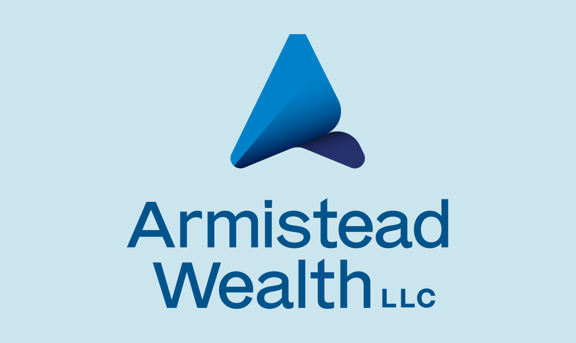
Armistead Wealth Logo
Abstract shapes and gradients pair with clean, professional typography to position Armistead Wealth as a confident, strategic brand.
The Confraternity of The Pelican Christ Logo and Reach Out Your Hands And Be Healed Logo
The Confraternity of the Pelican Christ is a faith association committed to God's presence and love. Catholic symbolism encourages others to seek and experience the joy and healing power of the Eucharist.
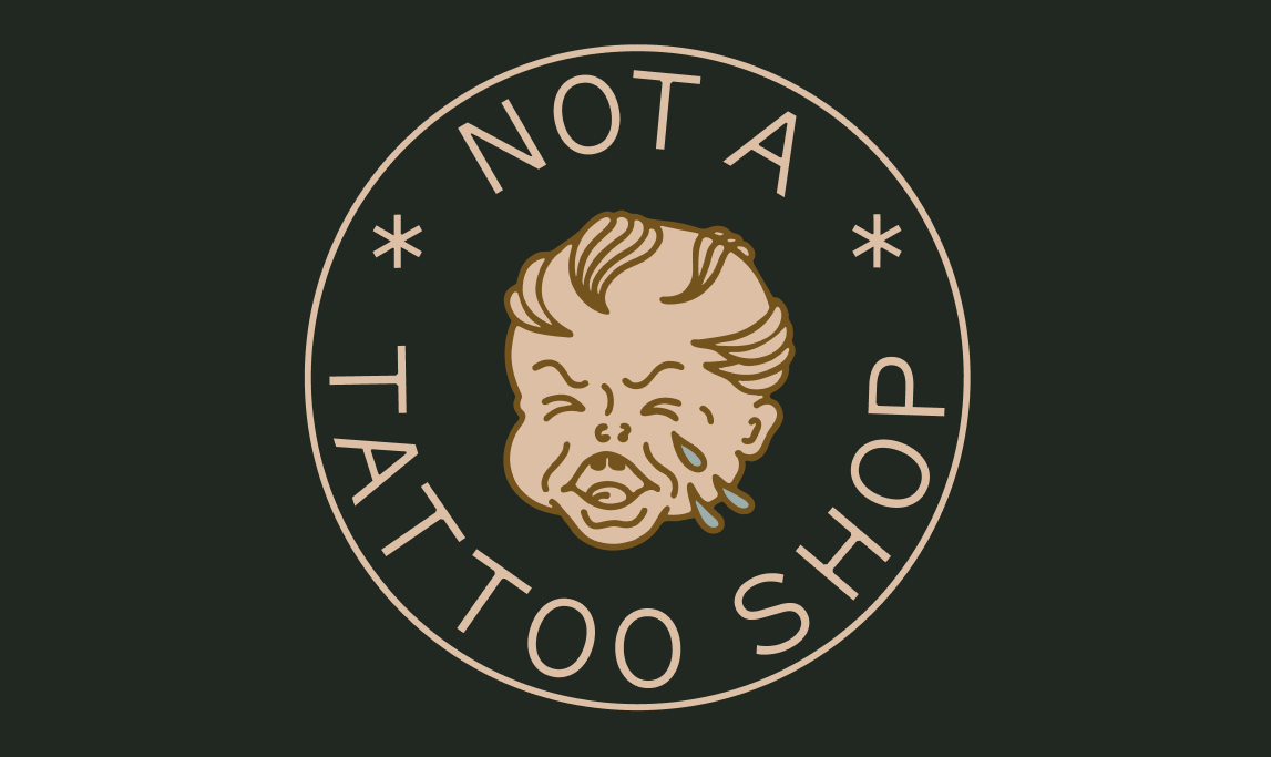
Not A Tattoo Shop
A playful badge with vintage tattoo shop imagery and linework creates a memorable logo that is as practical as it is ironic, applicable for a sticker given to visitors of an old tattoo shop-turned office building.
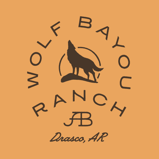
AB LAND & CATTLE/WOLF BAYOU RANCH
The logotype throughout these designs calls to heritage, operation, and legacy. Paired with a wolf, this establishes the brand with a deep, honest connection to place.The logotype throughout these designs calls to heritage, operation, and legacy. Paired with a wolf, this establishes the brand with a deep, honest connection to place.

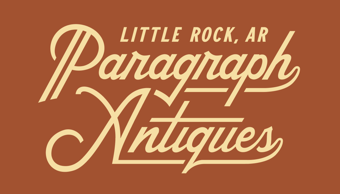
Paragraph Antiques Logotype
Flowing typography captures authentic, local tradition. The vintage color palette further gives personality for a timeless depiction.
Dramatic Logo for Visual Effect
The Dead To Me Blackberry Shandy features custom thorn-serif typography paired with blackberry bushes and a striking skull.
Monotone Logotype for Simple Elegance
Presented in a monochrome palette against a light background, the custom blackletter logotype for The Still Well embodies a timeless aesthetic, perfectly setting the tone for this serious American lager.

Chandler Family Dentistry Logo
A logomark for Chandler Family Dentistry featuring linear elements that form teeth combines into the letter "C," for Chandler. This design seamlessly integrates a harmonious friendly logotype, embodying the values of this Little Rock father-son dentistry duo.

Ava Model Management
With a name as a palindrome, AVA Model Management required a distinctive and modern logotype to set itself apart. Based in Little Rock, the modeling and talent agency serves the creative needs of Arkansas and beyond.
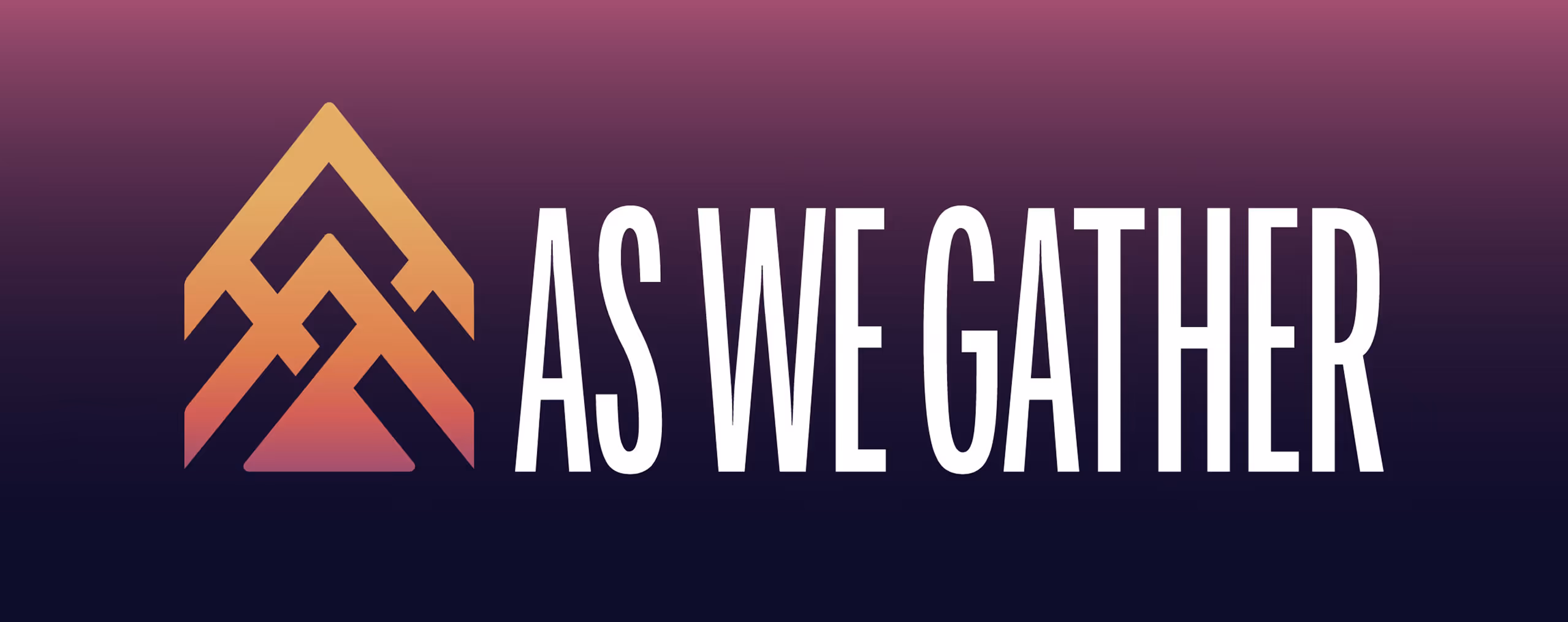
As We Gather
As We Gather’s logo represents the band’s music, production, and mentorship of other worship bands across the state. An upward facing play button points to symbols of the church and community.
Natural State Rock & Republic Logo Badge
Natural State Rock & Republic's concentric typographic logo badge captures the message of its brand. The logo outlines unparalleled experiences for cyclists and outdoor enthusiasts through the breathtaking Ozark region of Arkansas.
Ivy Vacations Logo
The typography-driven logotype for Ivy Vacations blends illustrative elements with design, adding foliage-inspired details into the character counters.
Logotype to Attract Fascination
This imperial IPA marks the first creation of The Ouachitas team at the launch of their microbrewery. The logotype captures the spirit of that moment, evoking a sense of haze and allure.


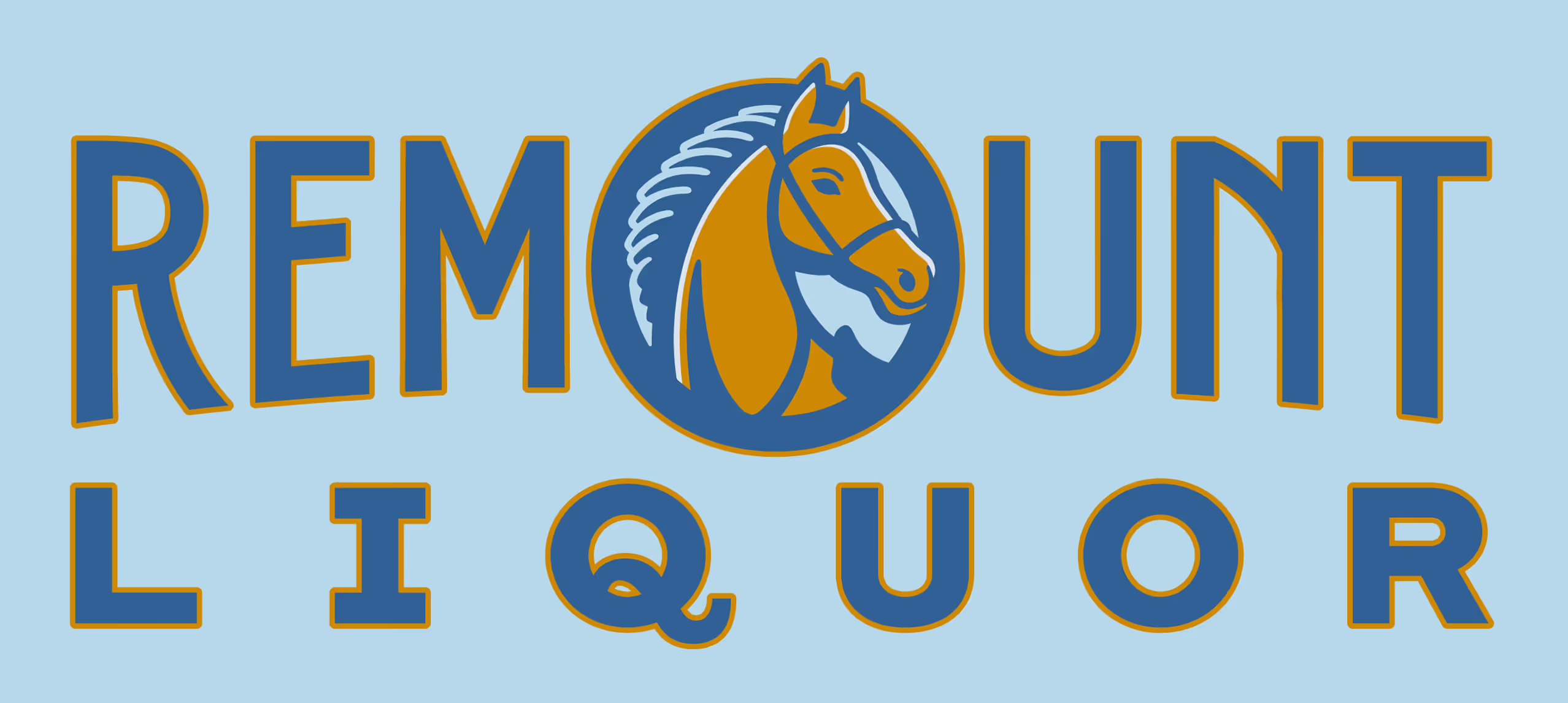
Remount Liquor
The focal horse in the Remount Liquor logo paired with a classic logotype alludes to Arkansas history. The mom-and-pop liquor store is located near old remount stations for soldiers to get service-ready horses.
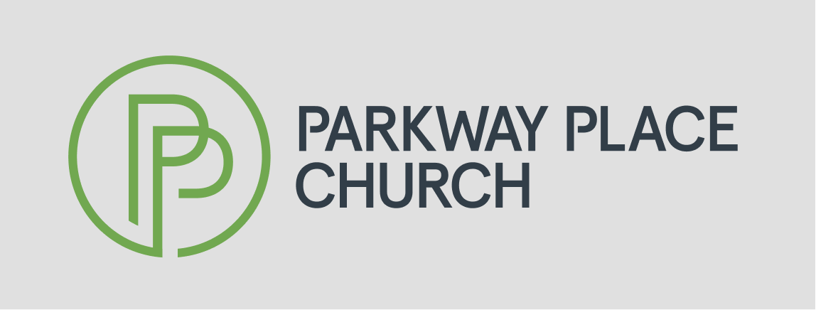
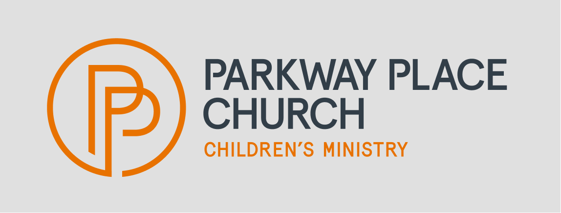
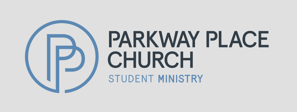
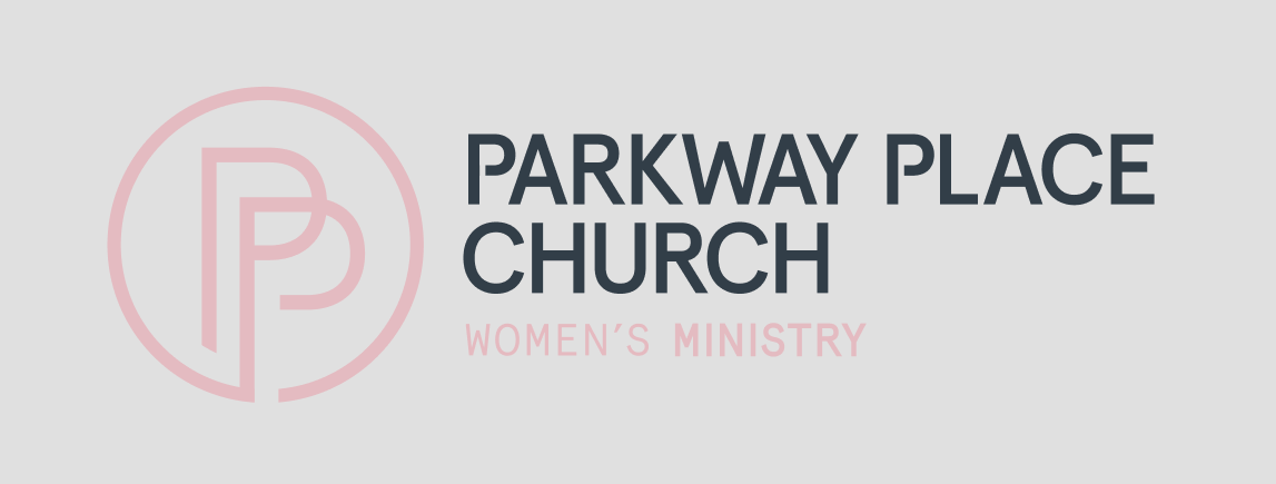
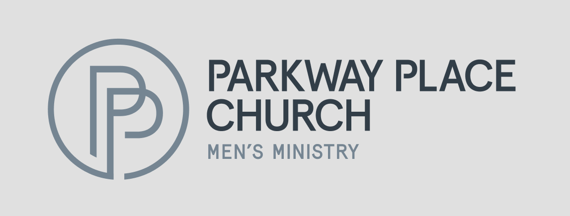
Parkway Place Church
This logo system offers flexibility across multiple church brand ministries. The variation in color allows for distinction while maintaining overall identity.
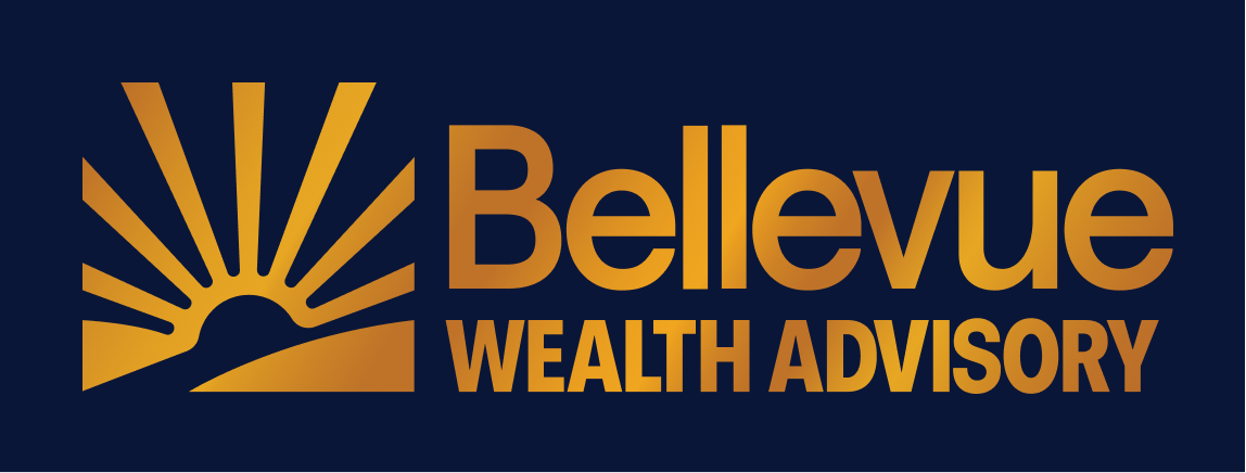
Bellevue Wealth Advisory
Bellevue’s logo fuses a rising sun icon and strong typography with metallic gold color, suggesting momentum grounded in trust.
If your current logo no longer reflects the business you've built, or if you've never had one designed with strategy behind it, that's where we start.
A Compass session builds the strategic foundation before we touch the design.
Schedule a discovery call to talk through what your logo needs to communicate and what a strategy-first process would look like for your business.