Graphic Design
IN LITTLE ROCK, ARKANSAS
Professional Graphic Design Services
Graphic design helps your business with brand strategy and growth. Unbound Collective's nationally recognized graphic design services enhance your brand through visual identities. We create memorable experiences with distinctive design work so that potential customers know who you are.
Whether you need a logo design, website refresh, or even business stationery design in Arkansas, we deliver for you. Graphic design's role in brand development makes lasting impressions on people who see your logo, website, or office.
Why Choose Unbound for Your Design Needs
Unbound's graphic design portfolio outlines our capabilities. We don't simply create designs based on what we think looks good. We work with you to develop a strategy, understand your business identity, and create value through our digital designs.
For logo design in Little Rock, Unbound Collective offers collaborative, brand-driven design services to reach your target audience. Our custom design elements include logos, typography, web design, and digital imagery. Through high-quality design, we communicate what you want to say to your clients.
Brand Identity Display
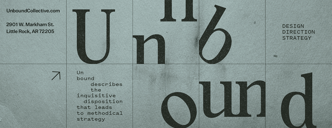
Unbound Collective
Core elements surround Unbound’s dynamic logotype, allowing for the brand’s identity to be clearly understood as a collective.
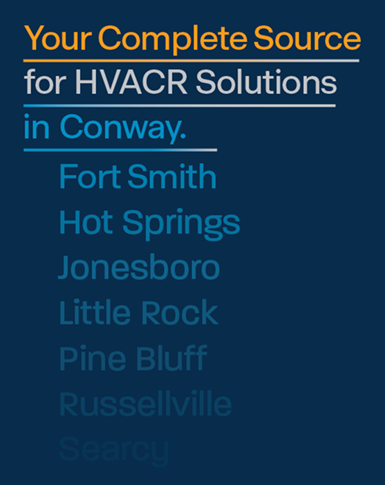
SALES COLLATERAL PAGES
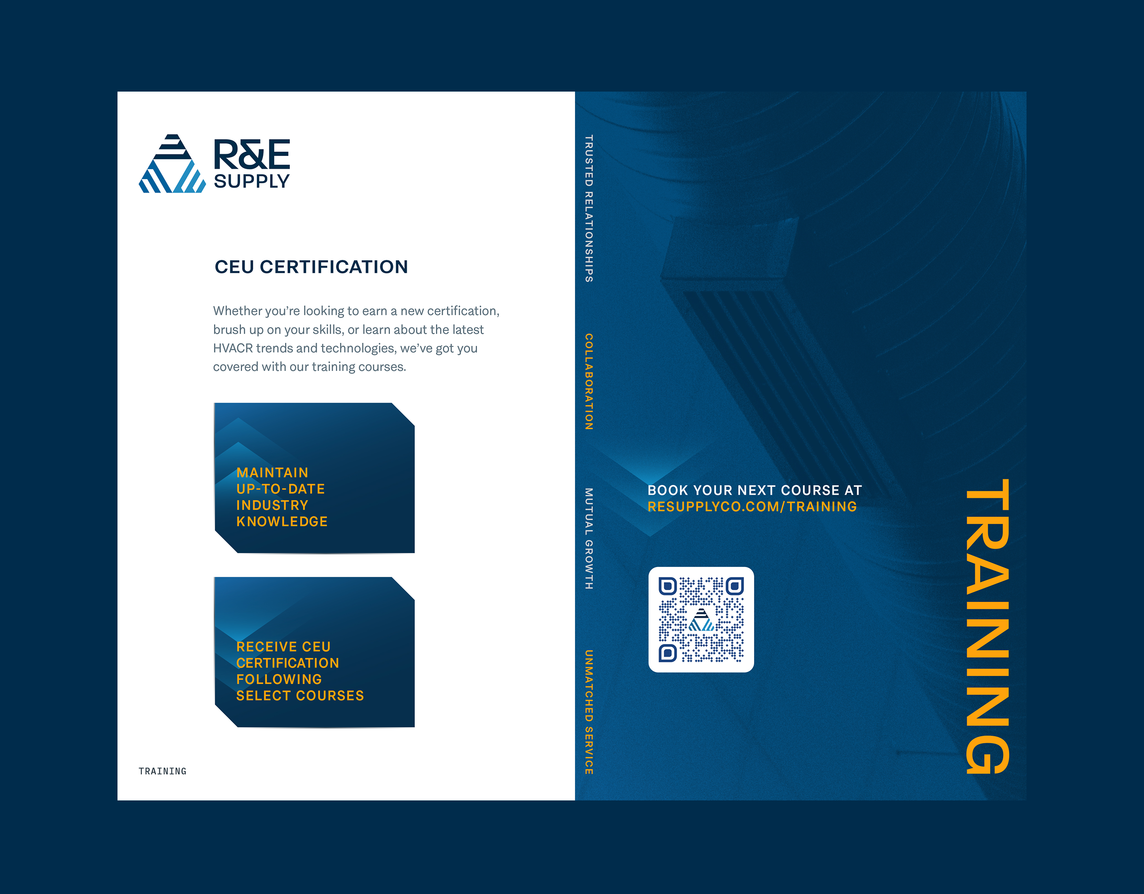
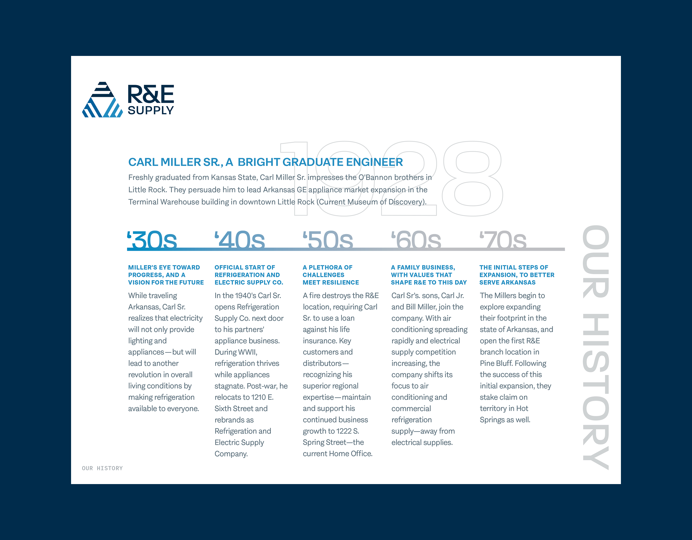
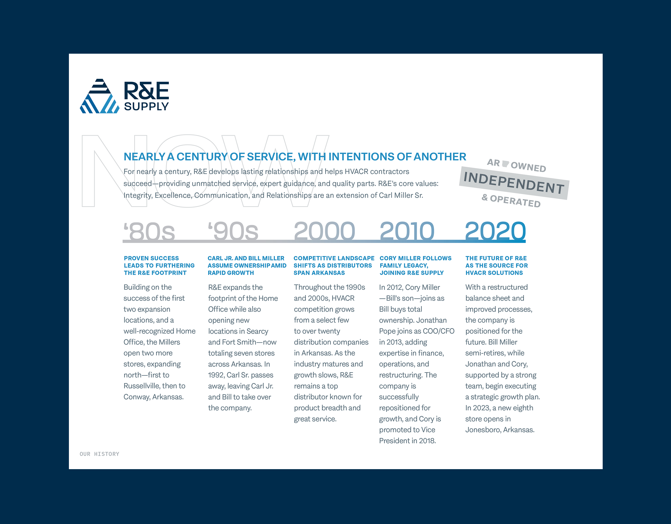
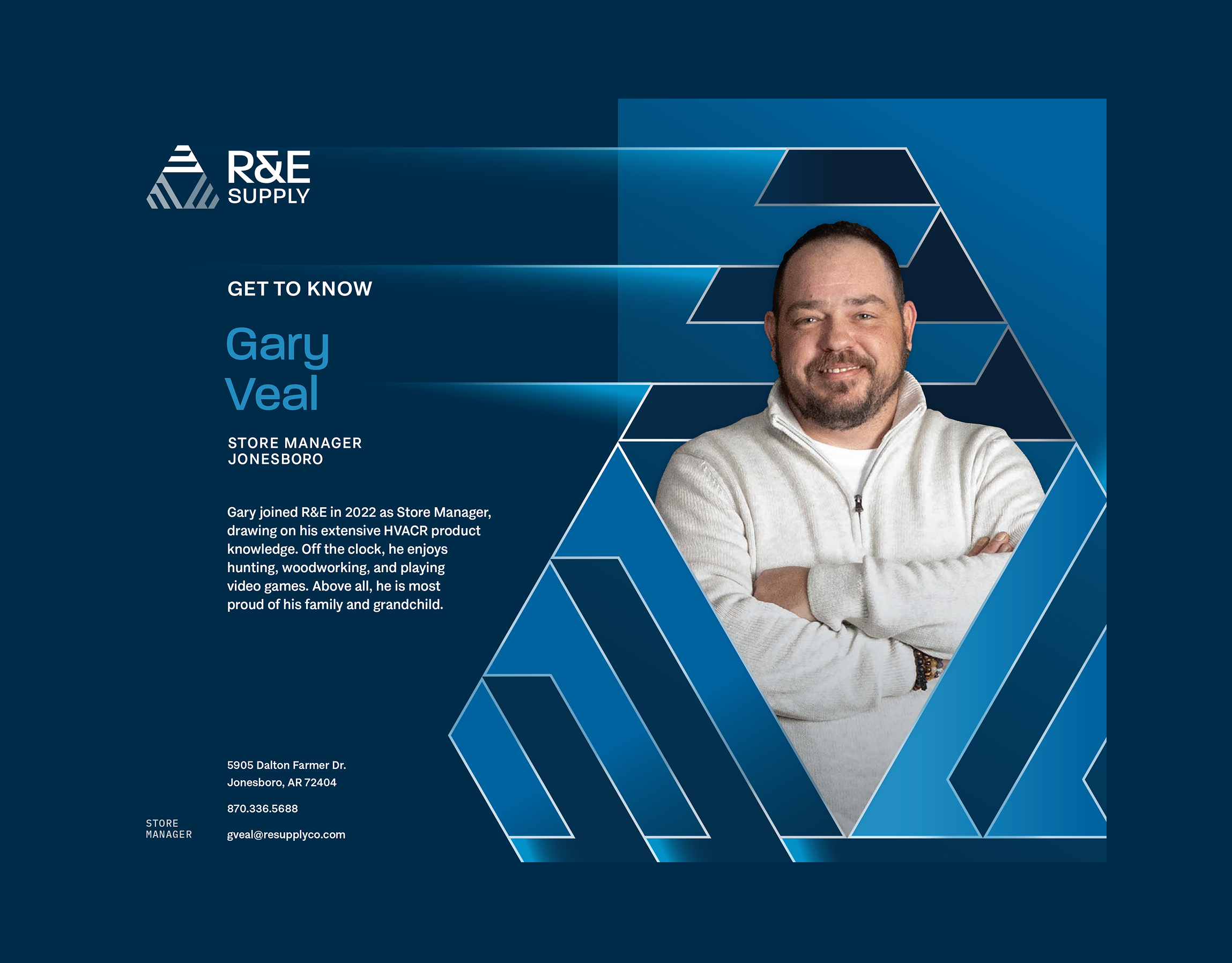
R&E Supply
Combining the brand color palette with R&E’s website layout, these pages comprise an enclosed sales collateral holder, used by Territory Managers to showcase brand events, company announcements, and local Management.
Sub-Brand Mark
Handle Barbershop
Designed for additional merchandise and general collateral, this brand mark is meant to pair with parent brand marks.
On The Edge Sub-Brand Mark
Handle Barbershop
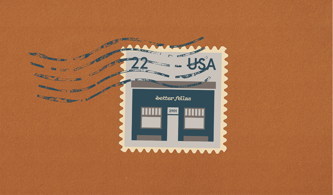
Situated on the edge of Sixth and Main in Little Rock, the address provided the opportunity to make a text play on the concept of a sharpened edge.


Logo Variation
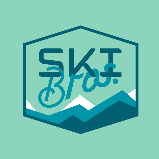
Ski Brothers Heat & Air
This logo exploration combines the existing color palette with a traditional ski patch for branding.
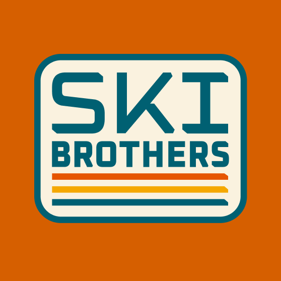
Logo Variation
Ski Brothers Heat & Air
Deisgn collaboration utilizes existing logotype, implements new fonts, and tests non-branded colors.
business collateral
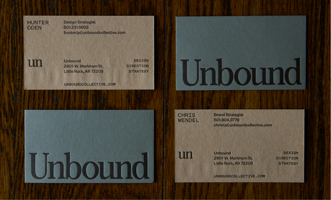
Unbound Collective
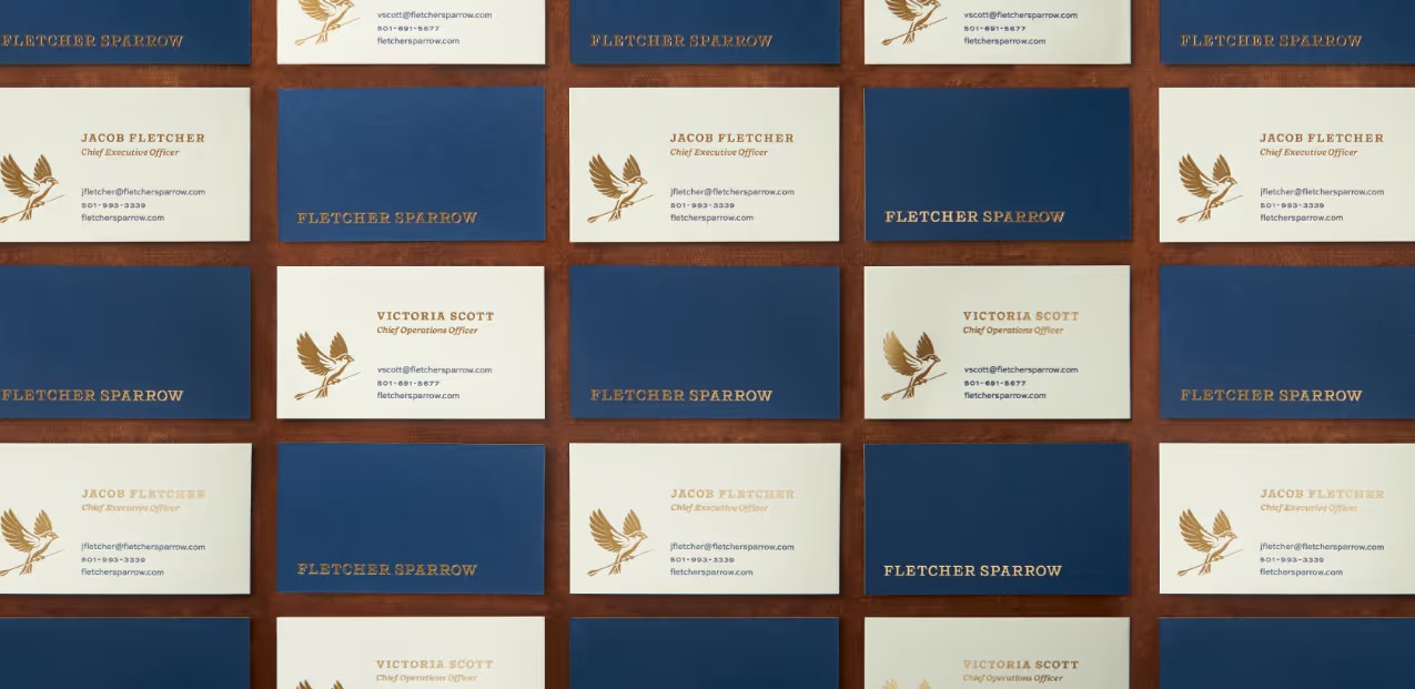
As one of the most valuable pieces of business collateral, business cards with clean composition, balanced proportions, and restrained typography represent an orderly design philosophy.
Location Specifications
R&E Supply
A custom section outlining business locations allows for easy navigation through the website.
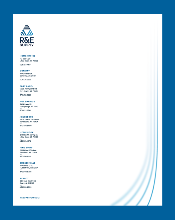
LETTERHEAD DESIGN
R&E Supply
Templated print materials create seamless execution of printed materials on letterhead.
POSTER DESIGN
The Ouachitas
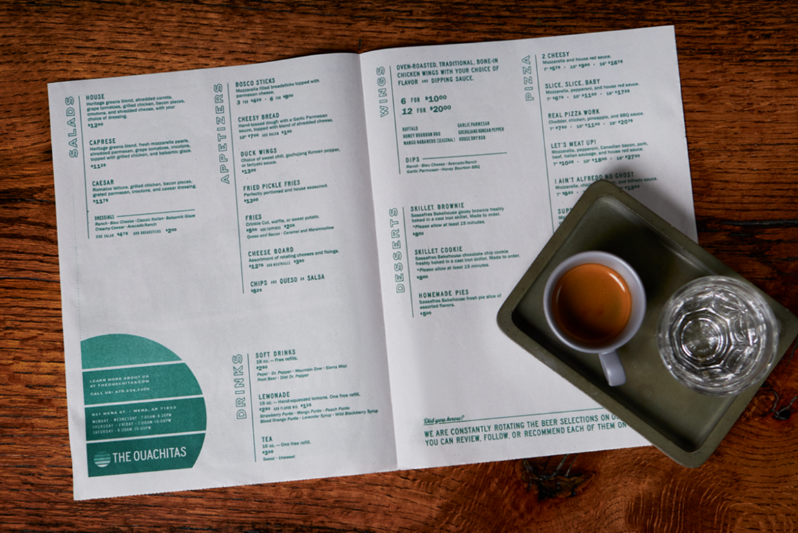
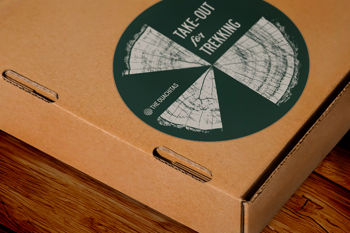
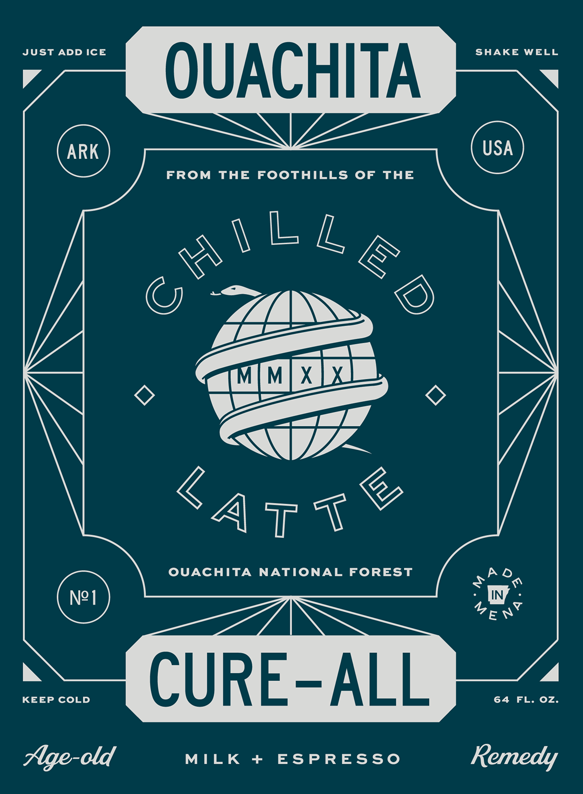
Geometric shapes combine with Branded Event details for an effective call to action.
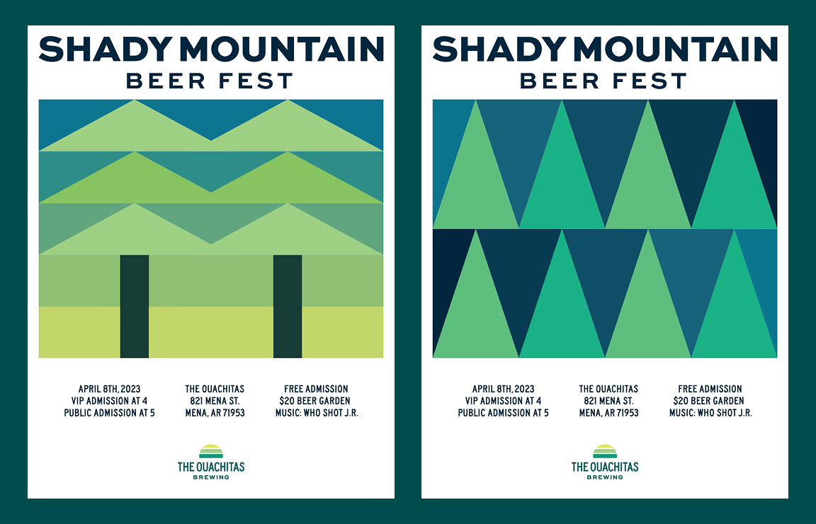
POSTER DESIGN
The Ouachitas
The digital designs have a range of applications, from information sheets to balcony banners.
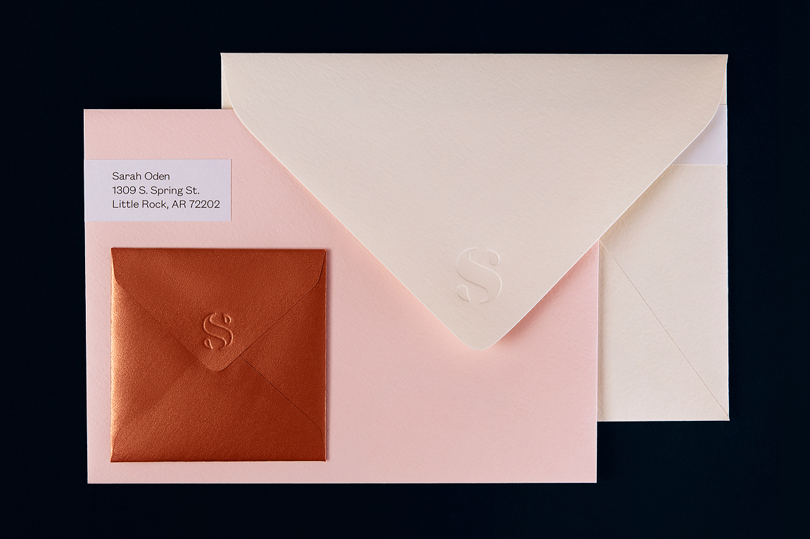
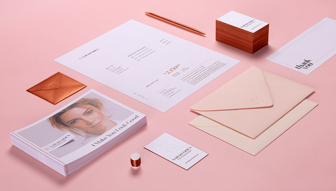
Branded Mail Collateral
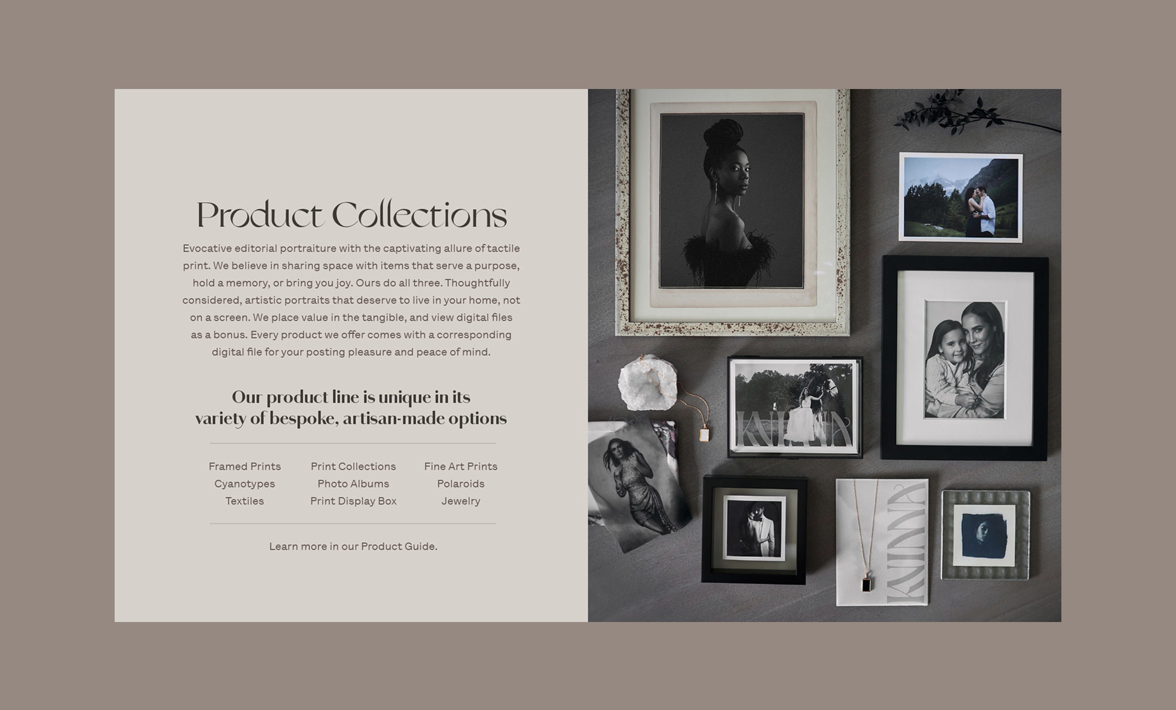
Sarah Oden Photographer
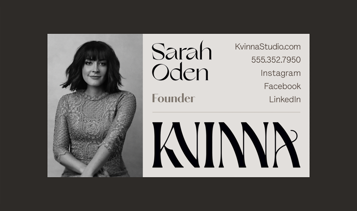
Implementing Brand Logotype and Color Palette in print materials makes for more personal client communication.
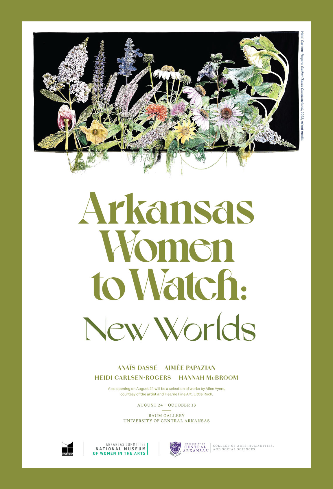
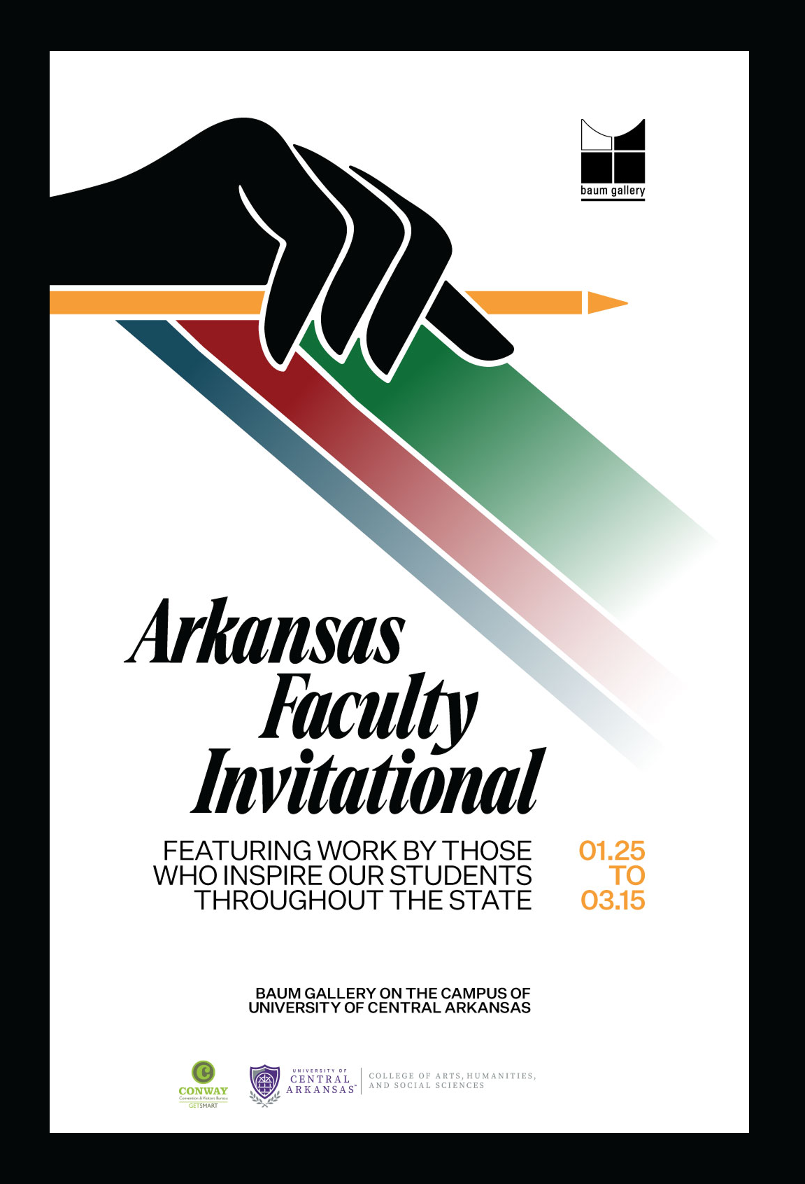
IMPACT POSTER
Baum Gallery
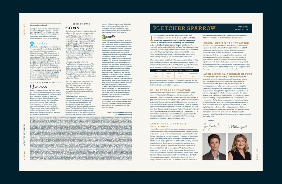
Stylized print material creates a cohesive environment for an elegant art show event announcement.
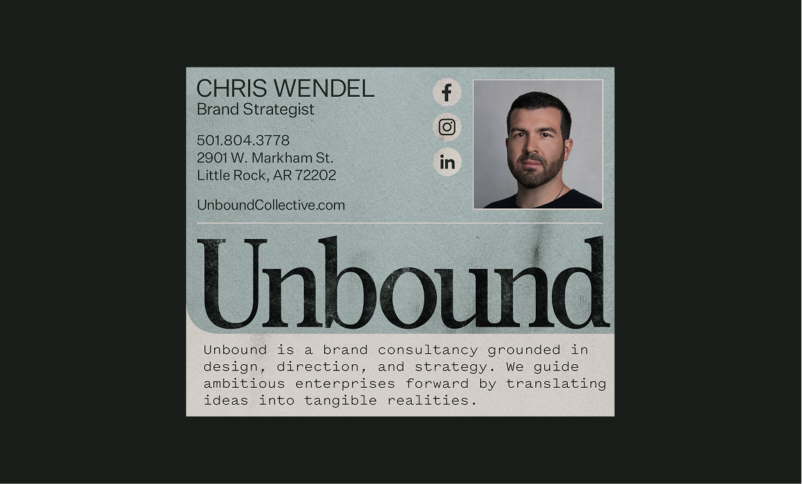
Dignified Email Signature
Unbound Collective
Keeping in line with all digital assets, these email signatures have clean structure with minimal noise, compressing the brand system into one space.
Stationery & Brand Collateral
Sarah Oden Photographer
Branded materials unite to inform and represent business capabilities with a touch of personality.
Digital Announcement
R&E Supply
News templates pull from the company’s brand image for custom holidays, sales, and other urgent announcements.

Organized Email Signature
Bushong Accounting
The Bushong email signature features appealing tones and represents the clarity and control offered by the business’s services.

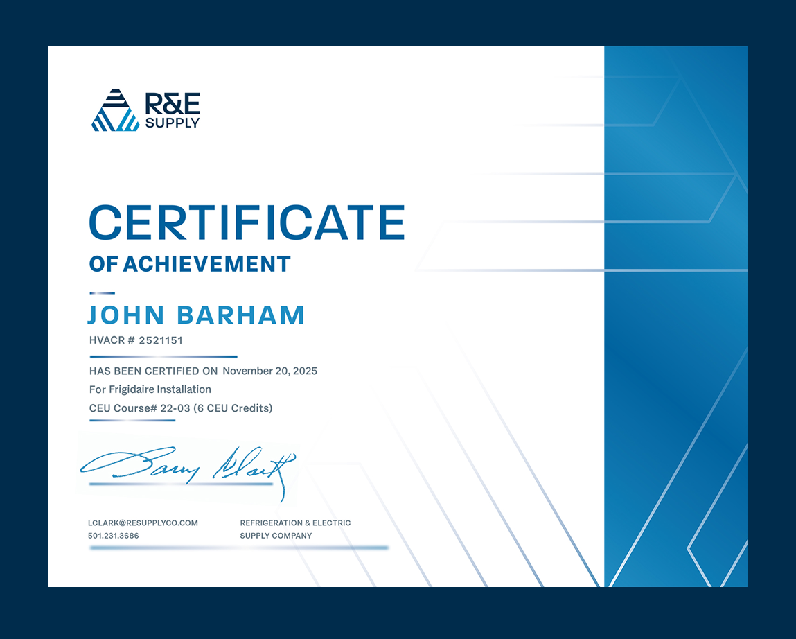
HVACR Certification
R&E Supply
Custom certificates of completion for company-specific courses add personalization to achievements.
Information Sheet
Baum Gallery
Striking imagery mixes with bold type to establish this art show event’s presence and purpose.
Intermixing Typography
The Ouachitas
Five type families establish a flexible yet unified visual language that carries the brand’s voice across marketing, digital, and print.
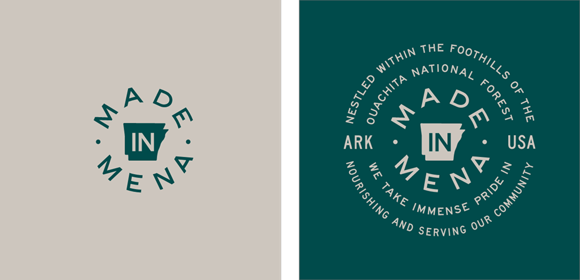
Made in Mena Text Badge
The Ouachitas
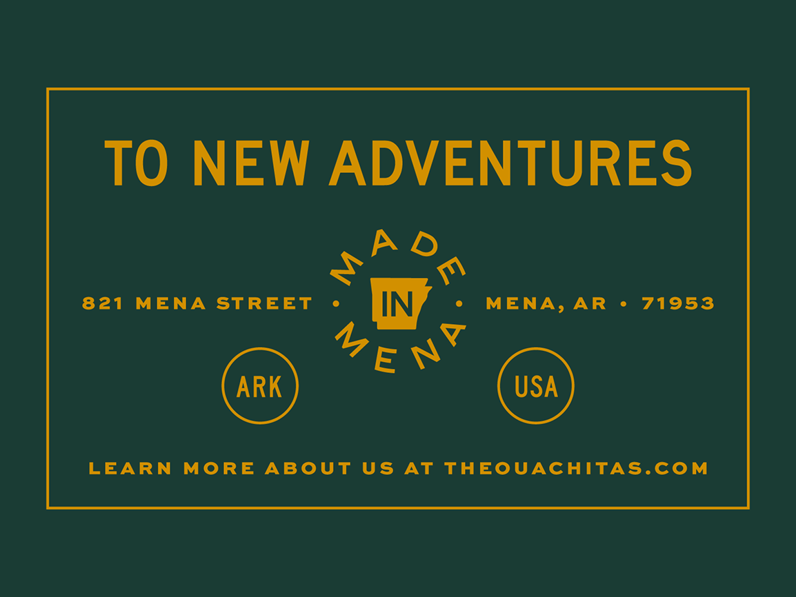
The preferred version of the ‘Made in Mena’ badge features a full-text statement, offering clear communication of the brand’s local roots and reinforcing its commitment to community.
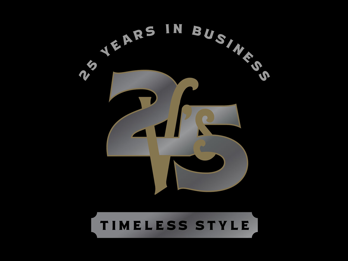
Anniversary Badge
V’s Barbershop
Interlinking font styles combine to form an elegant representation of the business’s grand 25 Year achievement.
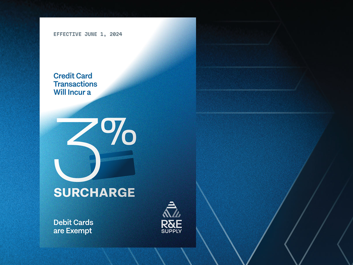
Digital Announcement
R&E Supply
With a sleek, branded design, font size variation attracts the eye to important areas of an announcement.
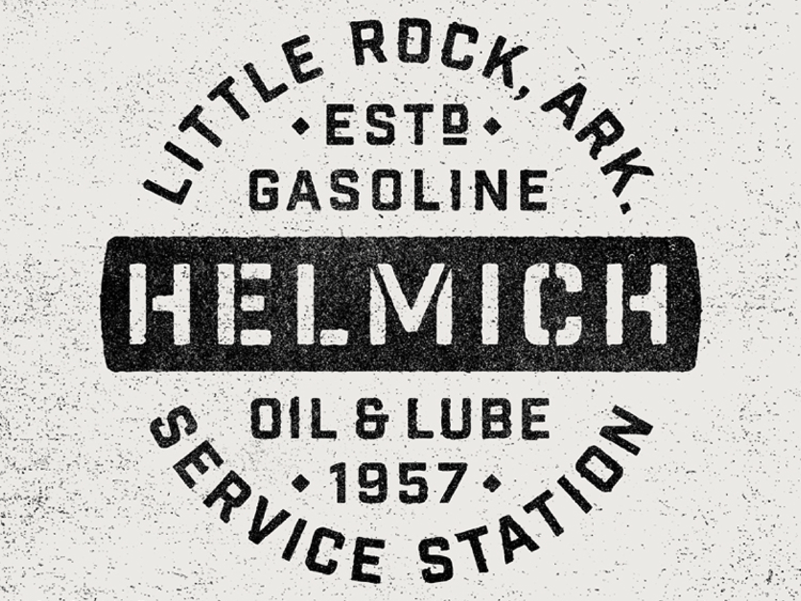
Brand Badge
Hill Station
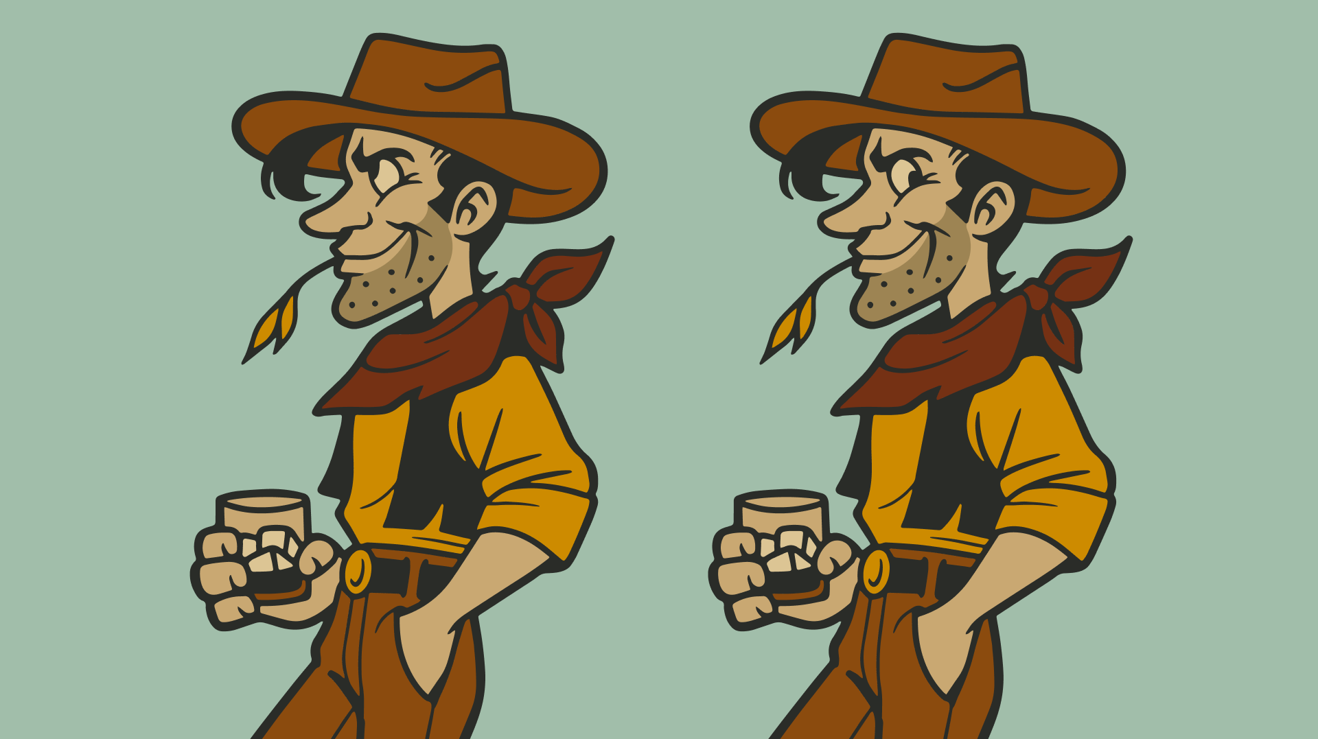
Old-fashioned typography within an antique sign-style logo recalls the business roots prior to renovation into a local favorite restaurant in Little Rock’s Hillcrest neighborhood.
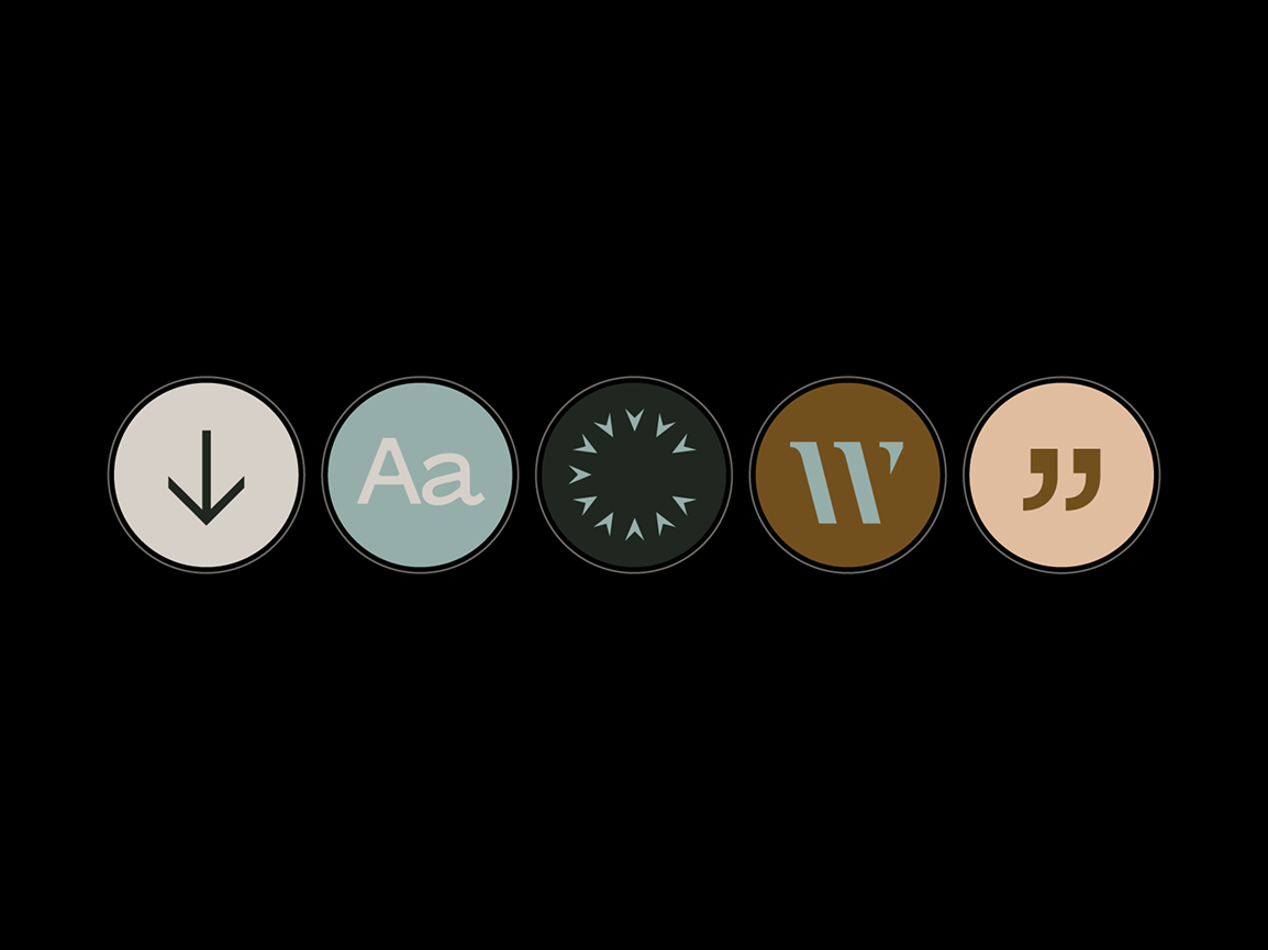
Icon Design
Unbound Collective
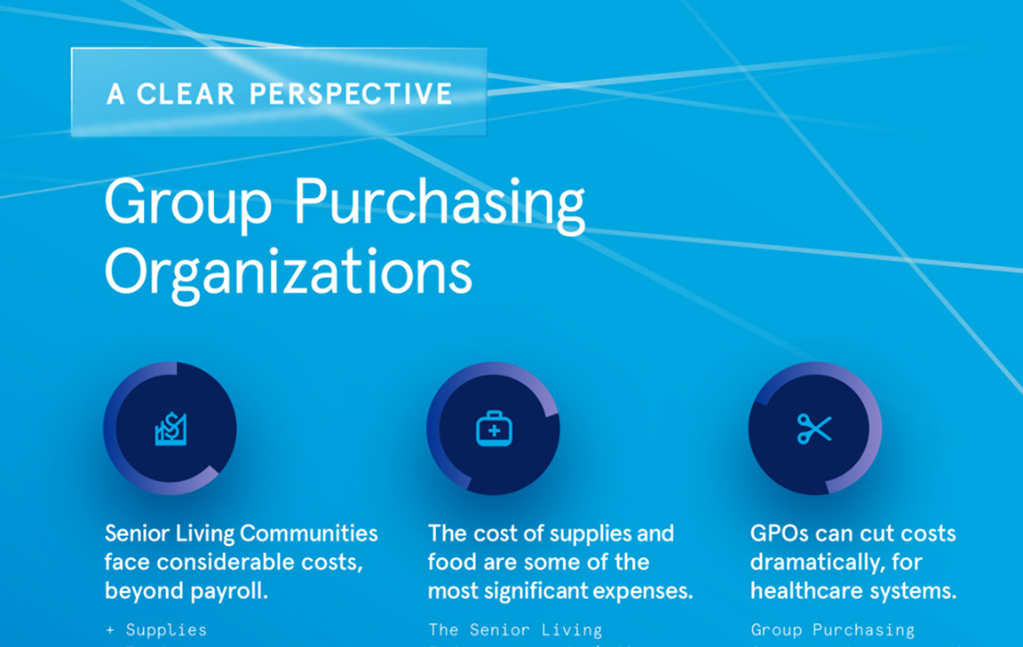
Iconography communicates messages clearly with incorporations of type families from Unbound’s digital applications.
COMMUNITY GUIDE BOOKLET AD
Ski Brothers Heat & Air
Each element of this full page ad directs intentional graphic design qualities to enhance trust in a local annual publication.

WORK WITH UNBOUND

A FRAMEWORK FOR STRATEGIC PLANNING—ALIGNING GOALS AND METHODS FOR BUSINESS GROWTH.

A FRAMEWORK FOR STRATEGIC PLANNING—ALIGNING GOALS AND METHODS FOR BUSINESS GROWTH.

A FRAMEWORK FOR STRATEGIC PLANNING—ALIGNING GOALS AND METHODS FOR BUSINESS GROWTH.


