


Color palette development
IN LITTLE ROCK, ARKANSAS
Crafting a Distinctive Color Scheme for Your Brand
The Ouachitas
The brand's collateral draws from an extensive, muted palette, ensuring visual cohesion across all materials.

Medtrust Health Alliance
This palette comprises a selection of cool colors meticulously chosen to create a broad contrast range, ideal for developing gradient applications.

Handle Barbershop
A minimal yet high-contrast Americana color palette defines the classic visual voice of the brand, resonating with timeless elegance.

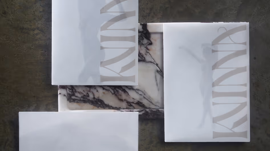
Kvinna Studio
This palette encompasses a comprehensive spectrum of warm neutrals, extending from off-white to rich black. Stark contrast serves as a fundamental element of the overall design ethos for the brand.

Better Fellas
The brand identity is defined by earth tones with sporadic accents of contè-colored orange to strategically draw attention within compositions.

Fletcher Sparrow Capital Management
The color scheme is intentionally restrained, utilizing only the hues found within the brand marks—except when depicting numerical charts.

Poco's Beer, Wine, and Spirits
The color palette features Western desert swatches complemented by a subtle green hue, reflective of the sea-foam band that adorns the top of the store.

Customize Your Branding and Marketing
Create memorable experiences that drive revenue growth
A FRAMEWORK FOR STRATEGIC PLANNING—ALIGNING GOALS AND METHODS FOR BUSINESS GROWTH.

A FRAMEWORK FOR STRATEGIC PLANNING—ALIGNING GOALS AND METHODS FOR BUSINESS GROWTH.

A FRAMEWORK FOR STRATEGIC PLANNING—ALIGNING GOALS AND METHODS FOR BUSINESS GROWTH.

Selected Work
Kvinna Studio


The Ouachitas


MedTrust Health Alliance


Handle Barbershop


Fletcher Sparrow Capital Management


Better Fellas


Poco's Beer, Wine, and Spirits


