Liquor Store Brand Identity
BRAND IDENTITY
ART DIRECTION
ILLUSTRATION
TYPOGRAPHIC DESIGN
WAYFINDING & SIGNAGE
MASCOT/CHARACTER DESIGN
Poco’s Beer, Wine, and Spirits is the first permitted liquor store in Polk County, Arkansas featuring an outlaw cowpoke mascot.
Image Nº 001—Poco's Primary Lockup
A custom-lettered logotype and unmistakeable mascot embody the lively, inviting essence of the Poco’s brand identity.

Image Nº 002—Contemporary Western Palette
The color palette features Western desert swatches complemented by a subtle green hue, reflective of the sea-foam band at the top of the store.

Image Nº 004—Custom Type and Character
The character Poco is depicted consistently looking to the left, a nod to the narrative of enduring the challenges of smuggling across county lines.
Image Nº 003—Sample Type Pairing
This type pairing combines a traditional wood type inspired font with our robust slab serif, "Poke," achieving an appealing contrast.


Image Nº 005—Full-Body Mascot
We offer two variations of the full-body mascot, differing only in the placement of Poco's pupil to enhance visual interest.

Image Nº 007—Full-Body Mascot
Displayed are comparative views of the full-body mascot, with and without color application, to showcase the Poco's mascot design's versatility.
Image Nº 006—Secondary Brand Mark
This representation focuses on the primary Poco’s lock-up, omitting any descriptive text for a cleaner appearance.


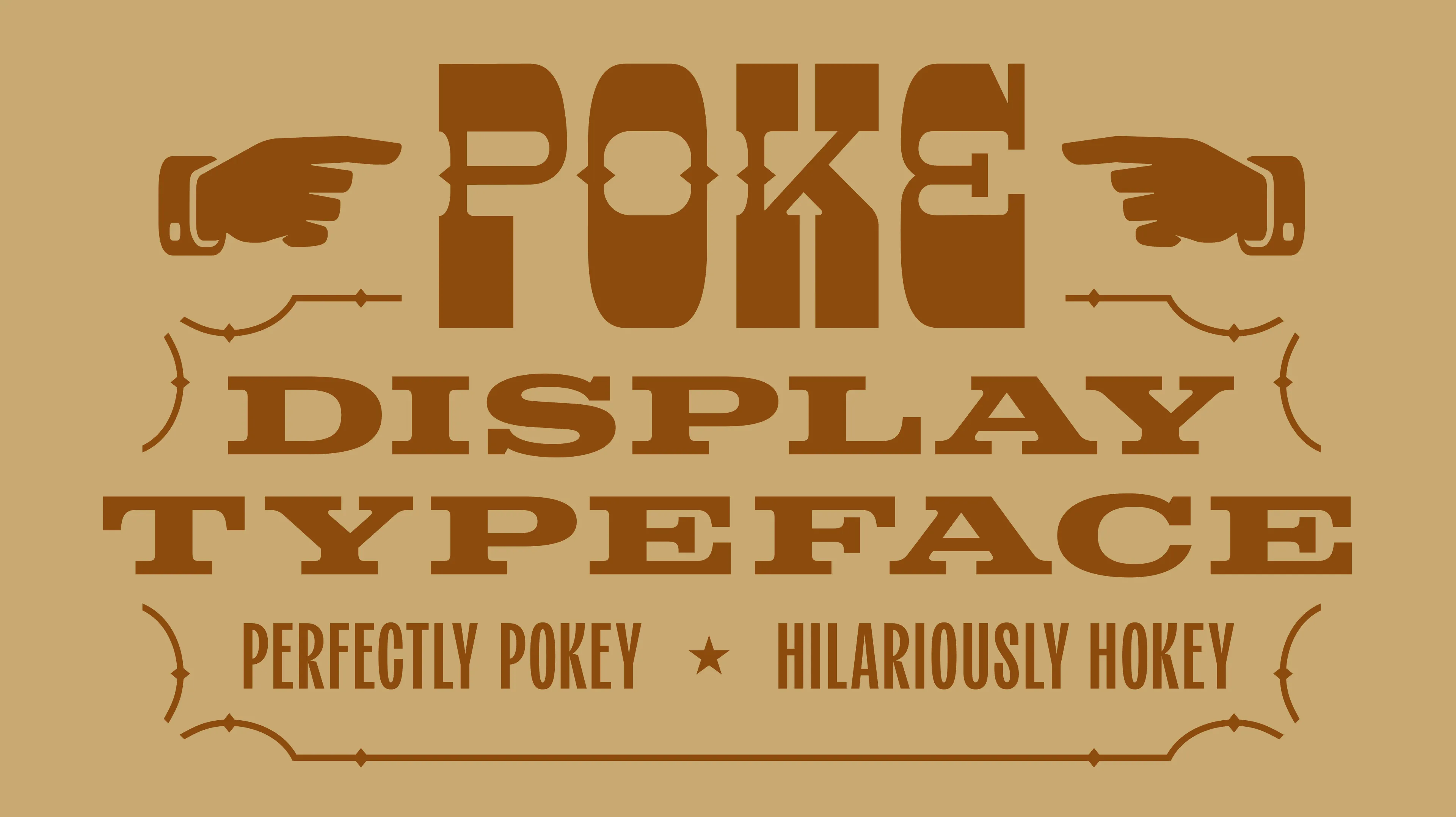
Image Nº 008—Poke Display Typeface
We designed a dramatically hokey slab serif display typeface named, "Poke" as a tribute to both Poco, and the classic wood type-inspired poking manicules we included in the set.
Image Nº 010—Single-Color Brand Mark
This brand mark is specifically designed for high-impact reverse color applications, ensuring brand consistency across all media.
Image Nº 009—Simple Packaging
Our simplified color branding reduces production costs and complies with printing specifications, optimizing efficiency while enhancing recognition.


Image Nº 011—"Poke" Says Howdy
Featuring a selection of characters that express one of Poco's favorite greetings, this set emphasizes the brand's friendly personality.

Image Nº 012—Poke's Manicules
Evoking the spirit of the Old West, these classic manicules are inspired by a vintage typecase, enhancing authenticity and typography.

Image Nº 013—Merchandise Design
The initial merchandise rollout features simple, brand-centric designs in a unisex color palette to cater to a broad audience.

Image Nº 014—All Types of Type
The Poco’s brand identity includes four distinct character sets, blending custom designs with digital typography to create a unique visual language.

Image Nº 015—Raise a Cheer to Poco
Canvassing Polk County was a formidable but fruitful endeavor that both benefited our client and quenched the thirst of many in Mena, Arkansas.


WORK WITH UNBOUND

A FRAMEWORK FOR STRATEGIC PLANNING—ALIGNING GOALS AND METHODS FOR BUSINESS GROWTH.

A FRAMEWORK FOR STRATEGIC PLANNING—ALIGNING GOALS AND METHODS FOR BUSINESS GROWTH.

A FRAMEWORK FOR STRATEGIC PLANNING—ALIGNING GOALS AND METHODS FOR BUSINESS GROWTH.
UNBOUND SELECTED WORK
Below is a body of selected work that is guided by the Compass session. Compass is the foundation of all of the work we do at Unbound.


