schedule a discovery call
→


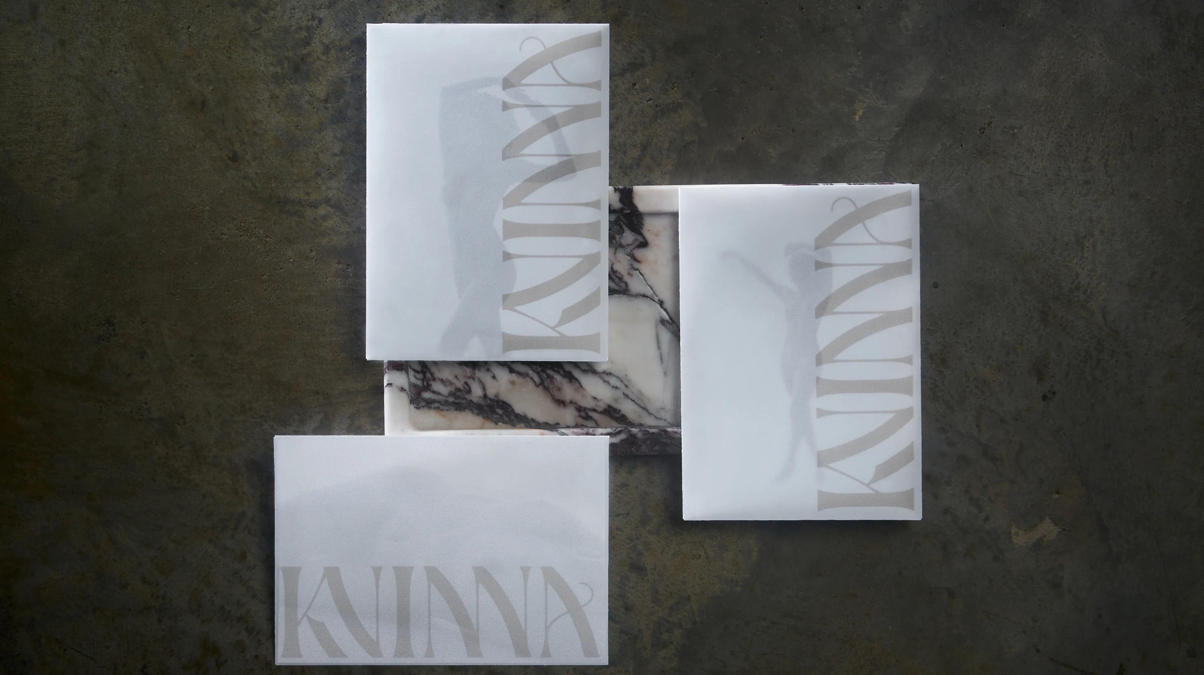
Image Nº 001—Fletcher Sparrow Logotype
The Fletcher Sparrow logotype embodies a blend of traditional luxury and contemporary simplicity.

Image Nº 002—Fletcher Sparrow Logo (A)
The primary brand mark features an elaborate depiction of a sparrow in flight, clutching an upward-pointing arrow that symbolizes market growth.
Image Nº 003—Fletcher Sparrow Logo (B)
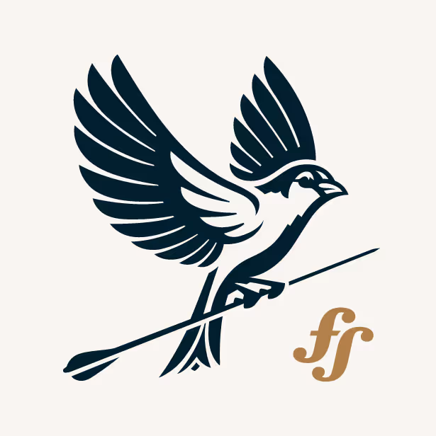

Image Nº 004—A Traditional Palette
The color scheme is intentionally restrained, utilizing only the hues found within the brand marks—aside from numerical chart depiction.

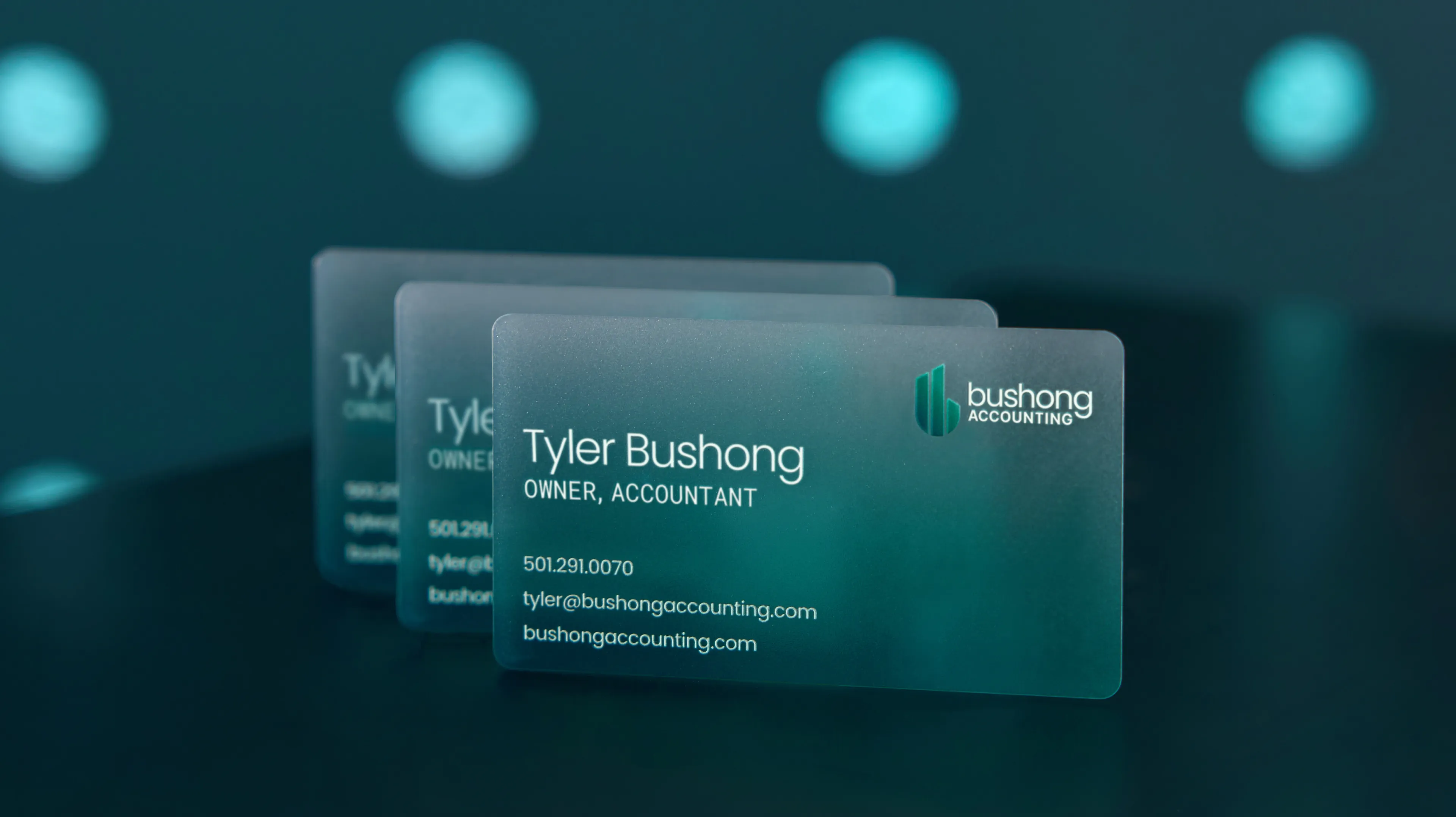
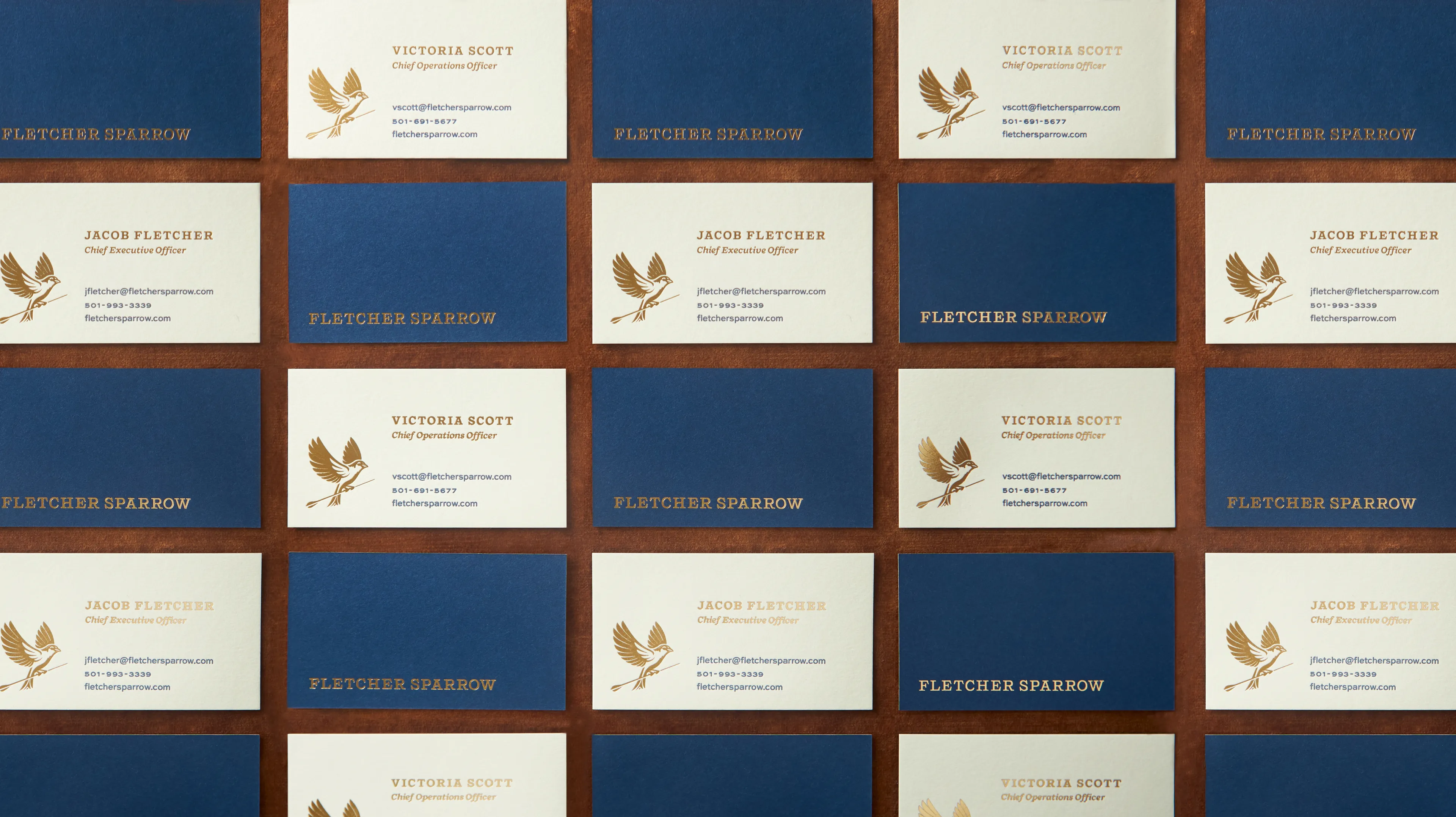
Image Nº 005—Premium Business Cards
The executive team's business cards are crafted from matte brass foil and letterpress printed. These designs present a sophisticated, compelling impression to prospective investors.
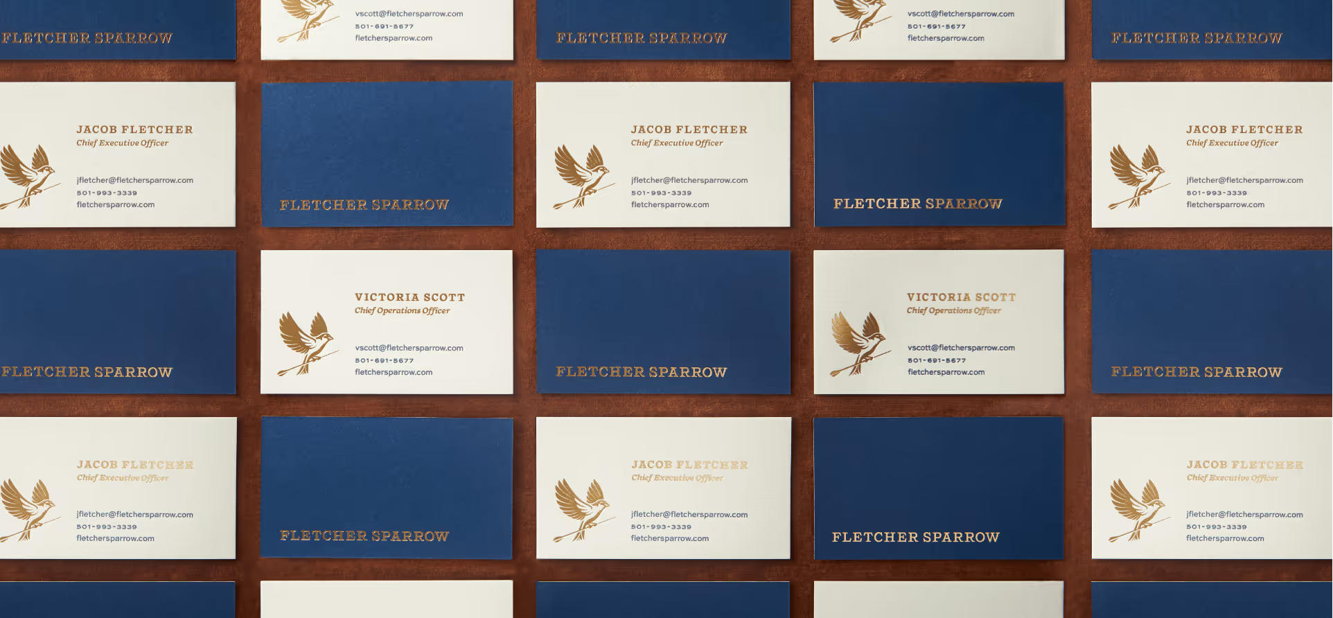
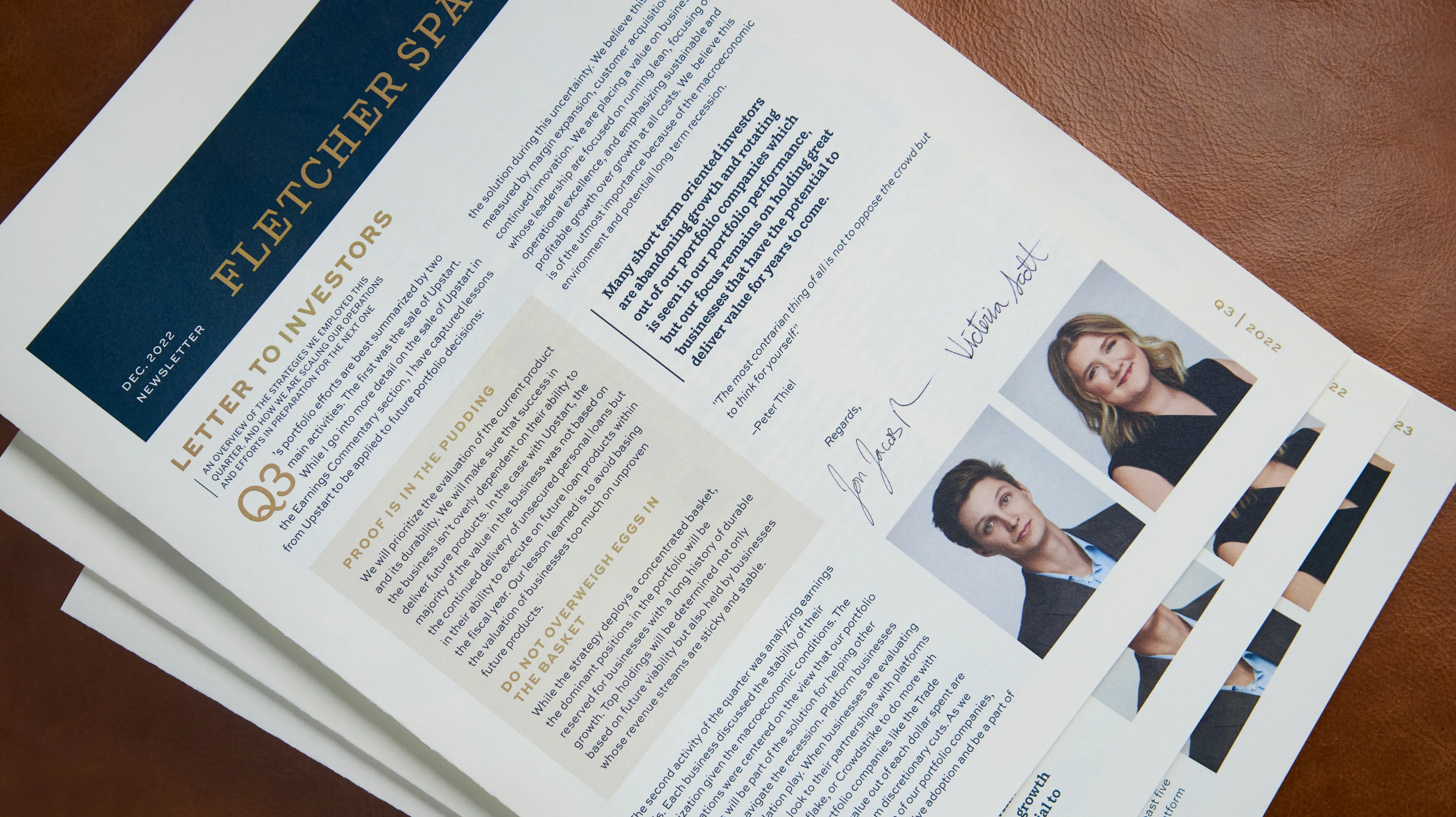
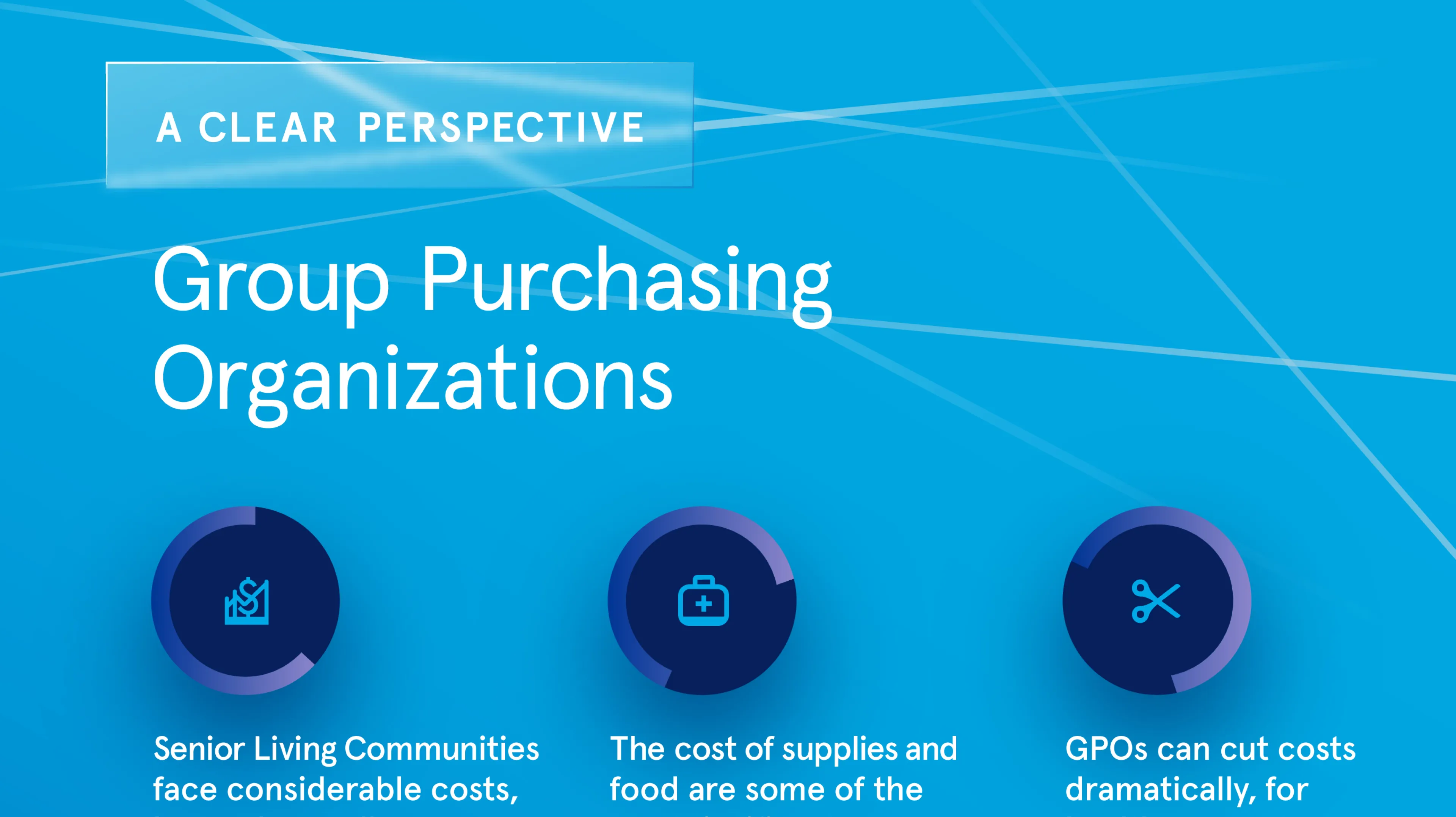
Image Nº 006—Quarterly Investor Updates
We established a template system to consistently produce and communicate quarterly investor updates via mail.
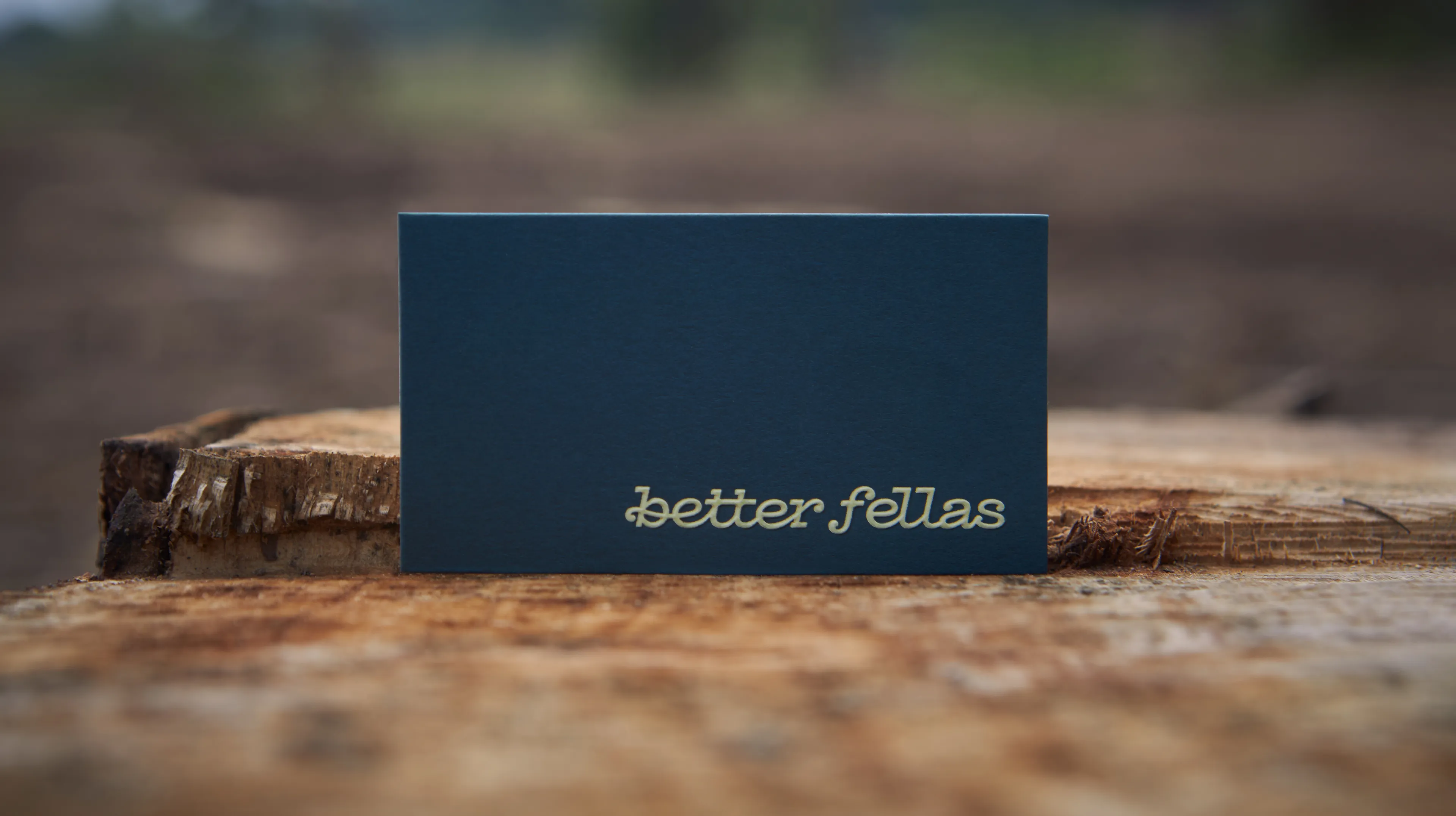
Image Nº 007—Matte-Brass Foil
Employing matte-brass foil stamped on matching blue stock with the logotype only, these elements use minimalism to convey a sense of wealth and sophistication.

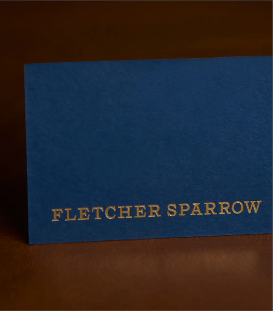
Image Nº 008—Quarterly Print Newsletter
Each quarterly newsletter showcases a cover spread and a personal letter to investors, designed to maintain engagement and provide insightful updates in the market.

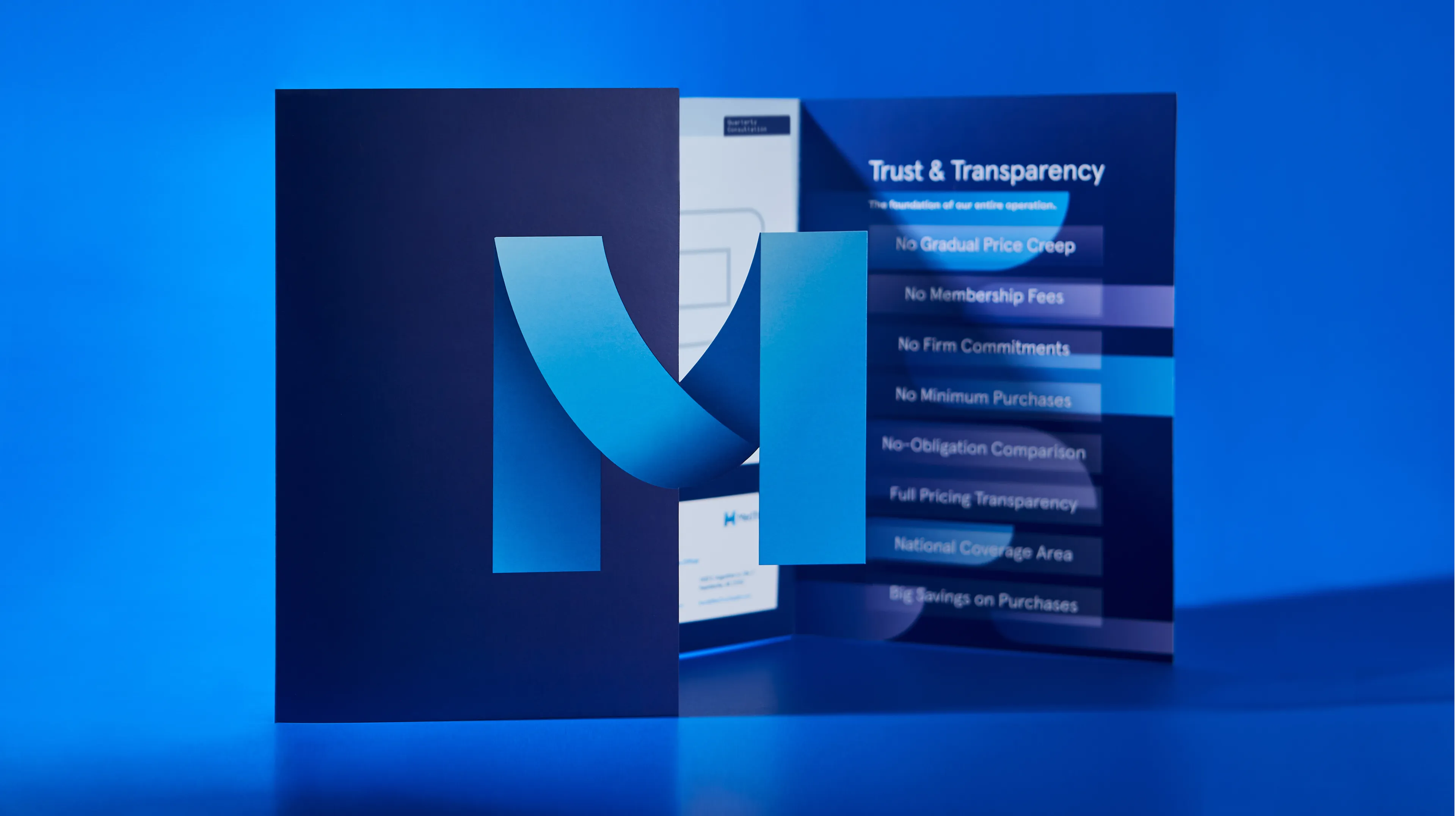
Image Nº 009—Quarterly Digital Newsletters
Complementing our print offerings, we also distribute digital versions of the newsletters to enrich the Fletcher Sparrow archive.


Below are the results that came from a Compass session. Compass is the foundation of all the work we do at Unbound.