


type Palette
IN LITTLE ROCK, ARKANSAS
Establishing a Consistent Typographic Style for Your Brand
Presentation Graphics
This segment highlights various brand components—glassmorphism, a robust type palette, iconography, drop-shadows, and a linear networking motif.

Typographic Style
A section of the menu showcasing the Americana-inspired typographic style, reflecting the brand’s visual voice.

Menu Spread
The interior and exterior menu spread, presented on newsprint in monotone ink—paired with a shot of espresso and pallette cleanser.


Intermixing Typography
The complete identity system incorporates five distinct type families, each seamlessly integrated into aesthetically pleasing compositions that maintain a unified vocal expression.
A Complex Typographic System
Our typographic strategy is all centered-aligned, fostering an inviting yet luxurious visual narrative.


Typographic Hierarchy
Our typographic framework utilizes three high-contrast, curvilinear display typefaces in conjunction with a unified weight of sans serif and serif text types, wich are optimized for readability at smaller scales.

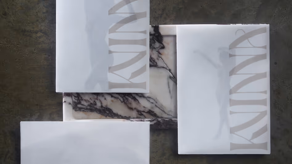
This entry elaborates on the detailed breakdown of session, image, and product rates, transcending simple pricing to encapsulate the full, premium Kvinna Experience.


Handle Sans Custom Lettering
With nearly a quarter of the English alphabet represented in the logotype, we expanded the set to include remaining glyphs for use as the primary headline typeface.

Quarterly Digital Newsletters
Complementing our print offerings, we also distribute digital versions of the newsletters to enrich the Fletcher Sparrow archive.


A Playful Voice
The brand's copy is intentionally pompous yet playful, supporting the lighthearted but effective results of the ROI Better Fellas yields their clients' PPC efforts.

Agency vs PPC
This playful chart contrasts the streamlined efficiency of an exclusive pay-per-click agency with the comprehensive services of a traditional all-inclusive agency.

Custom Slider for Simple UX
A custom slider incorporates five JavaScript variables to succinctly convey the nuances of partnering with Better Fellas, while offering a more engaging and effective alternative to traditional pricing tables with dynamic pricing breakpoints.

Poke, Display Typeface
We designed a dramatically hokey slab serif display typeface named, "Poke" as a tribute to both Poco, and the classic wood type-inspired poking manicules we included in the set.


All Types of Type
The Poco’s brand identity includes four distinct character sets, blending custom designs with digital typography to create a unique visual language.

Customize Your Branding and Marketing
Create memorable experiences that drive revenue growth
A FRAMEWORK FOR STRATEGIC PLANNING—ALIGNING GOALS AND METHODS FOR BUSINESS GROWTH.

A FRAMEWORK FOR STRATEGIC PLANNING—ALIGNING GOALS AND METHODS FOR BUSINESS GROWTH.

A FRAMEWORK FOR STRATEGIC PLANNING—ALIGNING GOALS AND METHODS FOR BUSINESS GROWTH.

Selected Work
Kvinna Studio


The Ouachitas


MedTrust Health Alliance


Handle Barbershop


Fletcher Sparrow Capital Management


Better Fellas


Poco's Beer, Wine, and Spirits


