schedule a discovery call
→


Image Nº 001—Bushong Accounting LogoType Variations
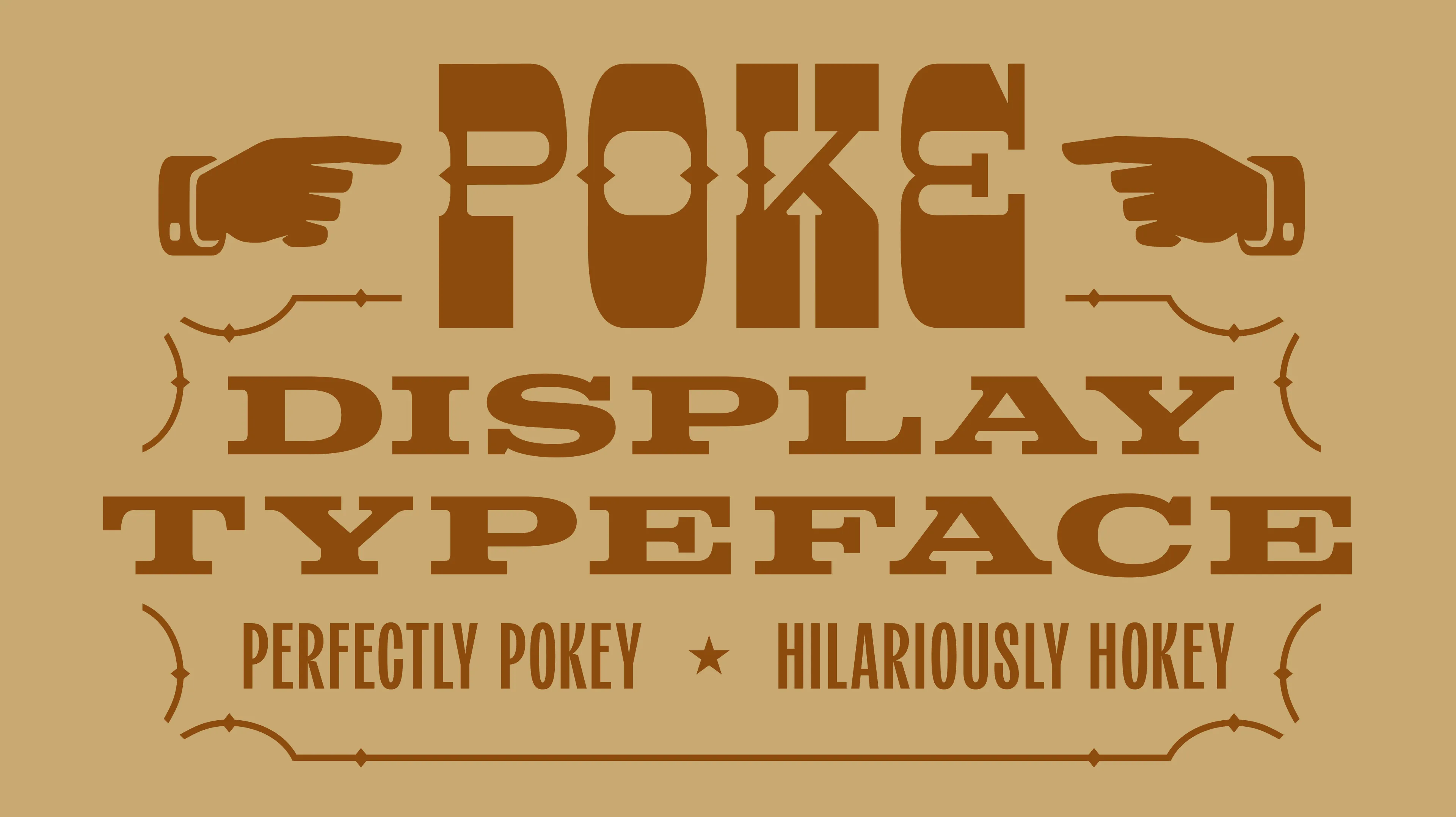
The Bushong Accounting mark pairs ascending geometric forms with a confident logotype, conveying the structural precision clients expect from their bookkeeper.We designed a dramatically hokey slab serif display typeface named, "Poke" as a tribute to both Poco, and the classic wood type-inspired poking manicules we included in the set.
Image Nº 002—Modern Financial Palette
Deep teals establish credibility while an electric mint accent pulls the eye where it needs to go.

Image Nº 003—Brand Positioning with Glassmorphism
The website hero showcases an anchor among glassmorphism that places clarity as a visual device throughout the brand identity.
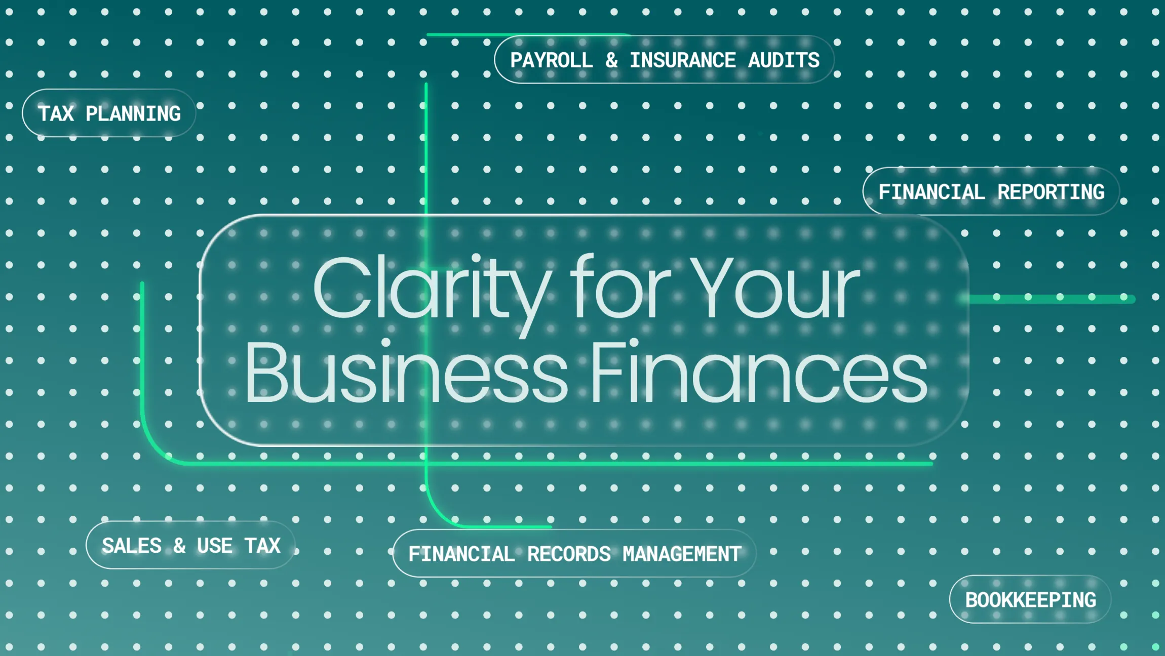
Image Nº 004—Interior Signage
Frosted plexiglass with raised lettering floats off a perforated impact wall, bringing the brand’s digital dot-grid motif into the physical space.


Image Nº 005—Website Overview
This overview showcases the website in desktop view, featuring custom development and animations that enhance user engagement with dynamic sections built to keep the reader moving down the page.
Image Nº 006—Typographic Style
Tonal variation across the headlines gives each term its own weight, with Roboto Mono anchoring the contact detail at left.

Image Nº 007—Growth Diagram Animation
The growth diagram device gives the brand’s three promises a literal shape: Clarity, Confidence, and Control rendered as ascending columns in clear glass.
Image Nº 008—Exterior Signage
Vinyl decals bring the logo and logotype to the entry glass for a clean, immediate read at street level.
Image Nº 009—Professional Headshots
Using a teal backdrop, directional low-key lighting, and brand-tonal wardrobe, linear vertical shadow lines are added in post, placing each team member in the same defined frame.
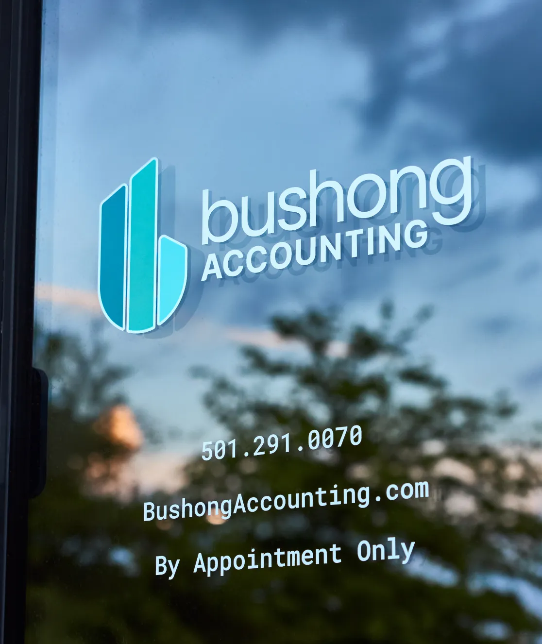


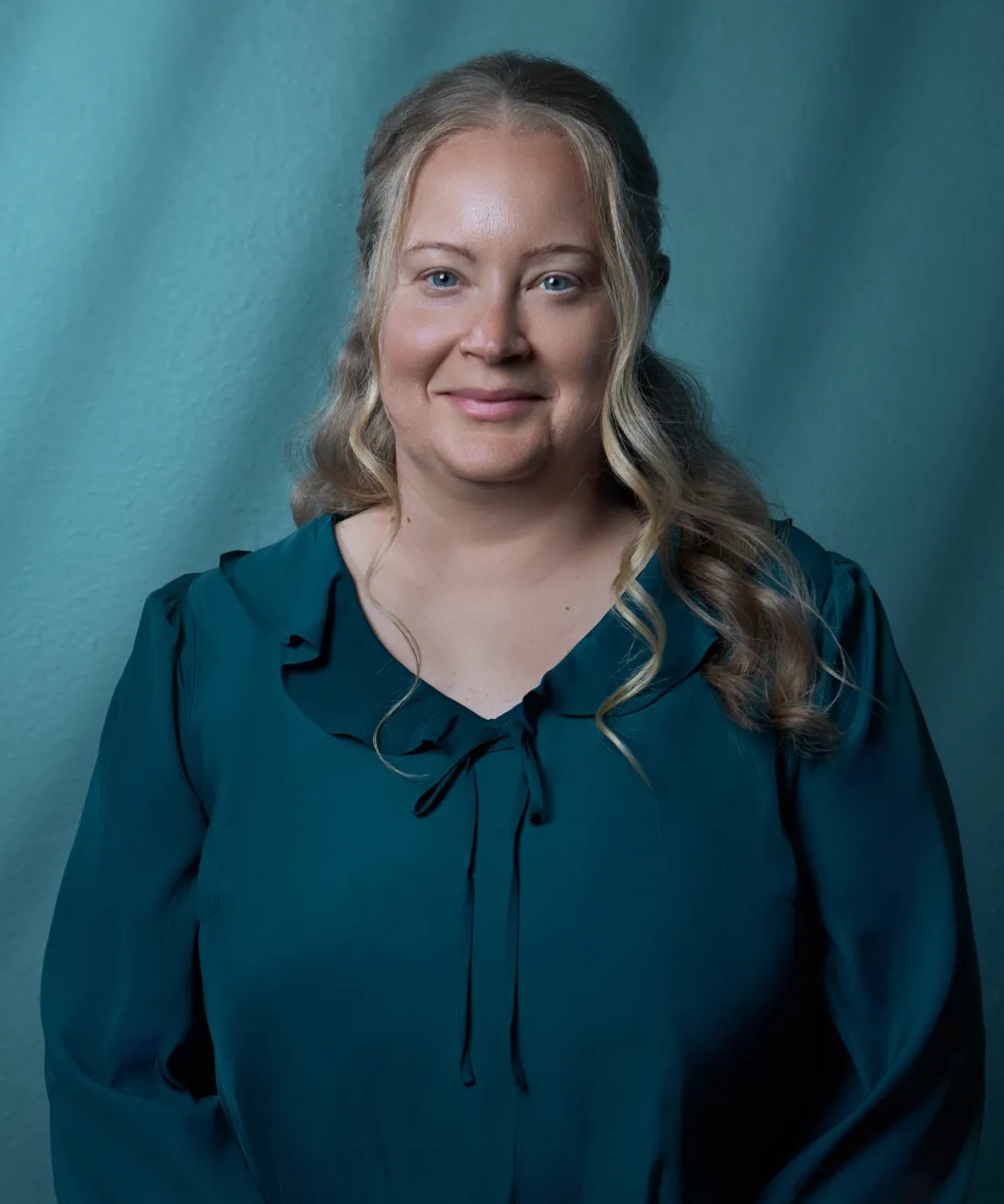
Image Nº 010—Office Exterior
The backlit sign serves as ambient light shifting toward the brand's teal range. This exterior shot connects the low, moody light that runs through all brand imagery.
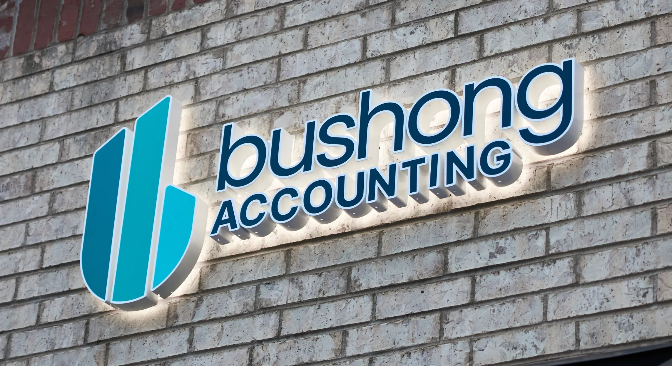
Image Nº 011—Exterior Sign Detail
The icon carries the full gradient at dimensional scale. Offset from the wall, the backlit aluminum casts a soft glow against the brick.
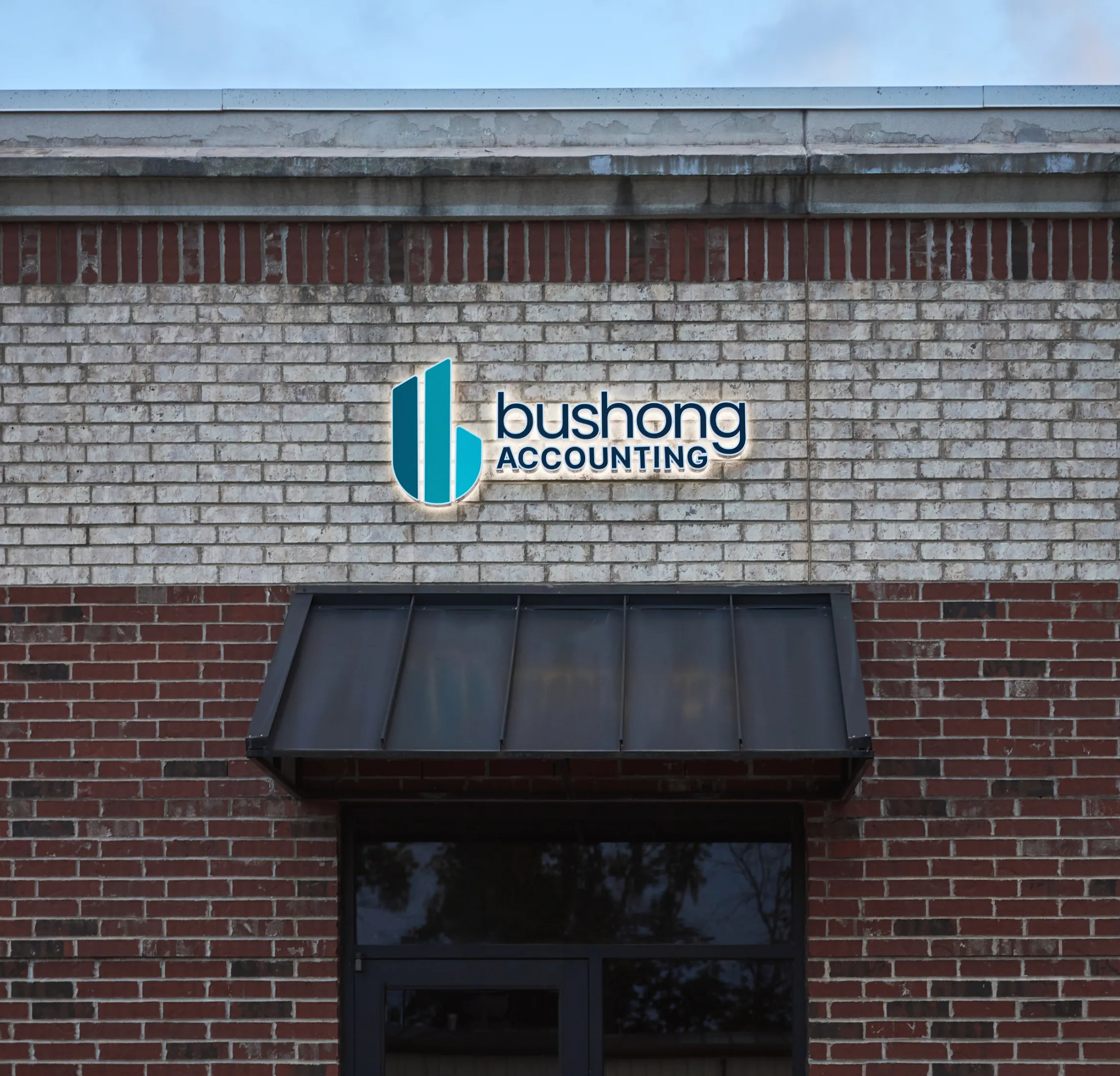
Image Nº 012—Rounded Edge Visual Components
The File Folder Corners run through each step using a border radius to reference accounting tabs. The ascending layout and GIF animation show the process as forward motion.
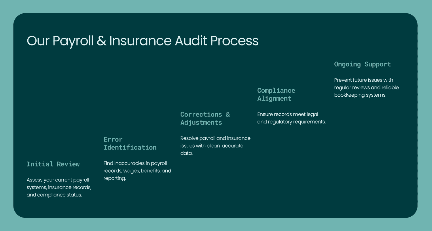
Image Nº 013—Professional Candid Photos
Positioned in scenarios where the Bushong team would find themselves on a daily basis, these shots capture natural imagery that can be implemented into the website.


Image Nº 014—Scroll-Based Animations
Layered isometric panels cycle through the firm's core benefits on scroll, using brand-toned depth to frame each one.
Image Nº 015—Bushong Accounting Isolated Brand Mark
The icon stands alone against a Glacier Mist background, its three panels reading as both lowercase “b” and a bar chart in ascent.

Image Nº 016—Bright Accent Color for CTAs
Electric Mint activates on hover, reserving the brand's accent color for the exact moment a service is selected.
.gif)
Image Nº 017—Dignified Email Signature
Visual devices from the brand system unite here, condensed into a single email signature in line with all digital assets.

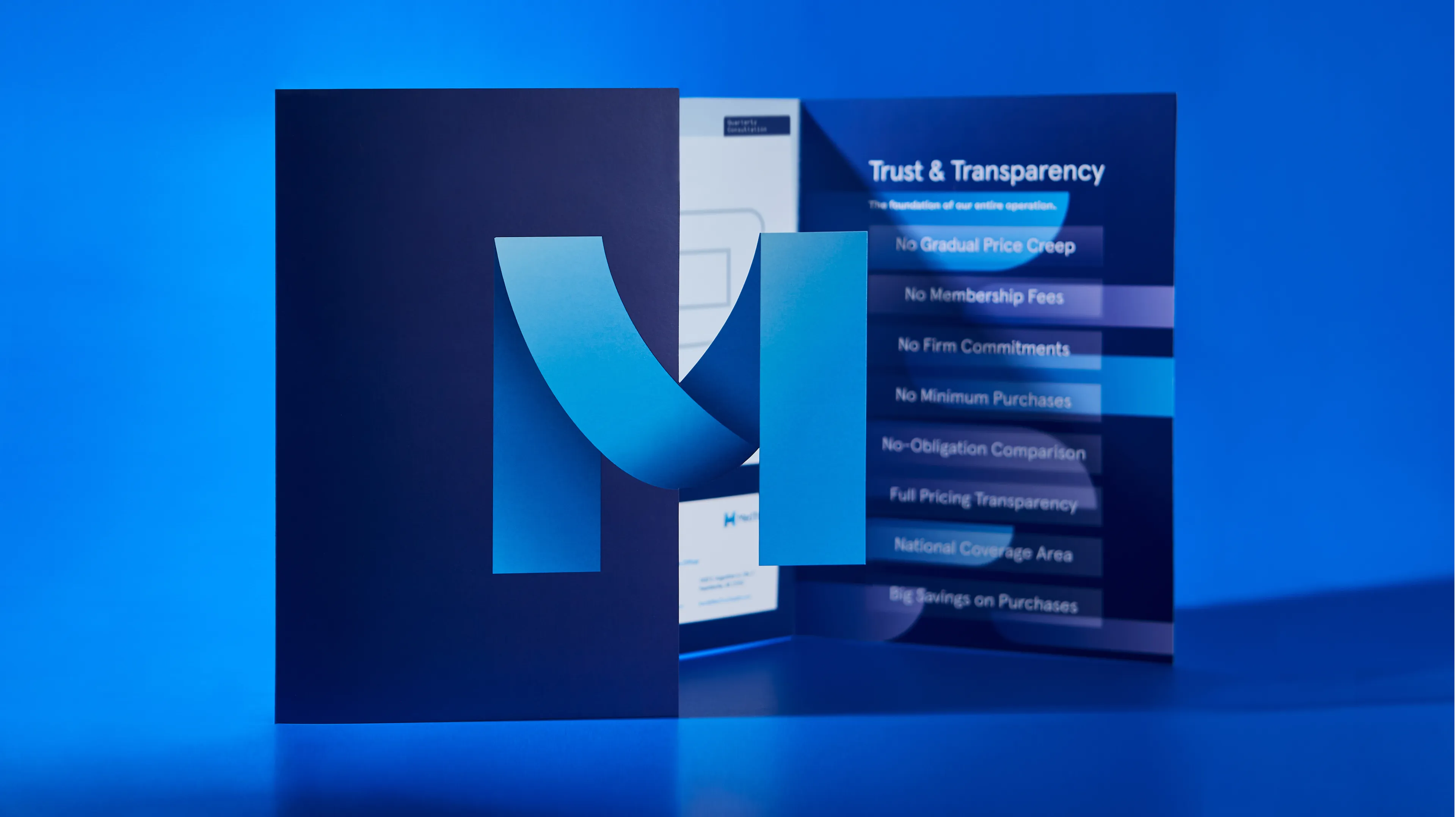
Image Nº 018—Printed Service Catalog
The digital visual identity carries directly into print, communicating the same visual and literal messaging throughout the catalog.


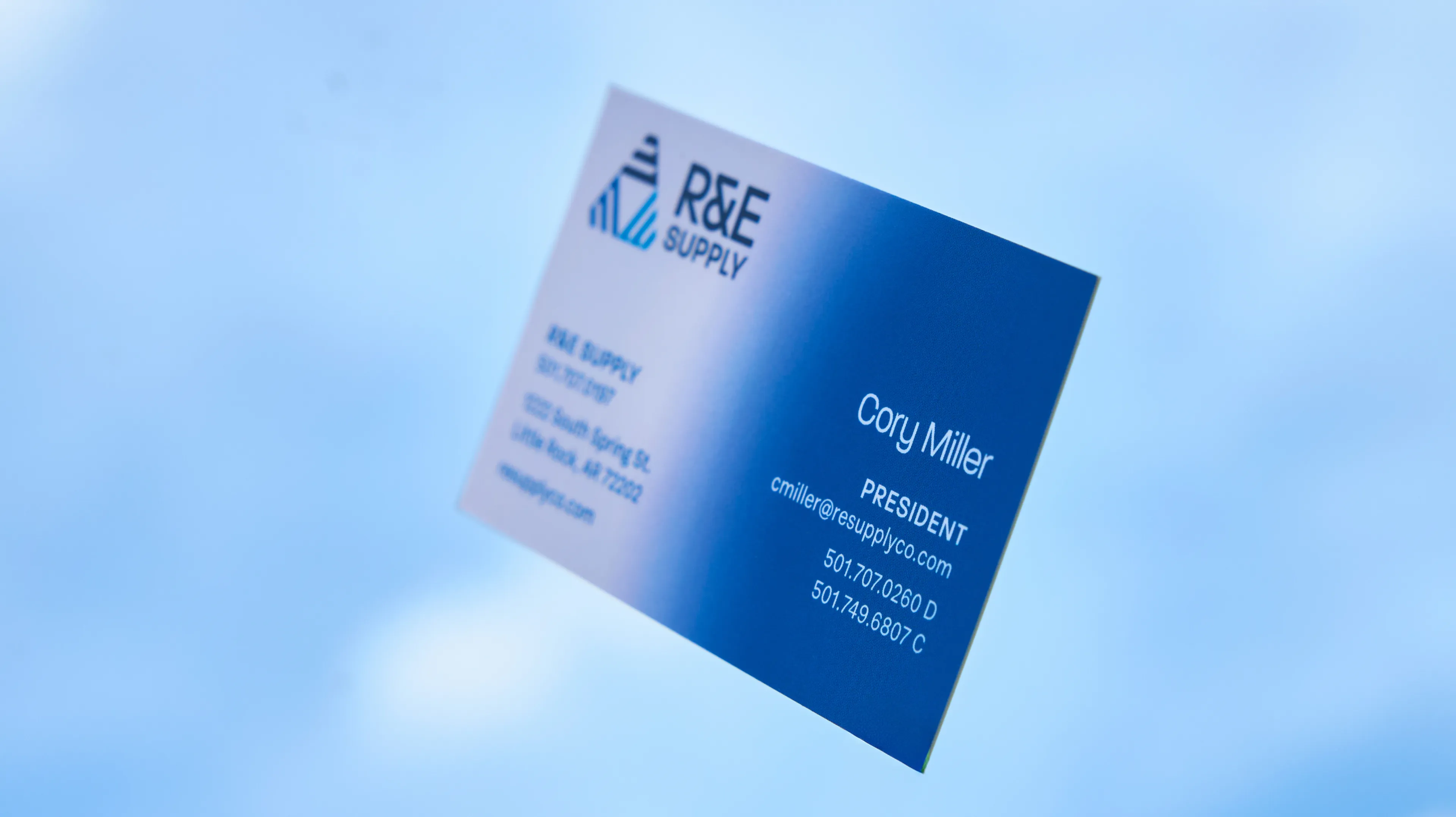
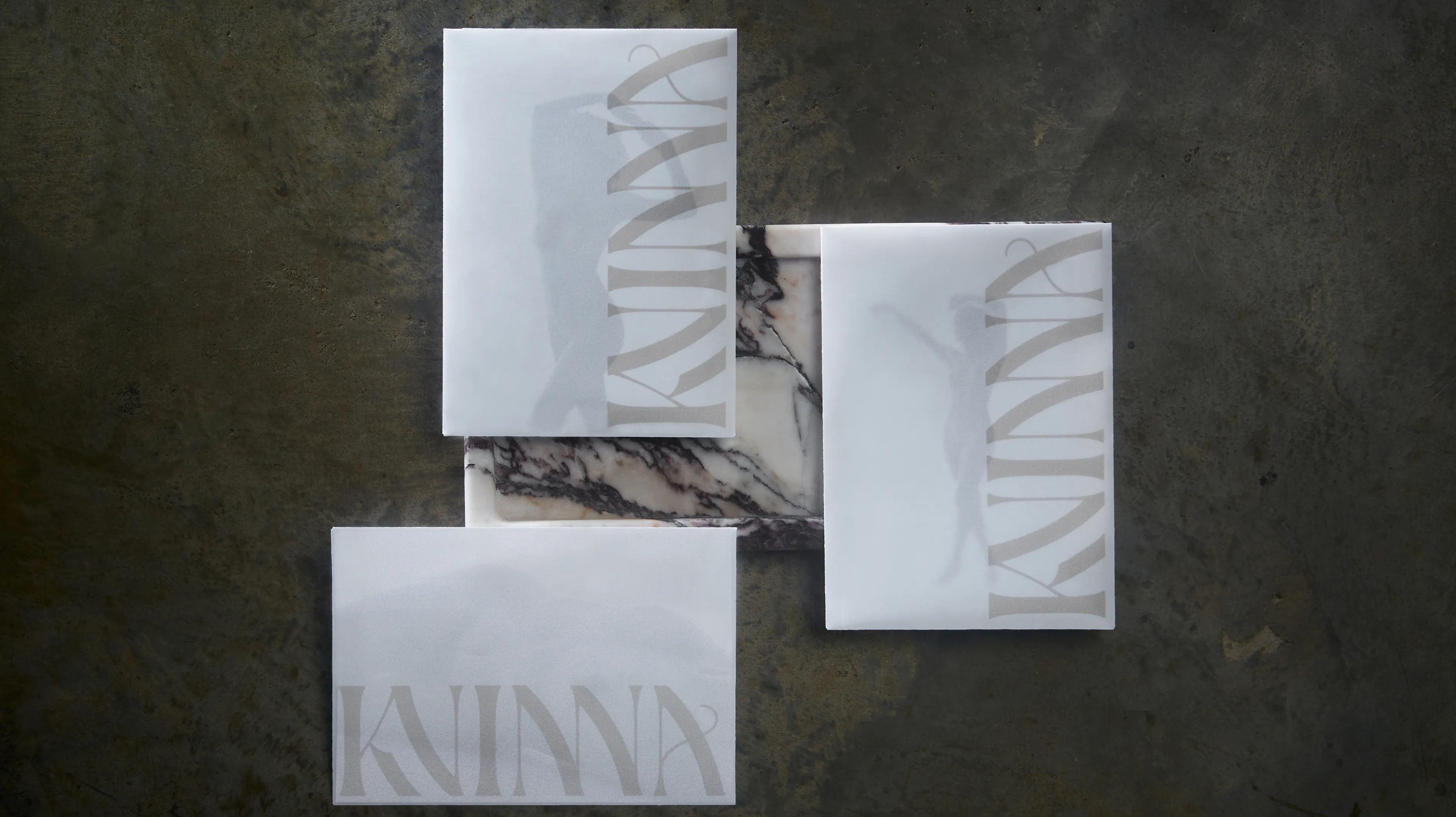
Image Nº 019—Clear Business Cards
The glassmorphism device extends to a physical material, with transparent stock photographed as linear slats to show the brand motif through.

Image Nº 020—Service Agreement
The Service Agreement gets the full brand treatment, so even the first legal document a client signs still feels like Bushong Accounting.
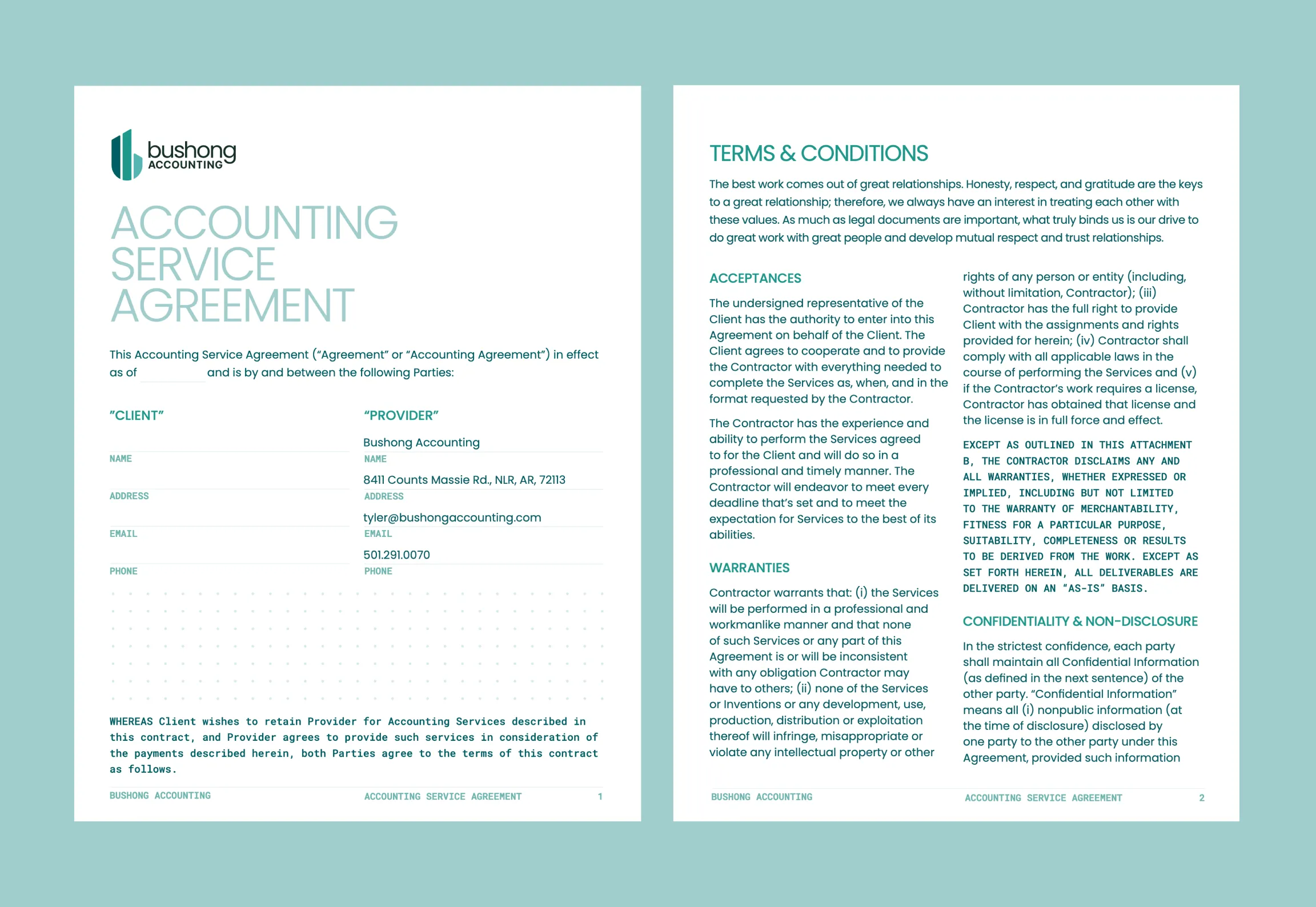
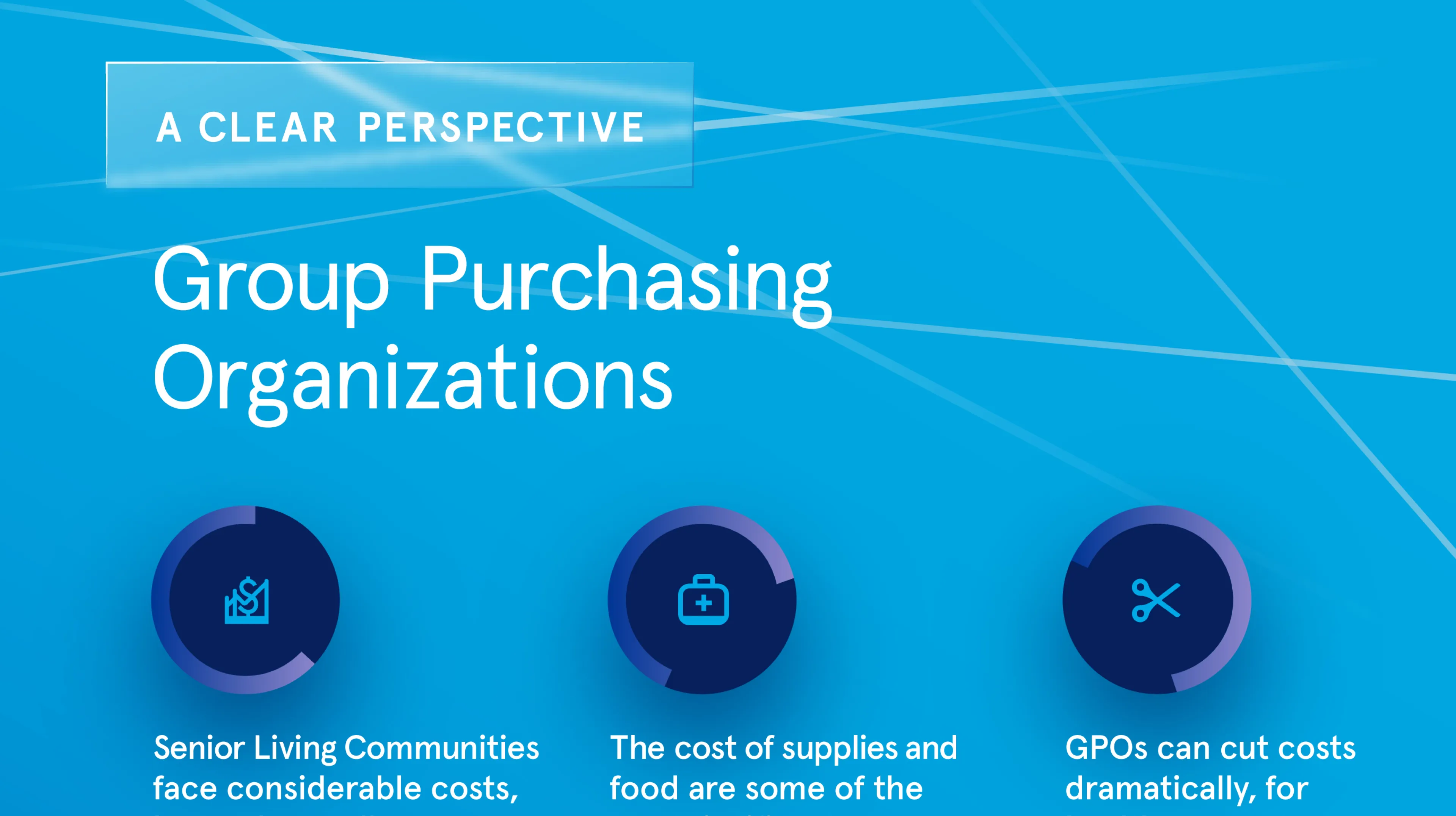
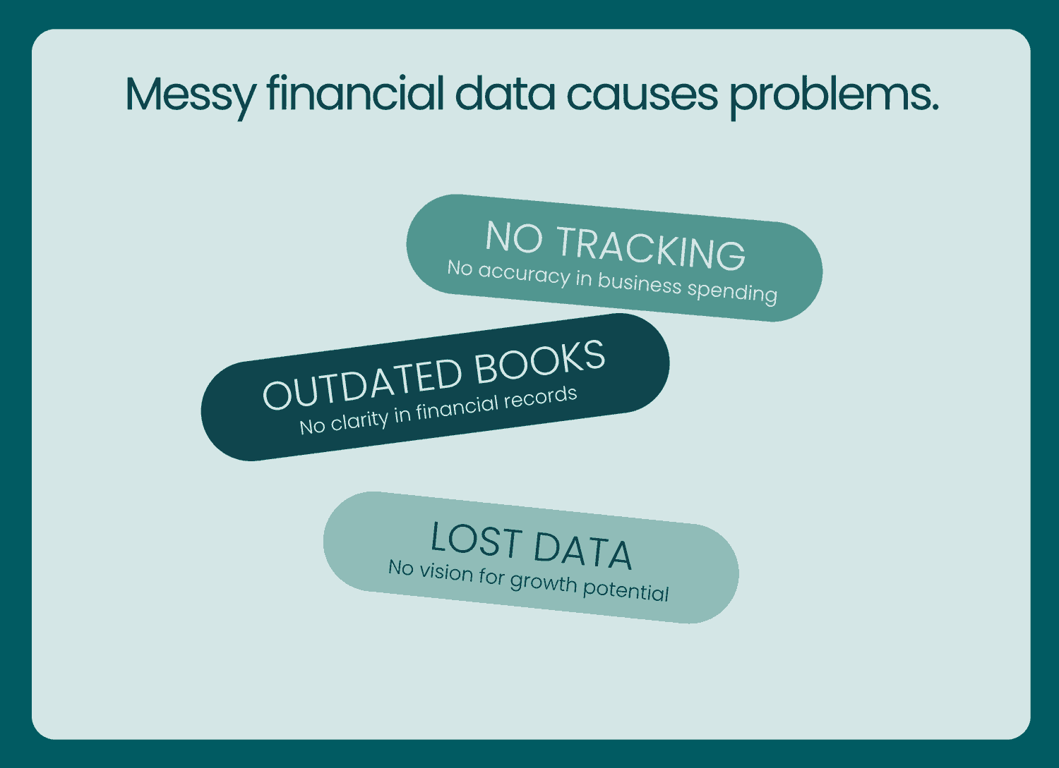
Image Nº 021—Problem Statement Animation
Tumbling pill labels animate the client’s pain points, using visual disorder to mirror the chaos of unmanaged financial data.
Below are the results that came from a Compass session. Compass is the foundation of all the work we do at Unbound.