schedule a discovery call
→


Image Nº 001—Ski Brothers Logo
Traditional HVAC shapes fused with skiing elements distinguish Ski Brothers’ reliability. Industry typography presents professional, clear, bold lettering.
Image Nº 002—Balanced Color Palette
A balanced color palette helps Ski Brothers maintain its voice across all seasons and brand implementations.

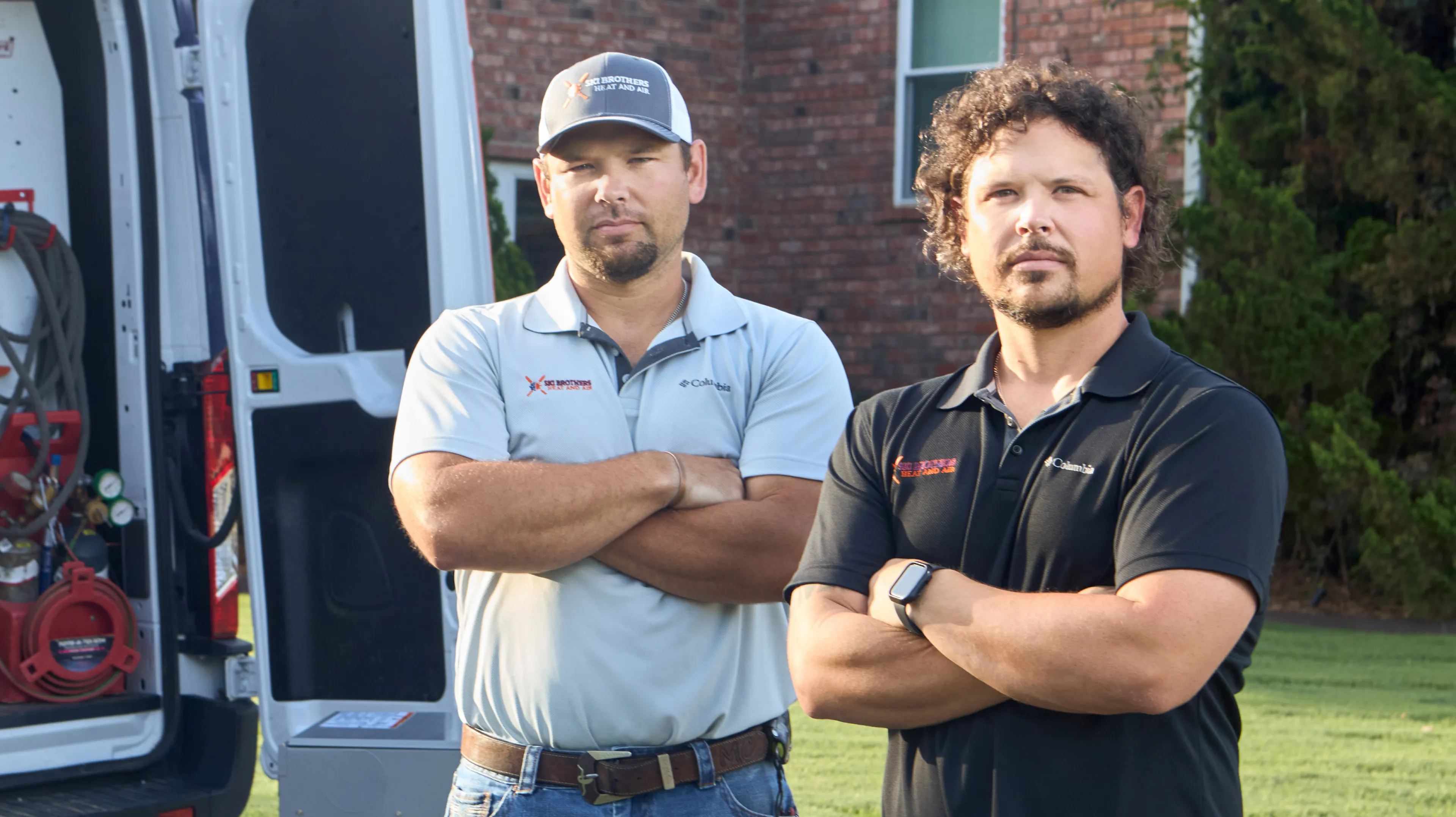
Image Nº 003—Matt and Aaron Chwalinski
The Ski brothers envisioned a brand that isn’t just an HVAC company. It’s a neighbor focused on the in-home comfort of its own community.

Image Nº 004—HVAC Iconography
This iconography clearly depicts HVAC specialty messaging while paying tribute to retro skiing imagery.
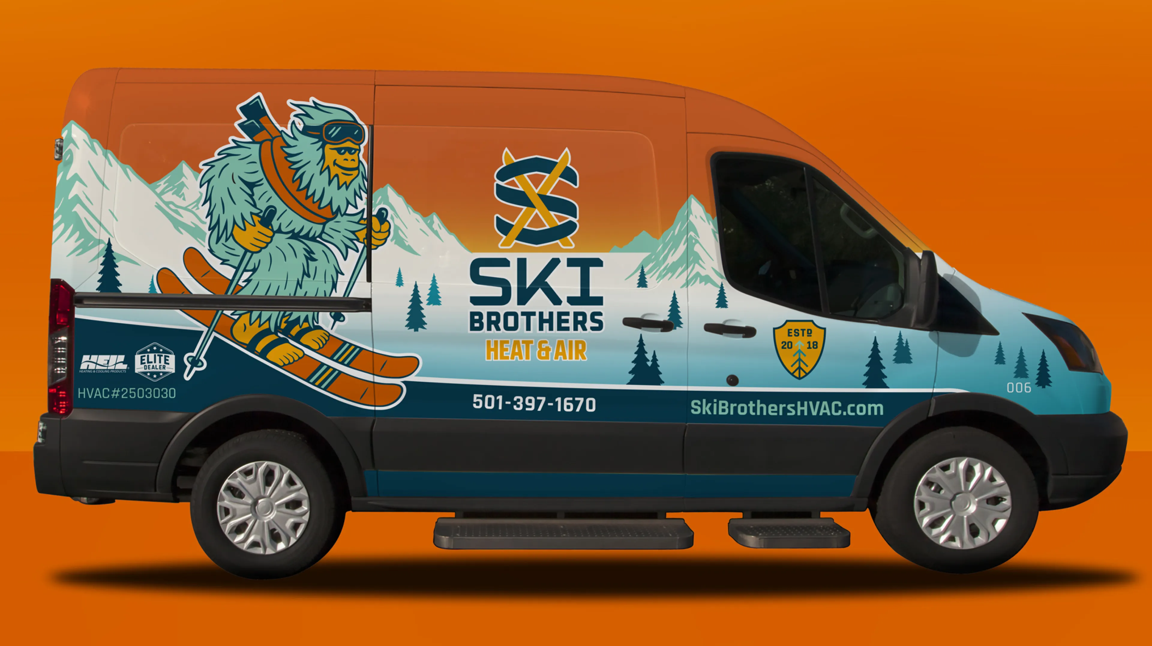
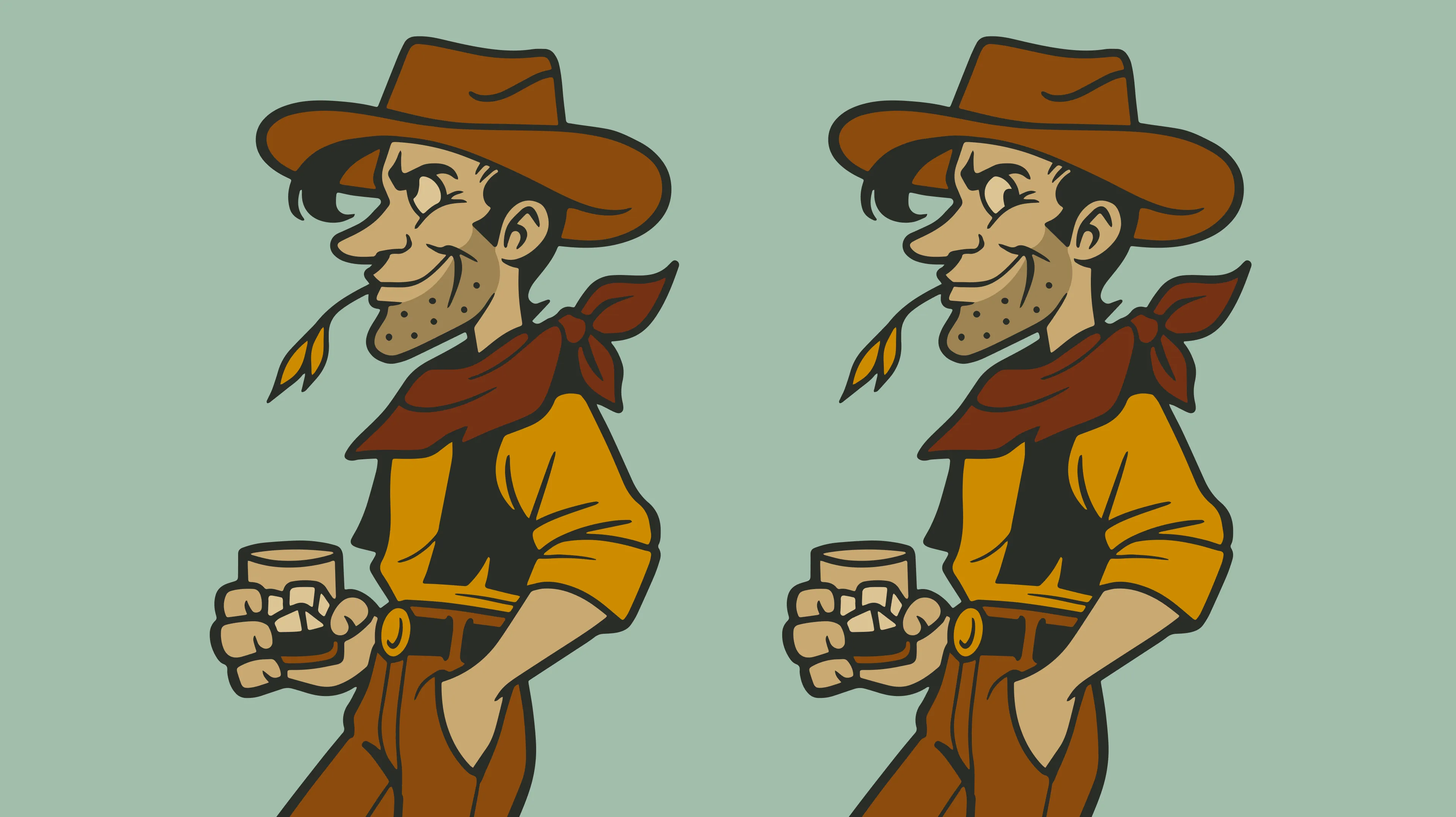
Image Nº 006—Mascot Creation
Designing a mascot with a clear connection to climate that customers can remember helps separate Ski Brothers from the competition with a distinct personality.

Image Nº 007—Diverse Application
The character can be translated in different positions across different applications for digital platforms, truck wraps, banners, and more.
Image Nº 008—Mascot Variation
Variation permits thematic changes across industry seasons, allowing seamless customization for the friendly mascot.

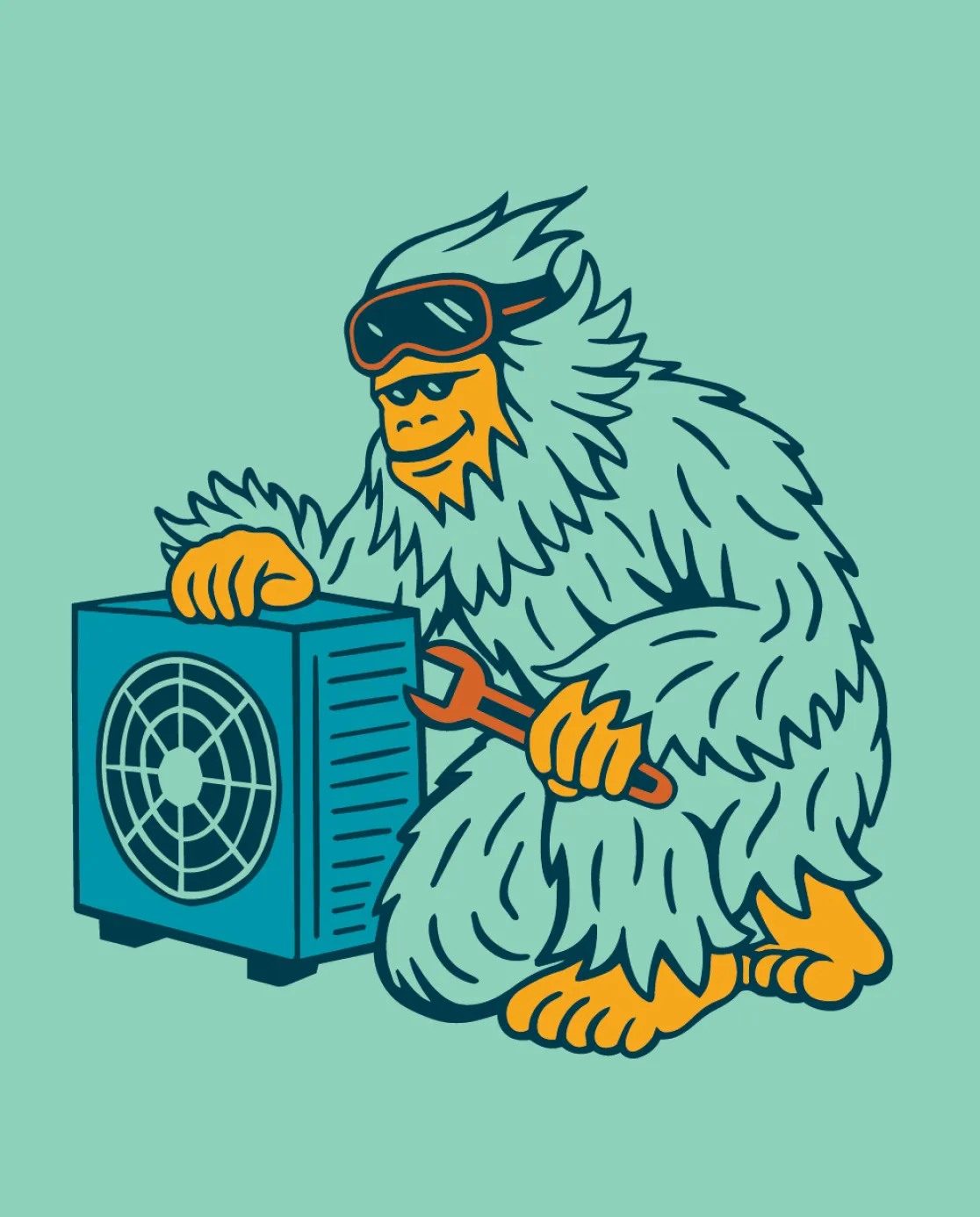
Image Nº 009—On-Site Imagery
Candid project photographs build trust across all local applications such as the website, Google Business Profile, and social media.

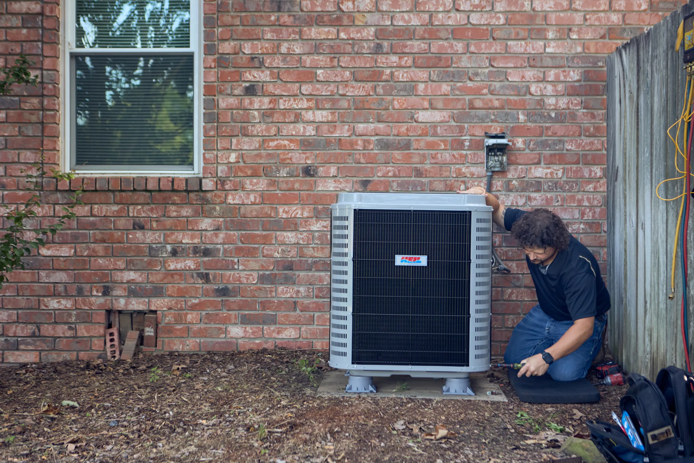
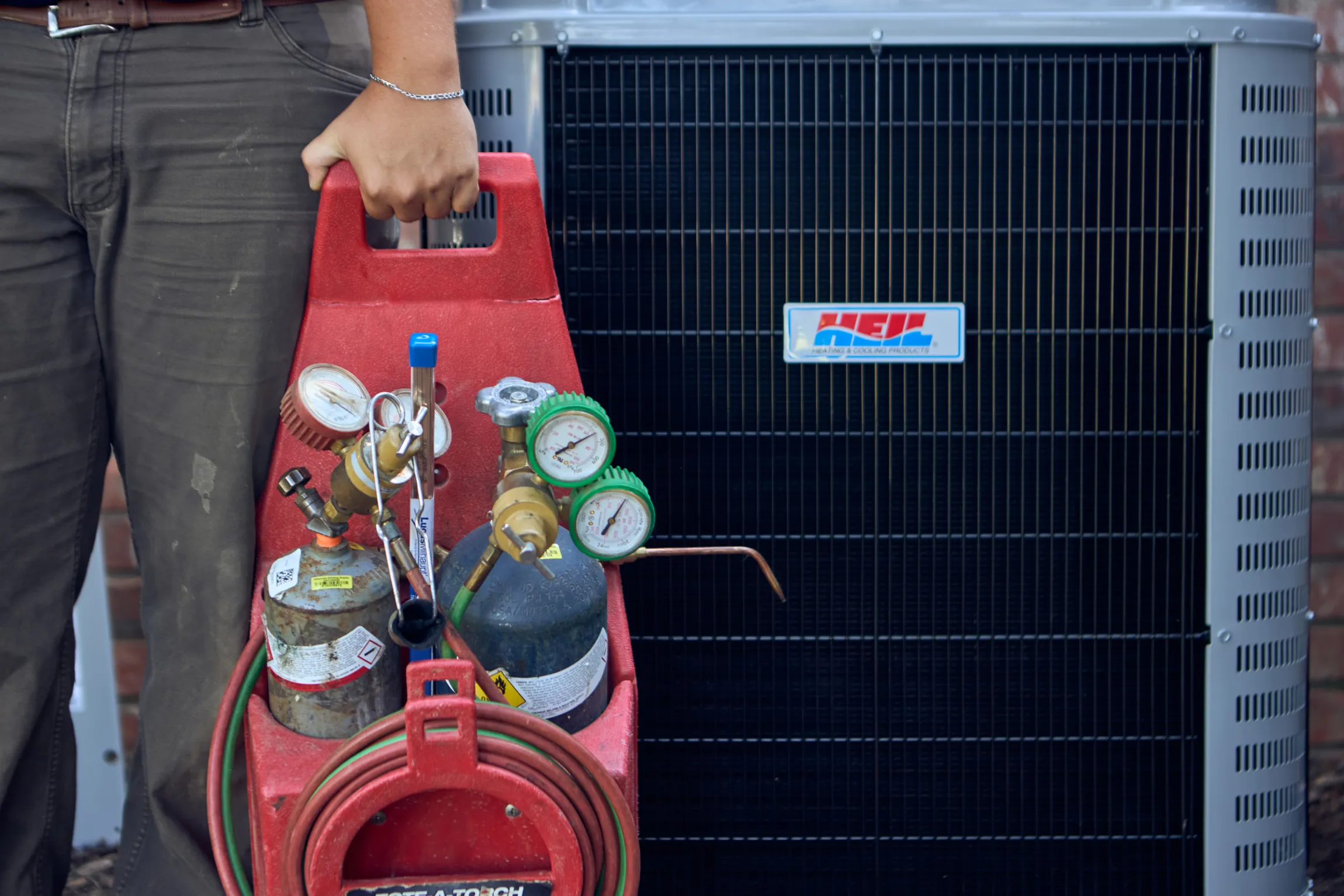


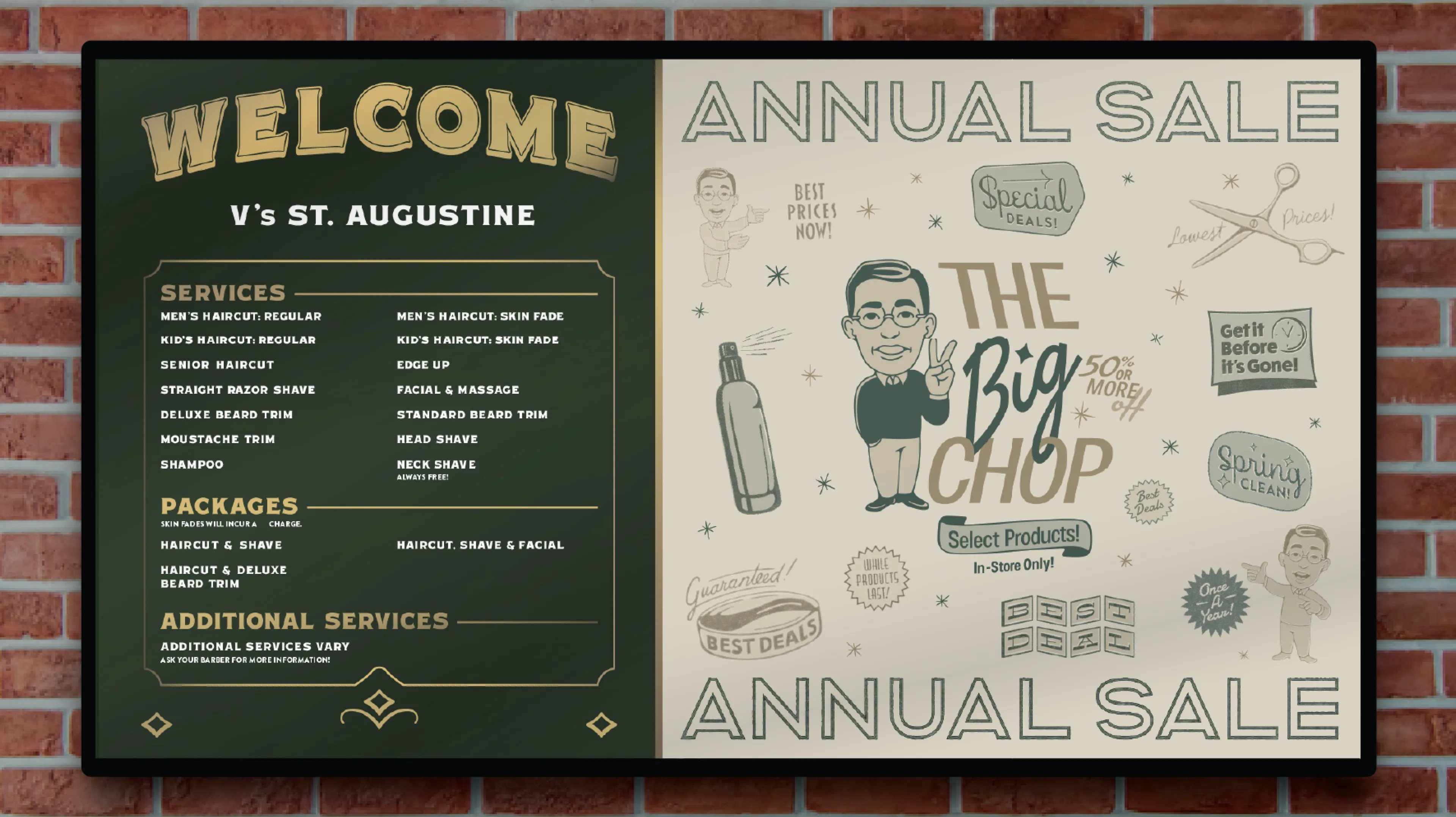
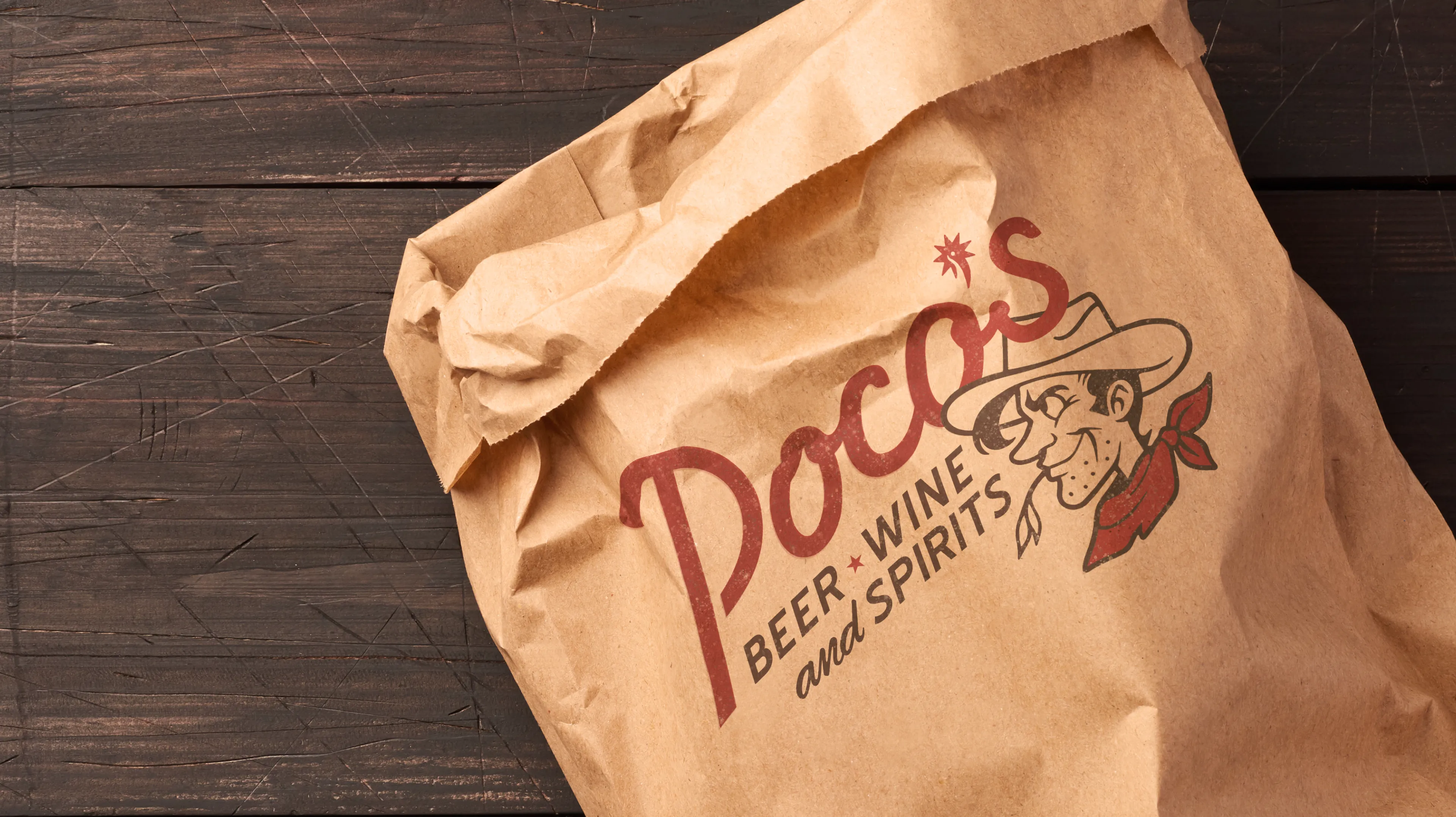
Image Nº 010—Badge Variety
Ski Brothers adapts the promotion of brand identity for different contexts in badges, creating cohesion with primary and secondary brand colors.
Image Nº 011—Sub-Logo Lockup
Using an everyday statement promotes Ski Brothers’ as a relatable option with a recognizable brand.

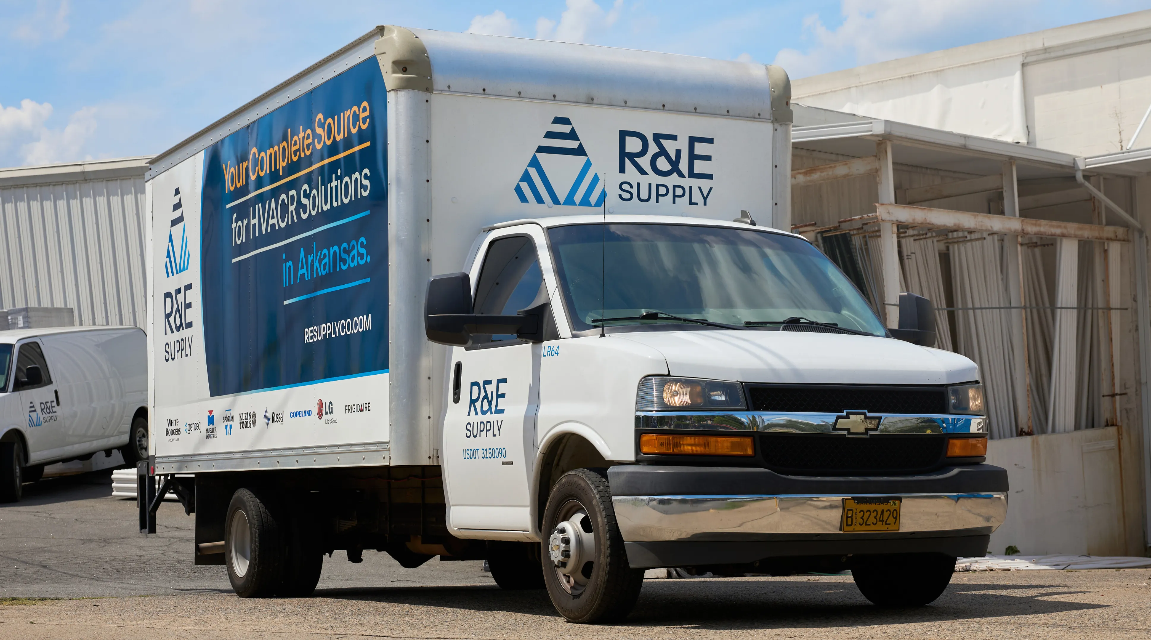
Image Nº 012—Truck Wraps
Vehicle wraps create a moving brand statement that reinforces recognition and trust within operation locations of Ski Brothers.
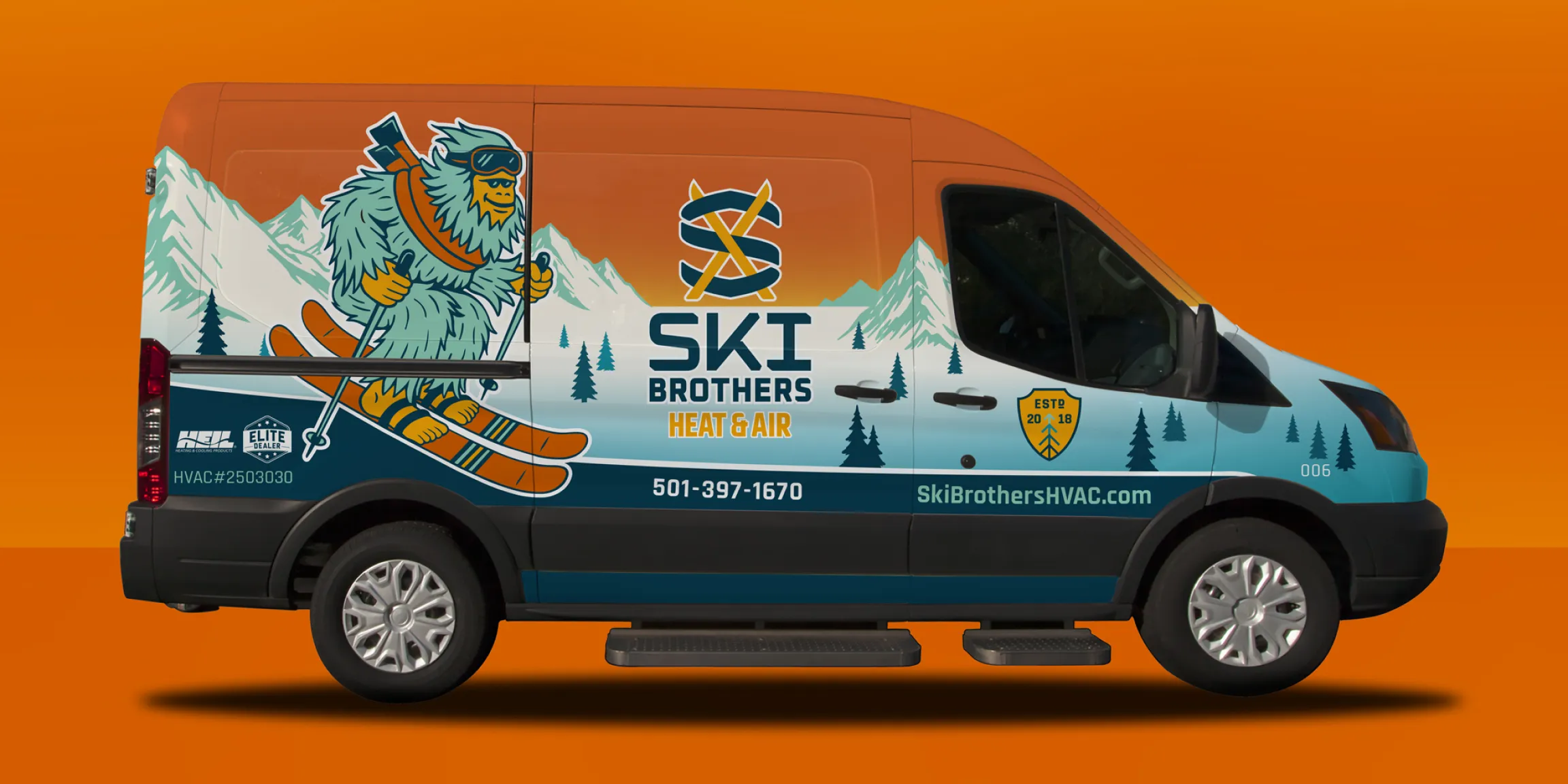
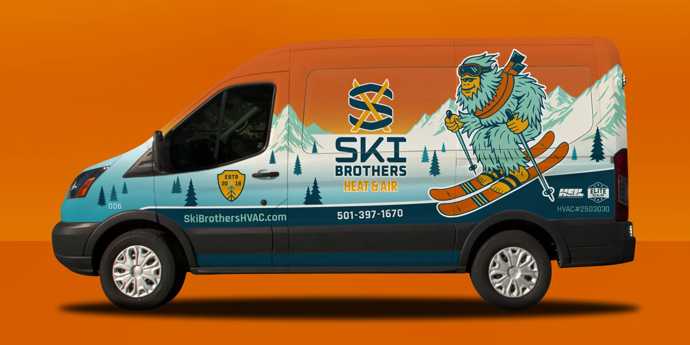
Image Nº 013—Founding Badge
This founding badge depicts the foundation of Ski Brothers, with the tree graphic symbolizing continual growth, capability, and longevity.
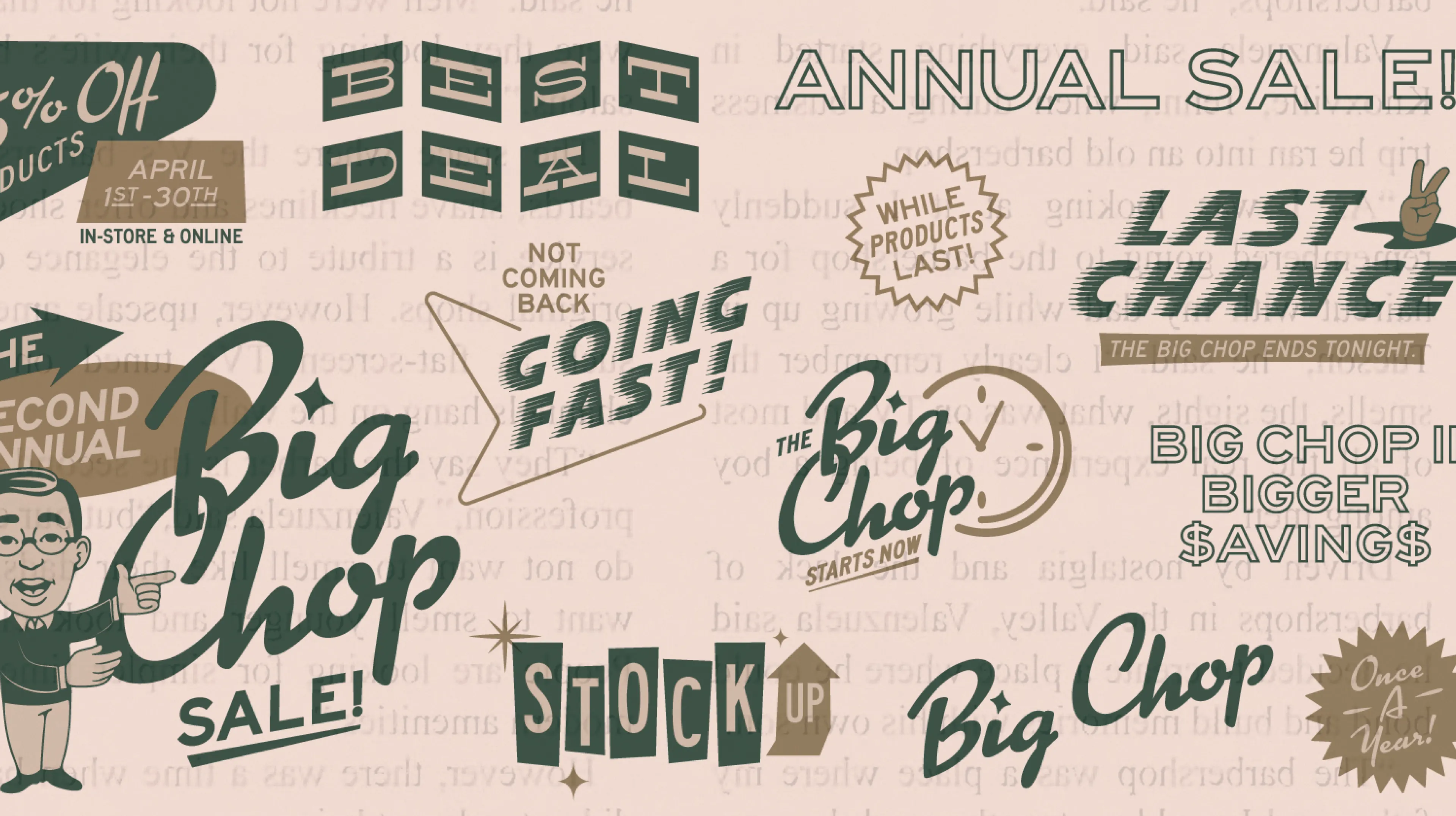
Image Nº 014—Campaign Badges
Further badge customization lends itself to seasonal, event, and campaign-specific branding.
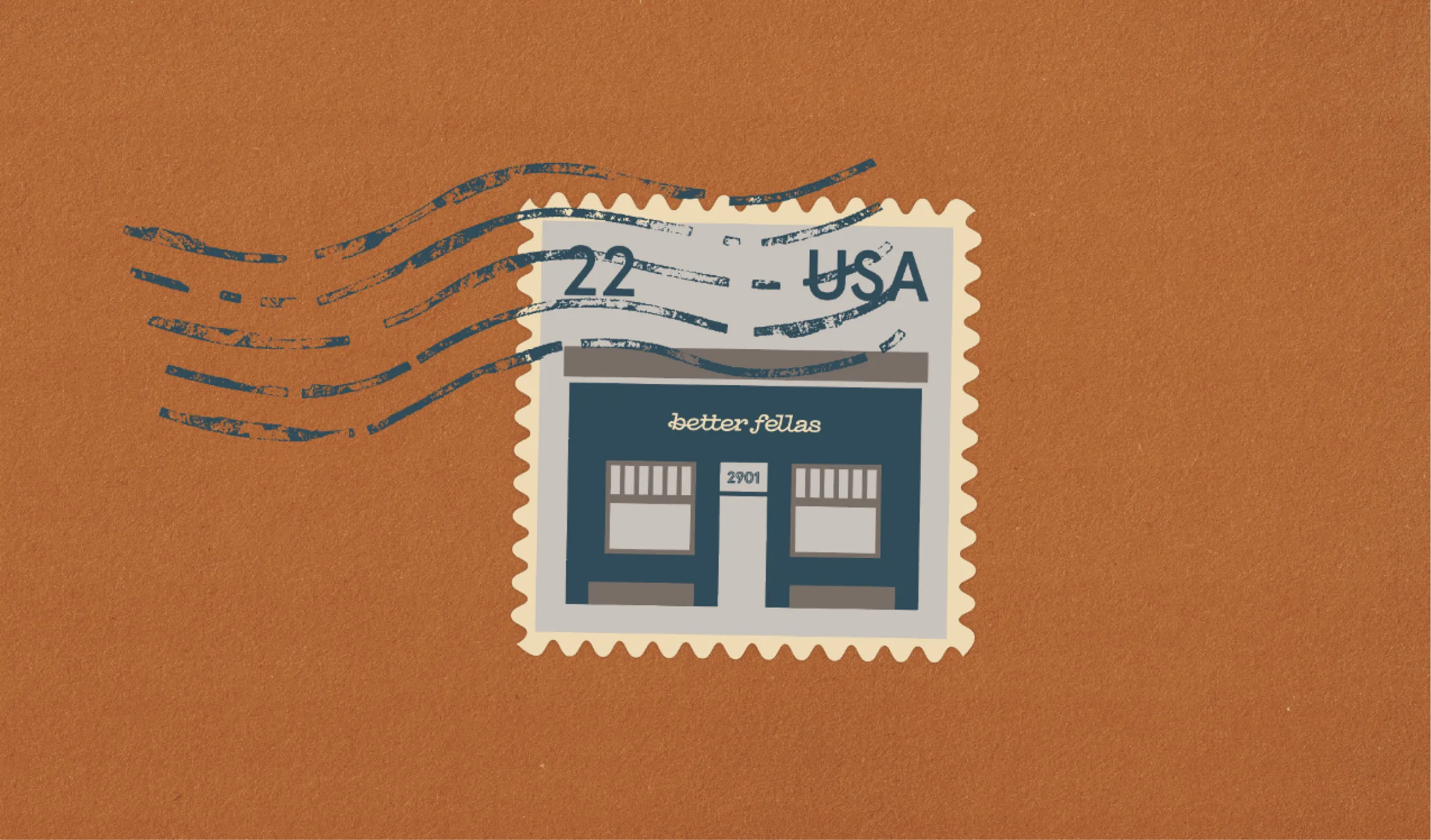
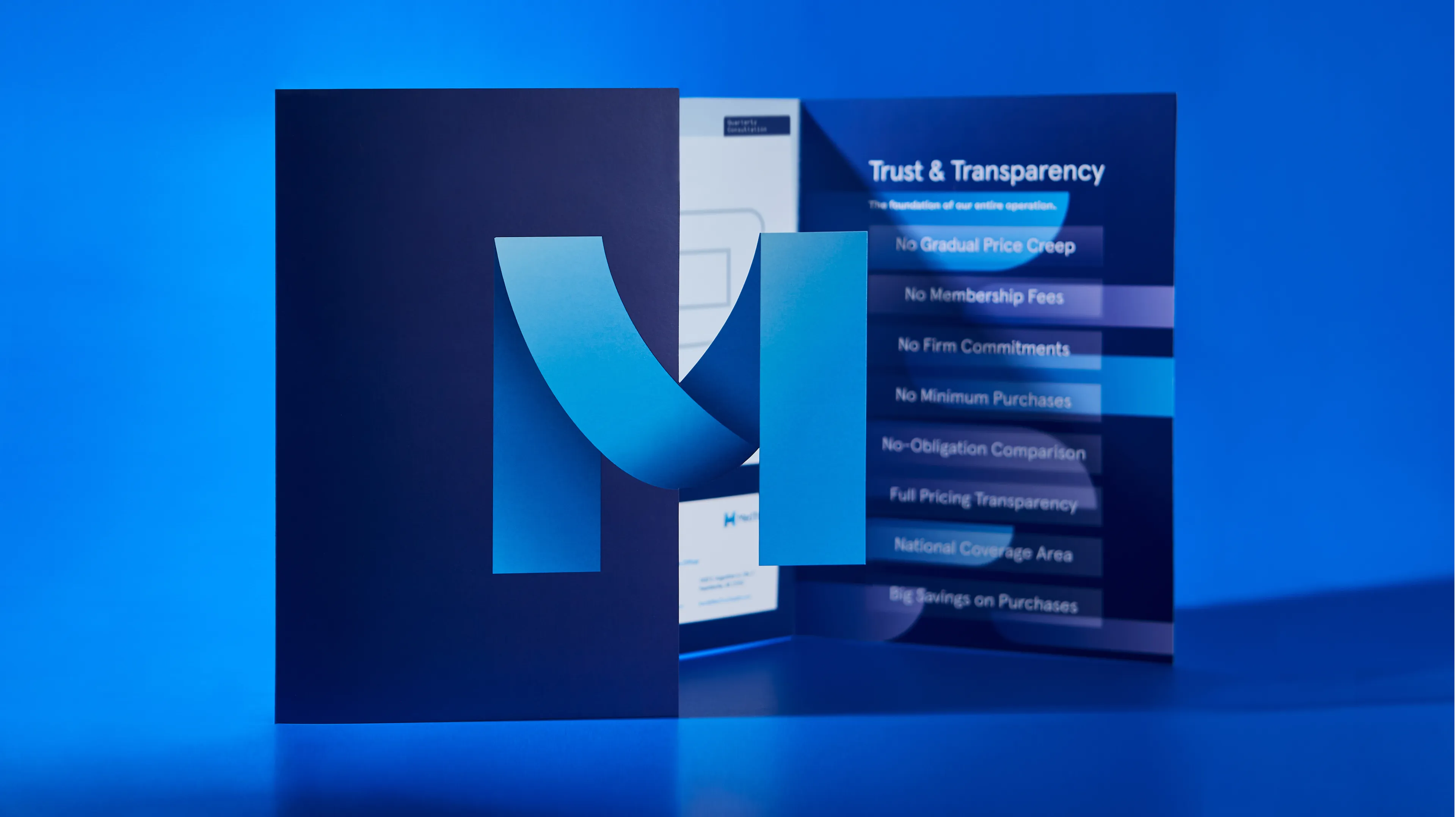
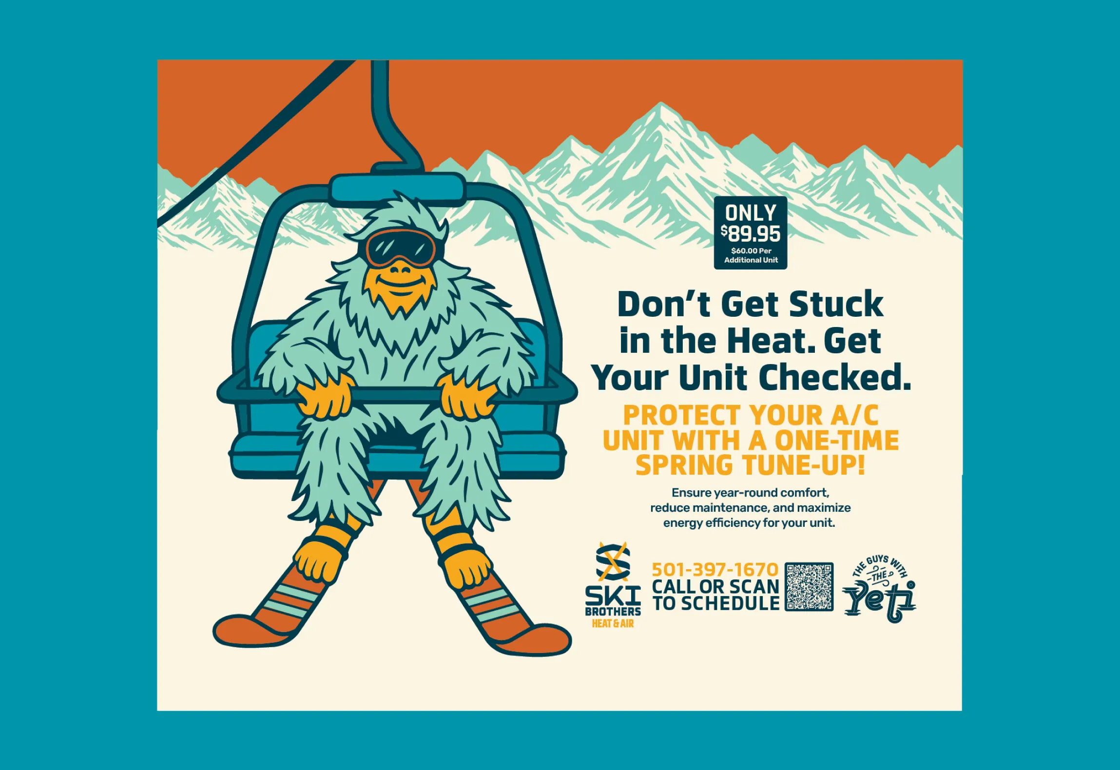
Image Nº 015—Branded Mailers
The mailer combines several original assets in an effort to blend brand recognition with seasonal urgency, with the potential to impact either top or bottom of funnel customers.
Below are the results that came from a Compass session. Compass is the foundation of all the work we do at Unbound.