schedule a discovery call
→


Image Nº 001—R&E Supply Logo
The R&E Supply logo integrates grid structure, geometric form, and typographic clarity. It crafts a visual identity that supports scalability and recognizability.
Image Nº 002—Monochrome R&E Supply Logo
The same geometric form holds reversed out on navy, confirming the mark doesn't depend on color to read.


Image Nº 003—Color Palette
Bold, intentional primary colors stand out, while industrial neutrals keep everything grounded and consistent.


Image Nº 004—R&E Supply Positioning Statement
The statement is set at equal size across three lines, with color doing the hierarchy work. It gives customers exactly what they need to make a decision: a clear claim, a specific geography, and nothing else.

Image Nº 006—Value Proposition Icons
Three custom icons built from the same geometric line system as the logo give R&E's core differentiators the same visual weight as the brand mark itself.
Image Nº 007—Location Cycling Statement
This dynamic feature cycles the positioning statement through all eight Arkansas locations, so a contractor in Jonesboro reads a claim about Jonesboro, not Arkansas in general.

Image Nº 008—In-Store Kiosks
Digital kiosks ask customers questions and feed directly into a growing database, organized into meaningful communication groups.


Image Nº 009—Kiosk Presentation
The interface mirrors R&E’s empowerment-focused website messaging on the kiosk screens.

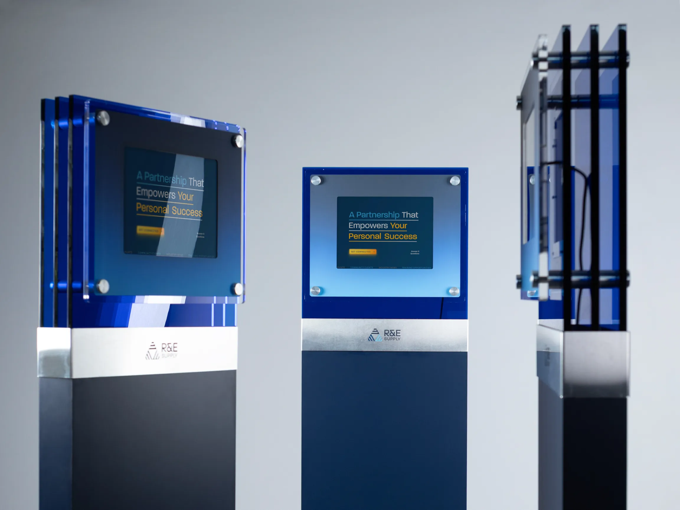
Image Nº 010—Partnership Statement Animation
The headline animates to land on empowerment-focused messaging on kiosk screens, directing attention to the contractor’s outcome rather than R&E’s offer.
Image Nº 011—Custom Form Template
Account creation doubles as qualification, segmenting contractors by trade type so R&E can match training, products, and communications to the work they actually do.
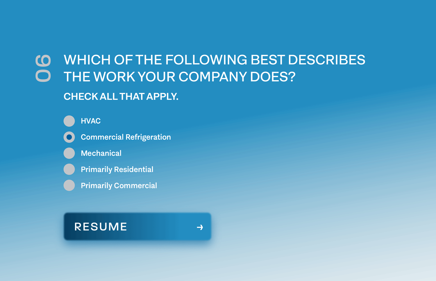
Image Nº 012—Truck Wraps
Every delivery doubles as a brand impression at the job sites R&E serves, putting the positioning statement and supplier roster in front of the contractors most likely to open an account.

Image Nº 013—Truck Wrap Mockups
The wrap was designed for all four surfaces, across eight distinct trucks, with each angle carrying its own hierarchy: full statement and supplier logos on the sides, isolated mark on the rear.


Image Nº 014—Dimensional Signage
Enhancing the original mark’s features with layering, shadows, and texture, this logo mark adds character in application.
Image Nº 015—Rear Truck Door
The rear door drops the wordmark entirely, letting the isolated mark scale to a size that reads at a distance and putting the website below it to do the conversion work.
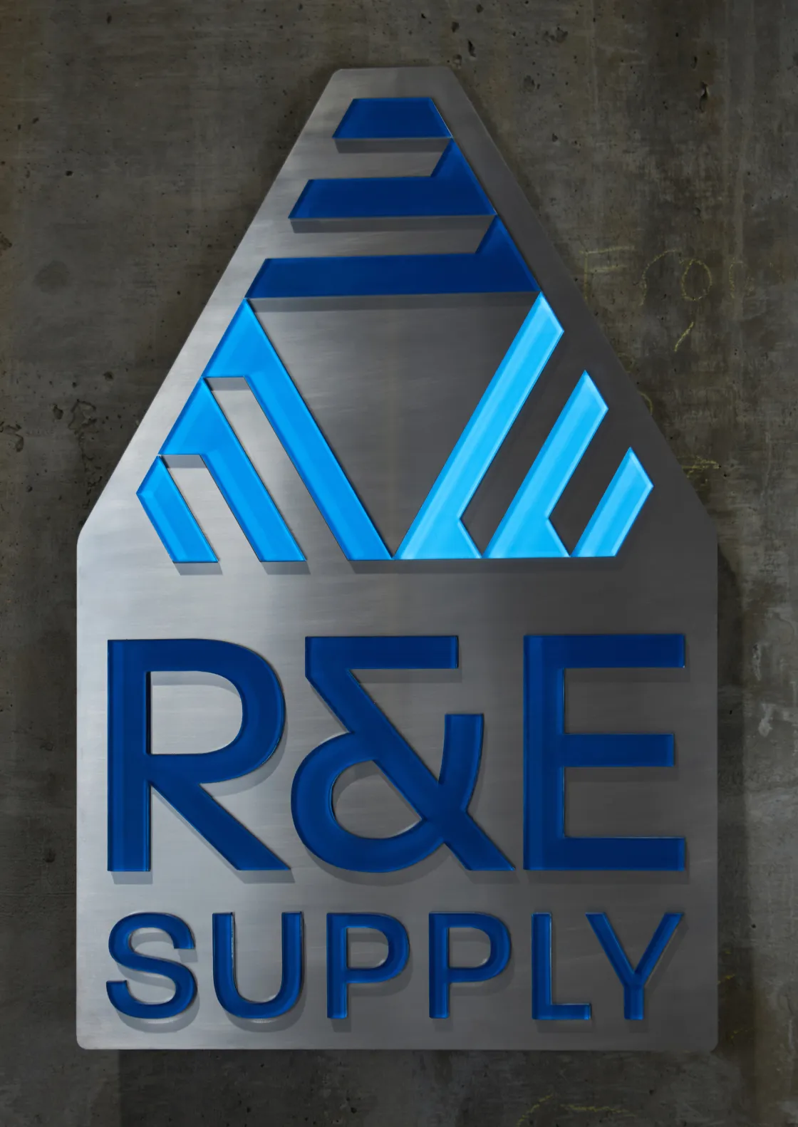
Image Nº 016—Branded Merchandise & Staff Assets
The mark holds across stitched caps, metal nameplates, and embroidered uniforms without simplification, covering every touchpoint a contractor has with R&E staff.
Image Nº 017—Staff Portraits
Shot against a consistent warehouse backdrop, the portraits are built to travel across the website, email signatures, and campaign materials, putting a name and face to the team at every location.


Image Nº 018—Email Signature
A two-column layout separates company details from personal contact, so every outbound email from any R&E staff member across all eight locations carries the same brand treatment.
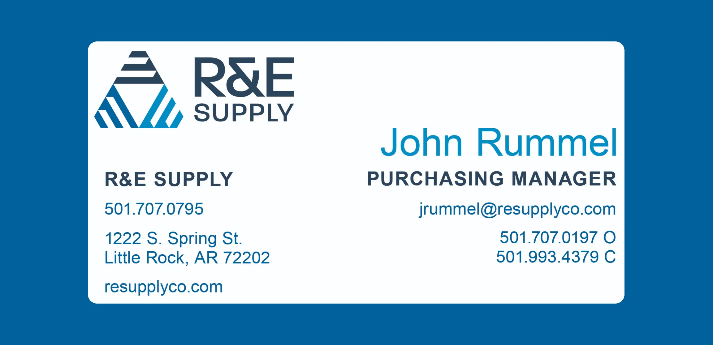
Image Nº 019—Warehouse Photography
Shot on the warehouse floor with working staff and fully stocked aisles, the photography gives contractors a direct look at the inventory scale behind R&E's parts availability claim.
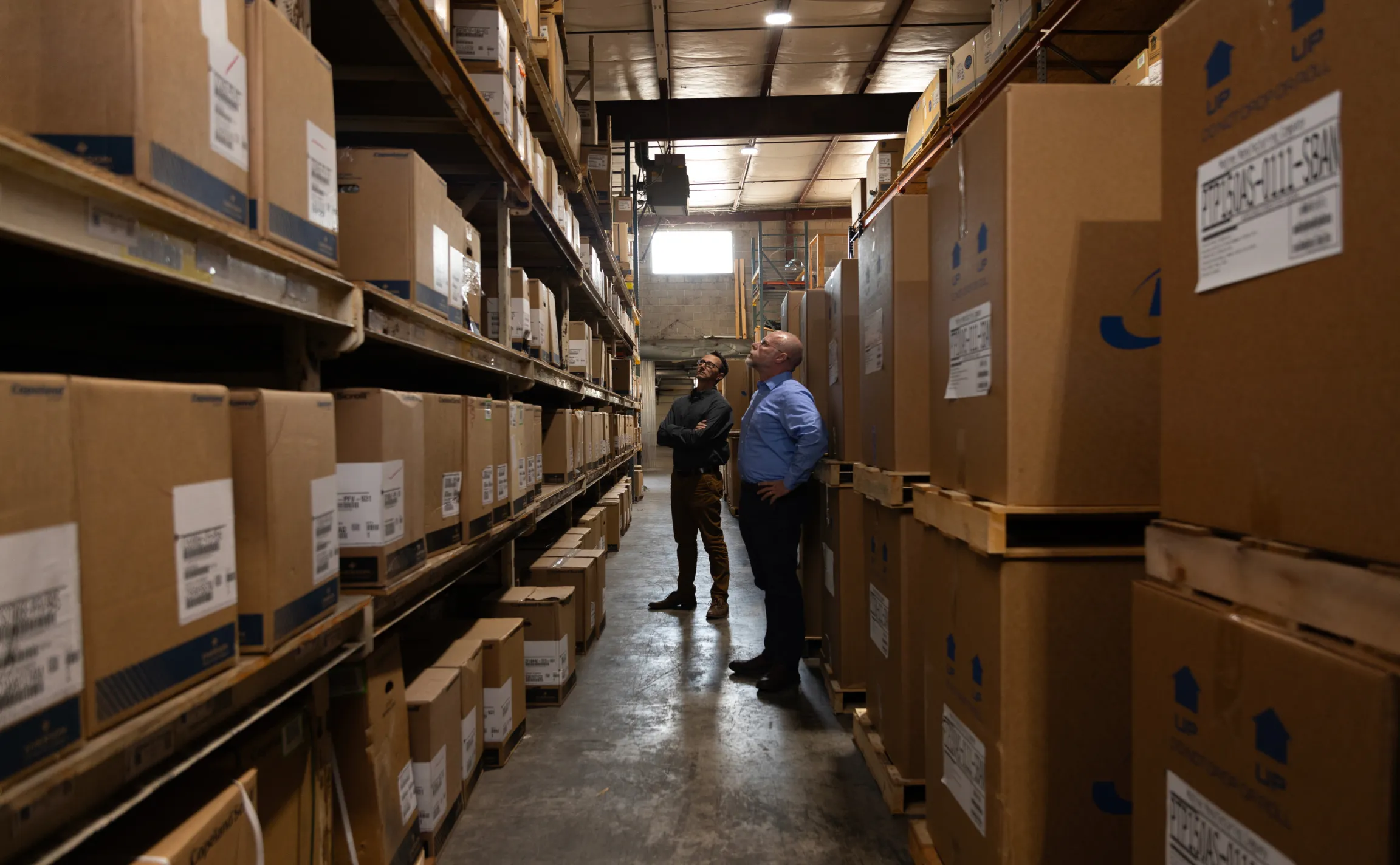

Image Nº 020—Brand Gradients
Three gradients mix geometric forms and flowing air textures to serve as visual backgrounds across content with the brand’s color system.


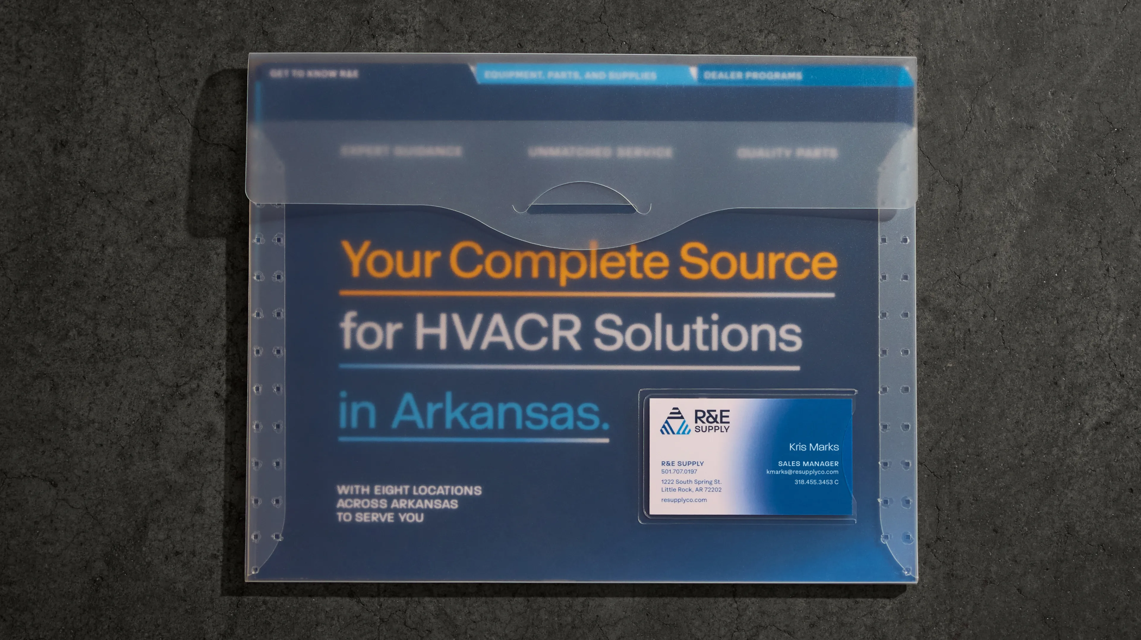
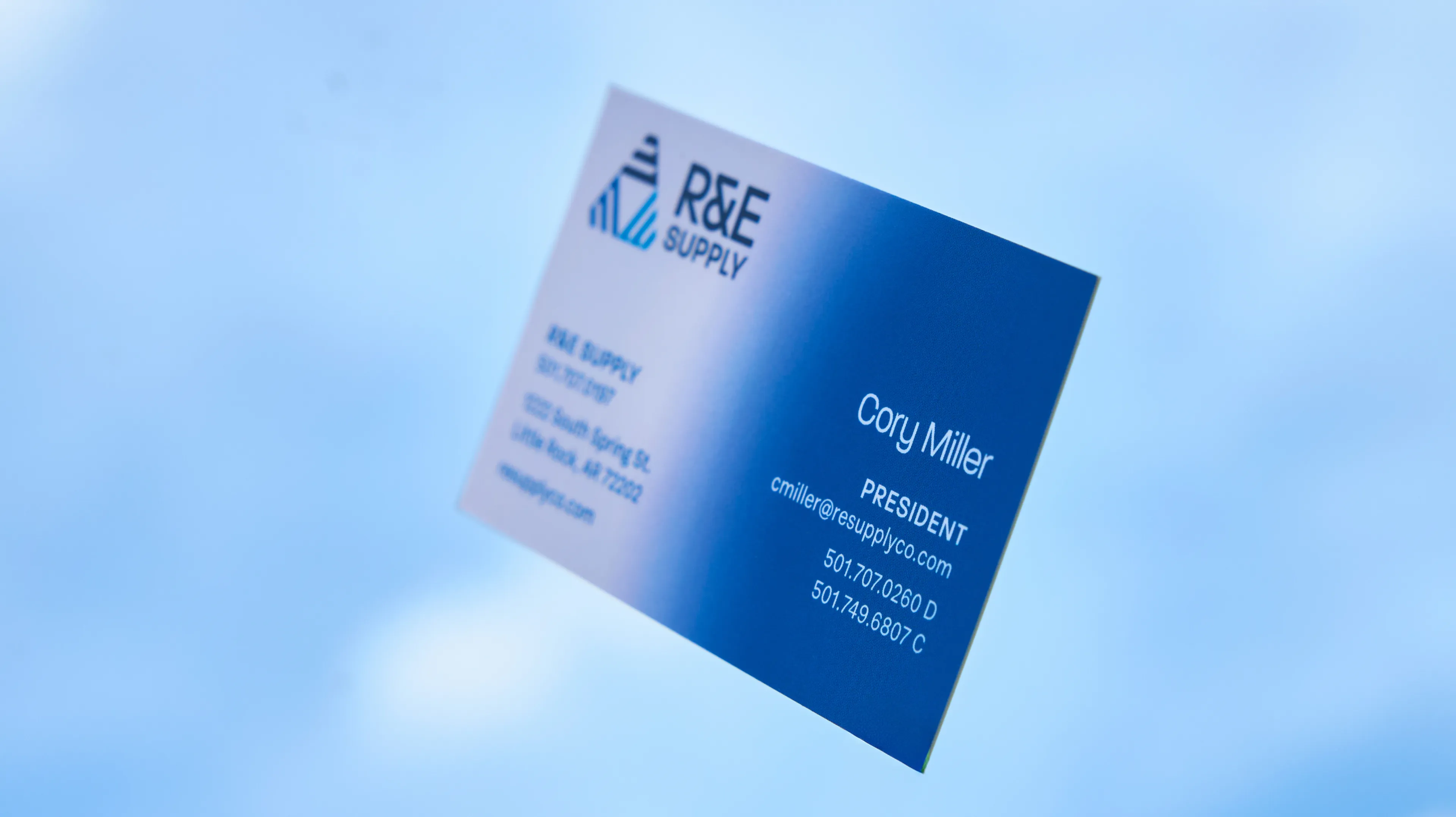
Image Nº 021—Business Cards
The card is photographed at depth to show both panels at once: company details receding, personal contact sharp in front, which is the order a contractor actually uses them.

Image Nº 022—Location Reference Cards
Two matched cards, one for business hours and one for after hours, give contractors a direct line to all eight locations regardless of when a job requires a part.

Image Nº 023—Sales Collateral Packet
Designed for Manager interactions, the packet puts the full brand into a single leave-behind: positioning statement, locations page, and a slotted business card, all matched to the same system a contractor has already seen everywhere else.

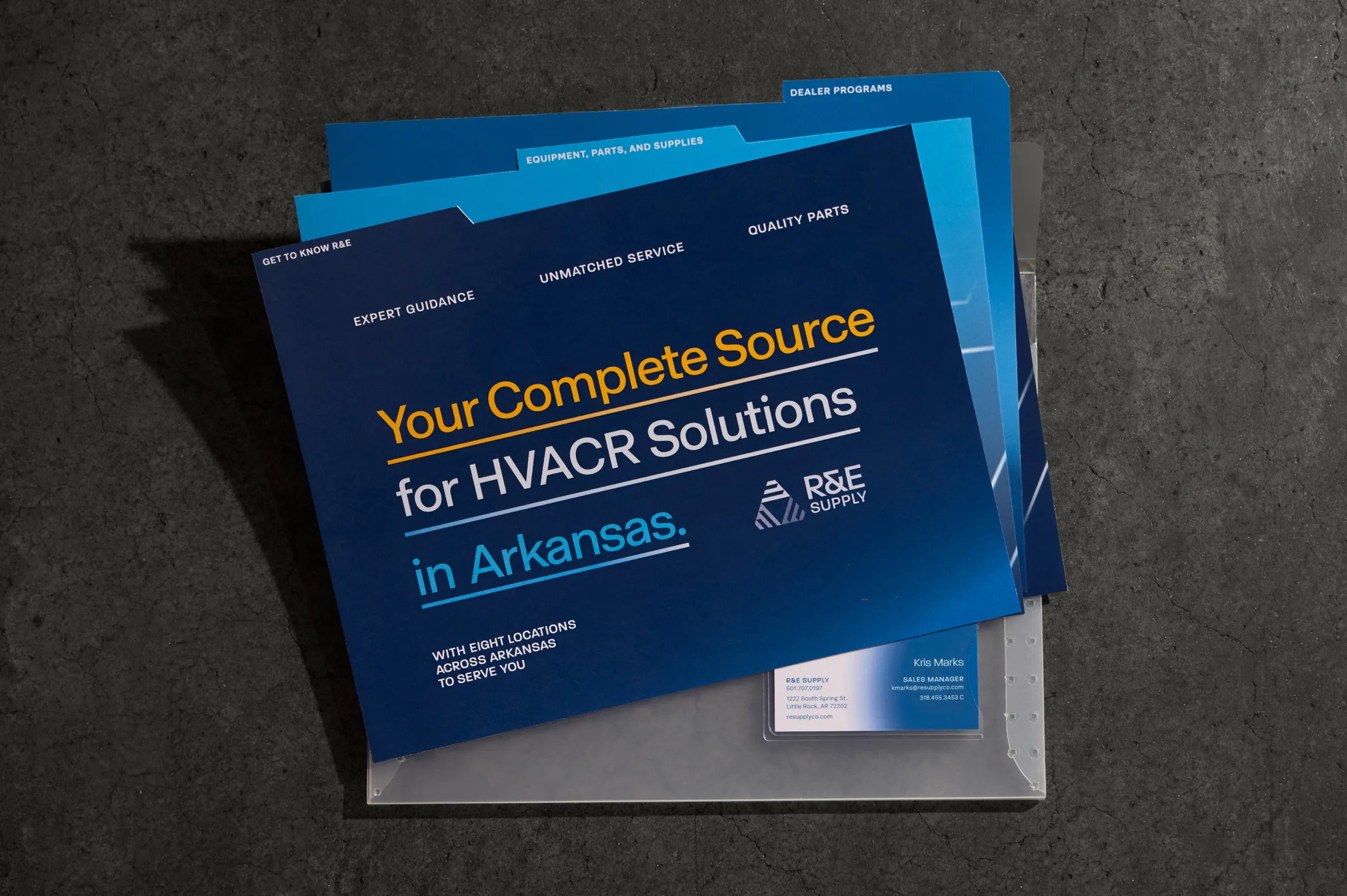

Image Nº 024—Packet Divder Mockups
The four tabbed sections mirror the website's navigation, organizing the physical packet around the same categories a contractor would browse online.


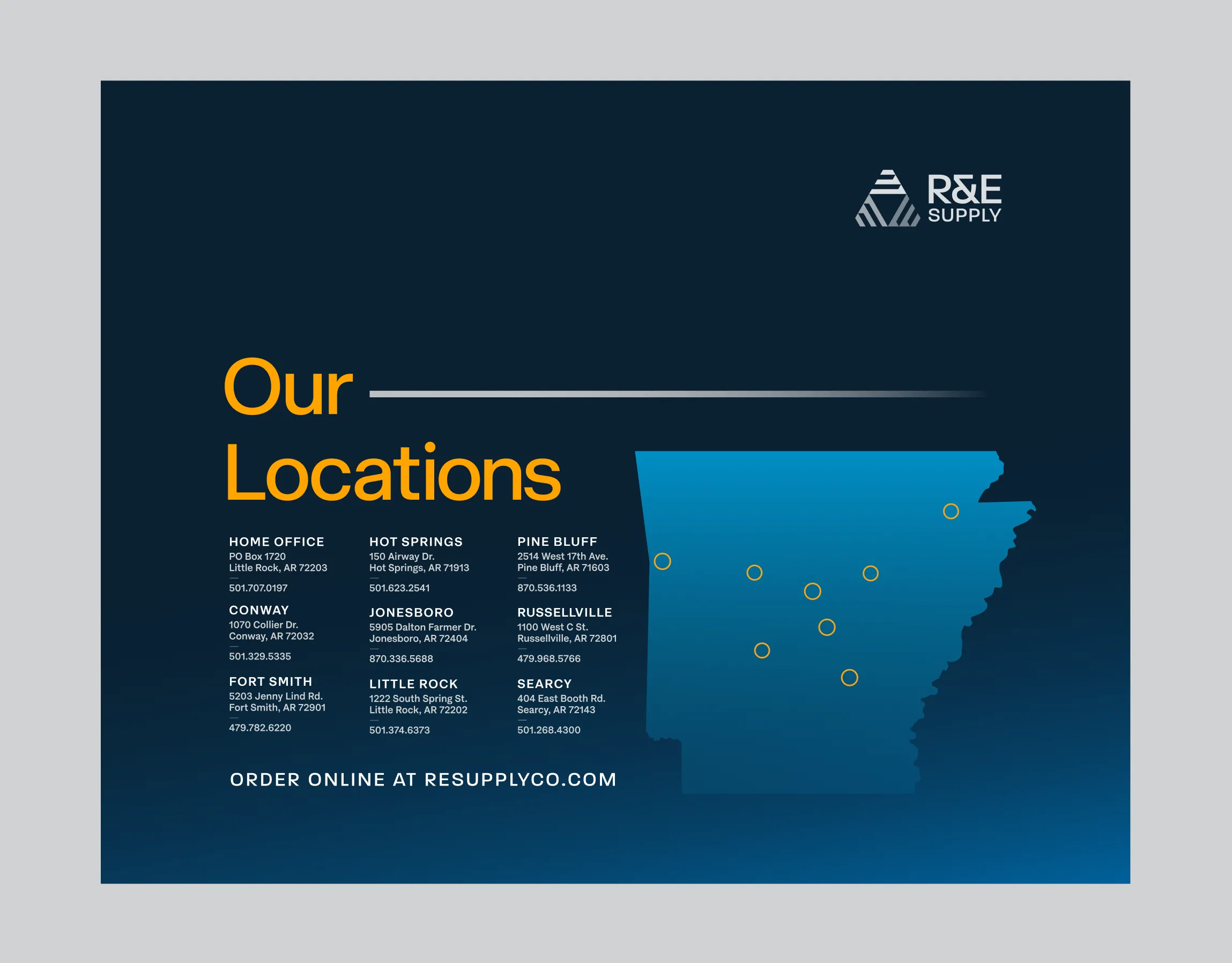
Image Nº 025—Sales Collateral Pages
Combining the brand color palette with R&E’s website layout, these pages comprise an enclosed sales collateral holder, used by Territory Managers to showcase brand events, company announcements, and local Management.


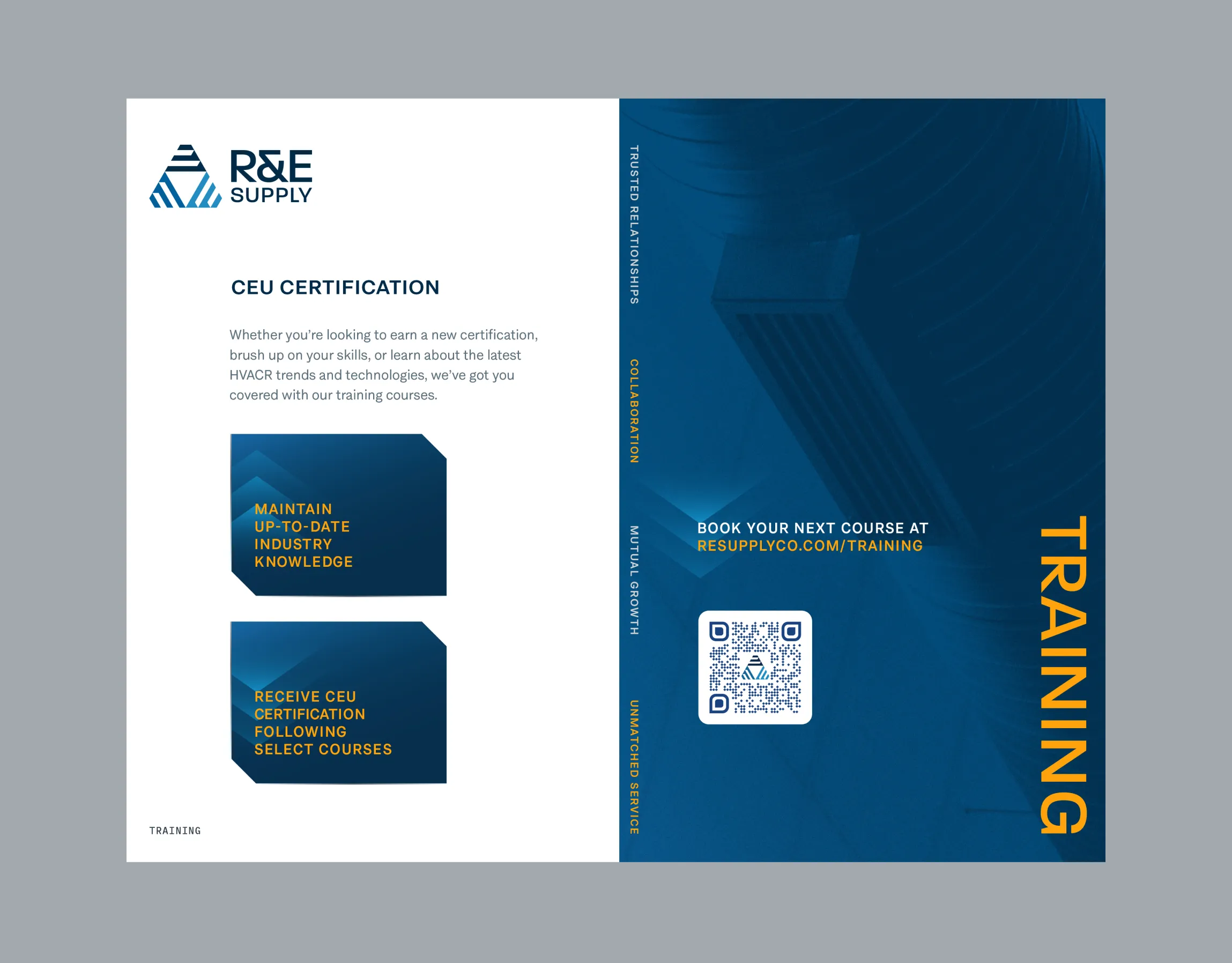


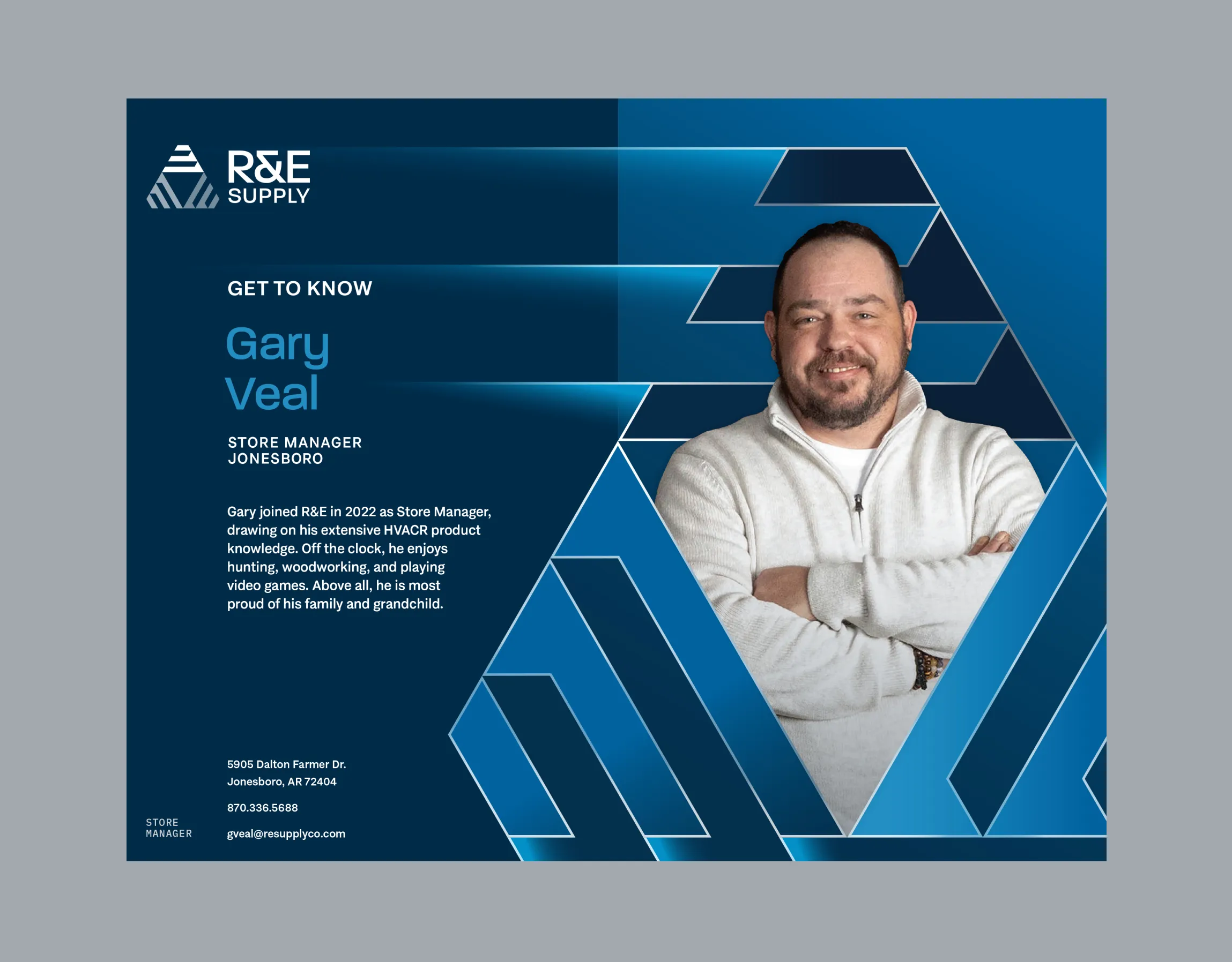

Image Nº 026—System Match Catalog
The Frigidaire system match catalog is co-branded with R&E on every page, so a contractor working through product specs and system matches is doing it inside an R&E document, not a manufacturer handout.
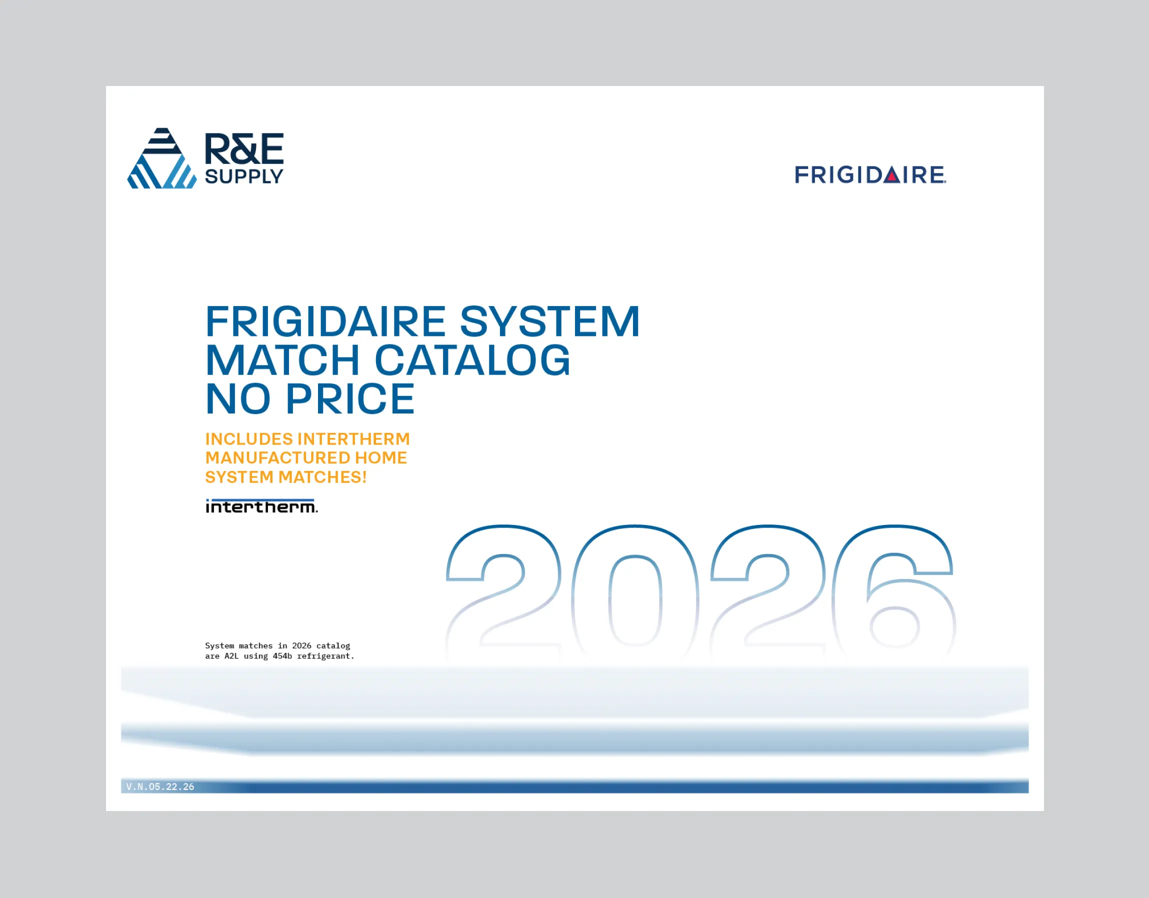


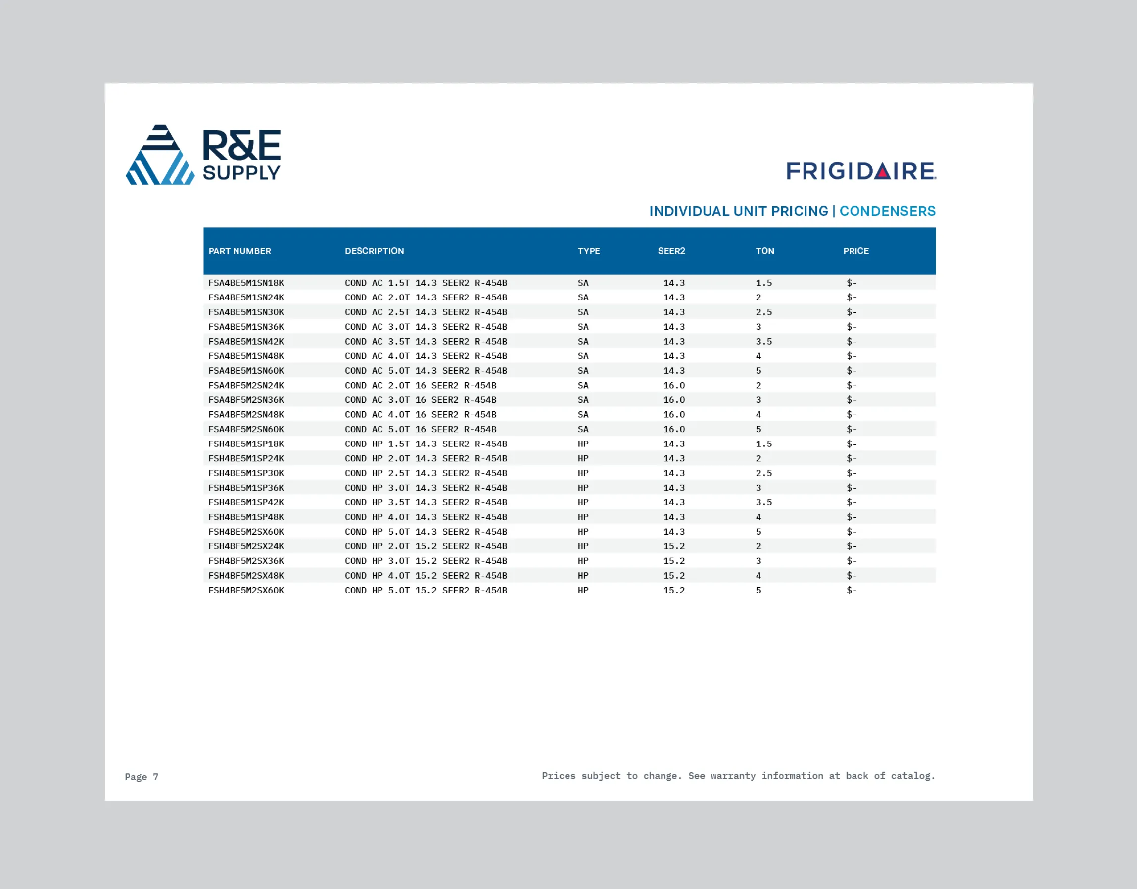


Image Nº 027—Training Course Animation
The animation introduces the course name, dates, and cost, then allows for easy sign-up with a QR code so a contractor has everything they need to know before committing to the event.
Image Nº 028—Certificate of Achievement
Issued under R&E's brand with a signed contact and license number, the certificate makes R&E the credentialing authority for a contractor's professional development, not just the place they took the course.
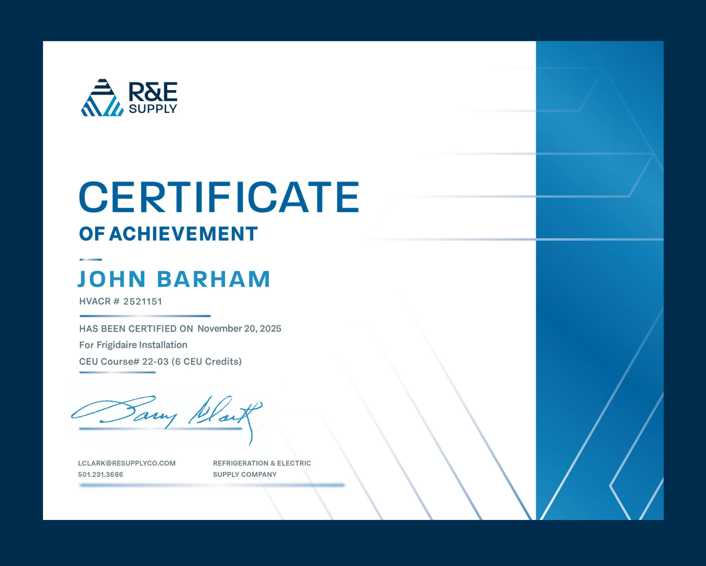
Image Nº 029—Training Course Graphic
A static training promotion CMS card built to the same template as R&E's animated course graphics, so every class R&E offers reads as part of the same program regardless of how it's distributed.
Image Nº 030—Class Capacity Alert
A sold-out notification designed in the thermal accent color as a full-border treatment, turning a capacity limit into a visible demand signal.


Image Nº 031—Executive Video Still
A branded lower third anchors the executive's name and title to the R&E system, so video content featuring leadership reads as a company production, with the warehouse visible in the background grounding it in the actual operation.

Image Nº 032—Employee Anniversaries Animation
Tenure ranging from 1 to 25 years is formatted as a branded graphic, turning internal recognition into external proof that R&E's team is built on long-term relationships, not high turnover.
Image Nº 033—Branded Giveaway Merch
Branded on items contractors use on the job site daily, the RTIC coolers and Turtlebox speaker put R&E's mark in front of everyone working the same site, not just the person who received them.
Image Nº 034—Branded Five-Gallon Bucket
A functional product contractors will actually buy, and a job site advertisement every time they carry it, with a "fill the bucket" promotion opportunity to give contractors a reason to keep coming back to fill it.


Image Nº 035—Animated Loading Icon
A custom loading ring in the brand's blue extends the visual system to every interaction point on the site, including the moments between page loads.
Image Nº 036—Iconography
Adding detail in iconography distinguishes online shop products into a digestible format to point customers in the right direction.
Image Nº 037—Store Signage
Placed above the ice machine at each location, the sign turns a free amenity into a branded touchpoint, giving contractors an additional reason to walk in that has nothing to do with placing an order.

Image Nº 038—Functional Branding
Color blocking using R&E’s primary palette systemizes an otherwise regular calendar as a branded giveaway tool for organization and scheduling.
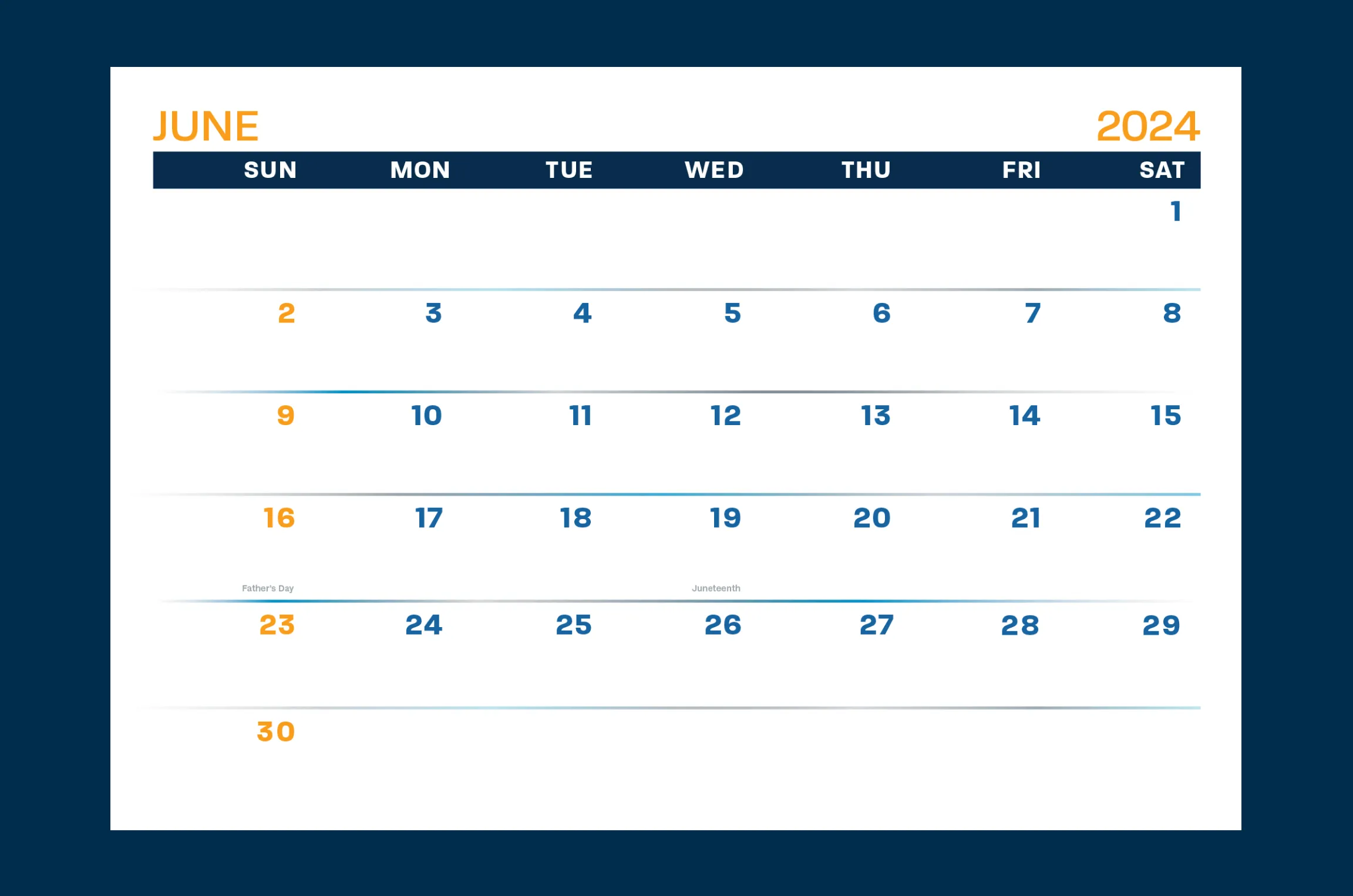
Image Nº 039—Digital Announcement
News templates pull from the company’s brand image for custom holidays, sales, and other urgent announcements.
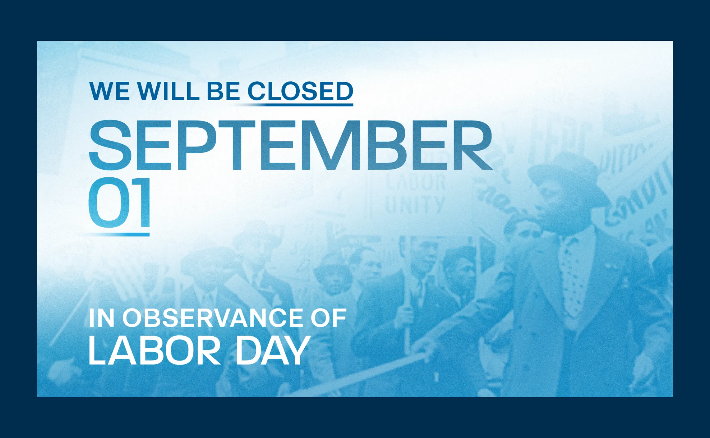
Image Nº 040—Announcement Templates
A templated format lets any of the eight locations produce a branded event flyer with location-specific details swapped in, so an in-store cookout in Hot Springs reads from the same visual system as everything else R&E puts out.
Image Nº 041—Table Tent Announcement
With a sleek, branded design, font size variation attracts the eye to important areas of an announcement, regardless of the application.
Image Nº 042—Letterhead Design
Templated print materials create seamless execution of printed materials on letterhead.

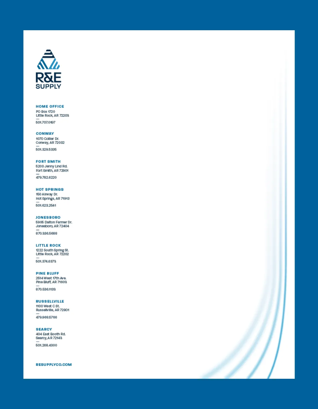
Image Nº 043—Interactive Map
An interactive Arkansas map in the brand's colors marks all eight locations with hover states that reveal details on demand, turning a coverage footprint into something a contractor can actually use.
Image Nº 044—Email Marketing
Utilizing fonts and gradients developed for varied application, the hero image of R&E’s “REfresh” marketing emails unifies the brand with both R&E events and industry updates.


Below are the results that came from a Compass session. Compass is the foundation of all the work we do at Unbound.