schedule a discovery call
→


Image Nº 001—Logo Animation
The logo animates as a rotating coin, with the circular badge format and EST. 1999 establishing V's as a professional brand.
Image Nº 003—Liquidation Sale Graphics
Three print designs for V’s product liquidation sale apply their compressed display type and diamond ornaments to clearance pricing, keeping the campaign inside the brand's visual system.

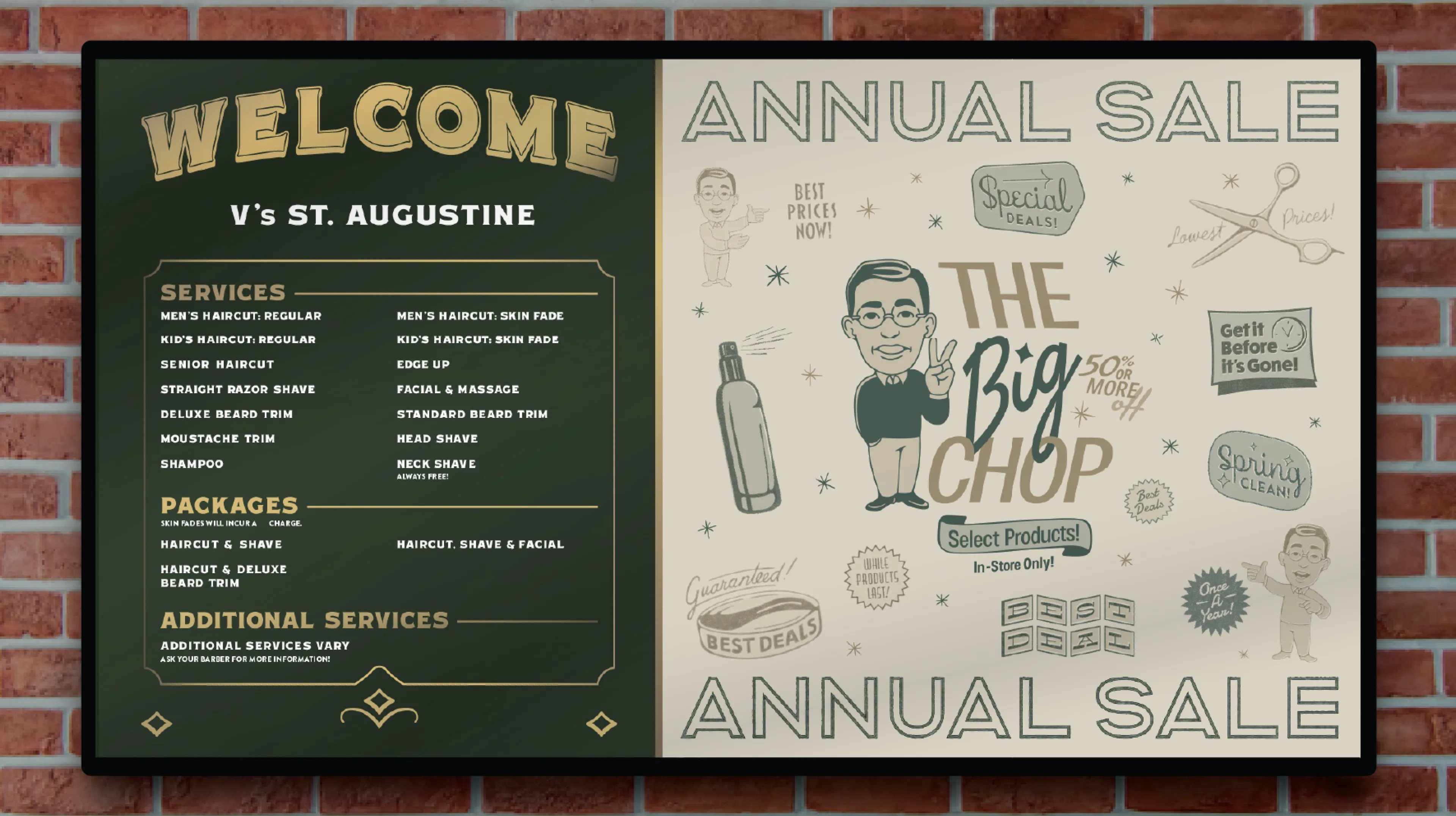
Image Nº 004—OptiSign Display
A large OptiSign display hangs in every shop. This screen is fully customizable at the corporate level, allowing for live edits on a split feature of location-specific pricing and swappable campaign graphics.
Image Nº 005—Model Recruitment Ad
We recruited models from existing customers for a photo library refresh, with a $100 haircut incentive formatted in the same typographic voice as every in-store V's promotion.
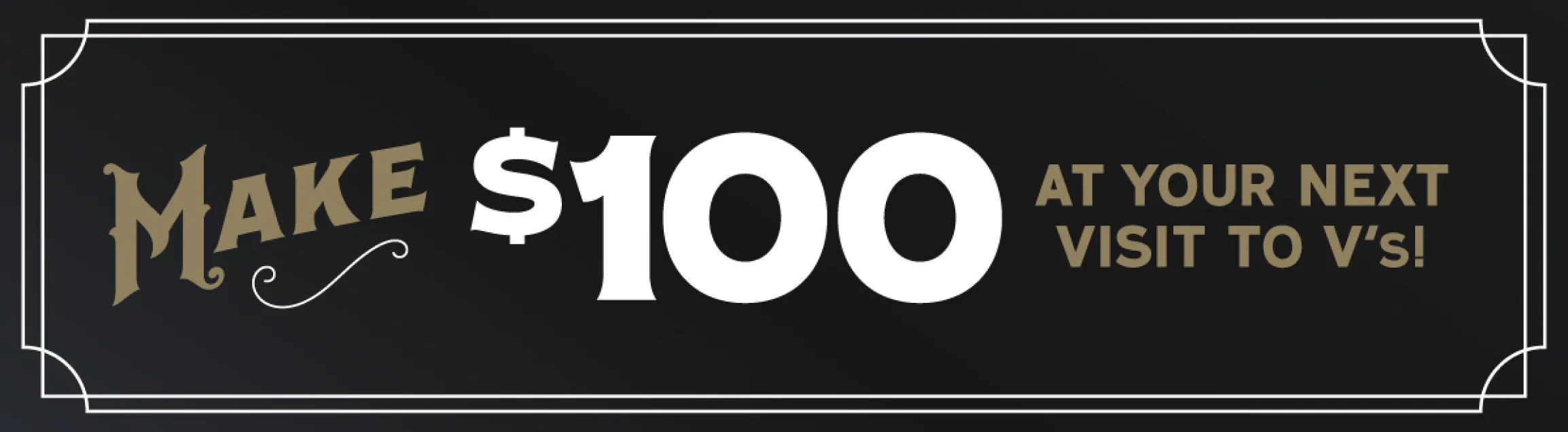
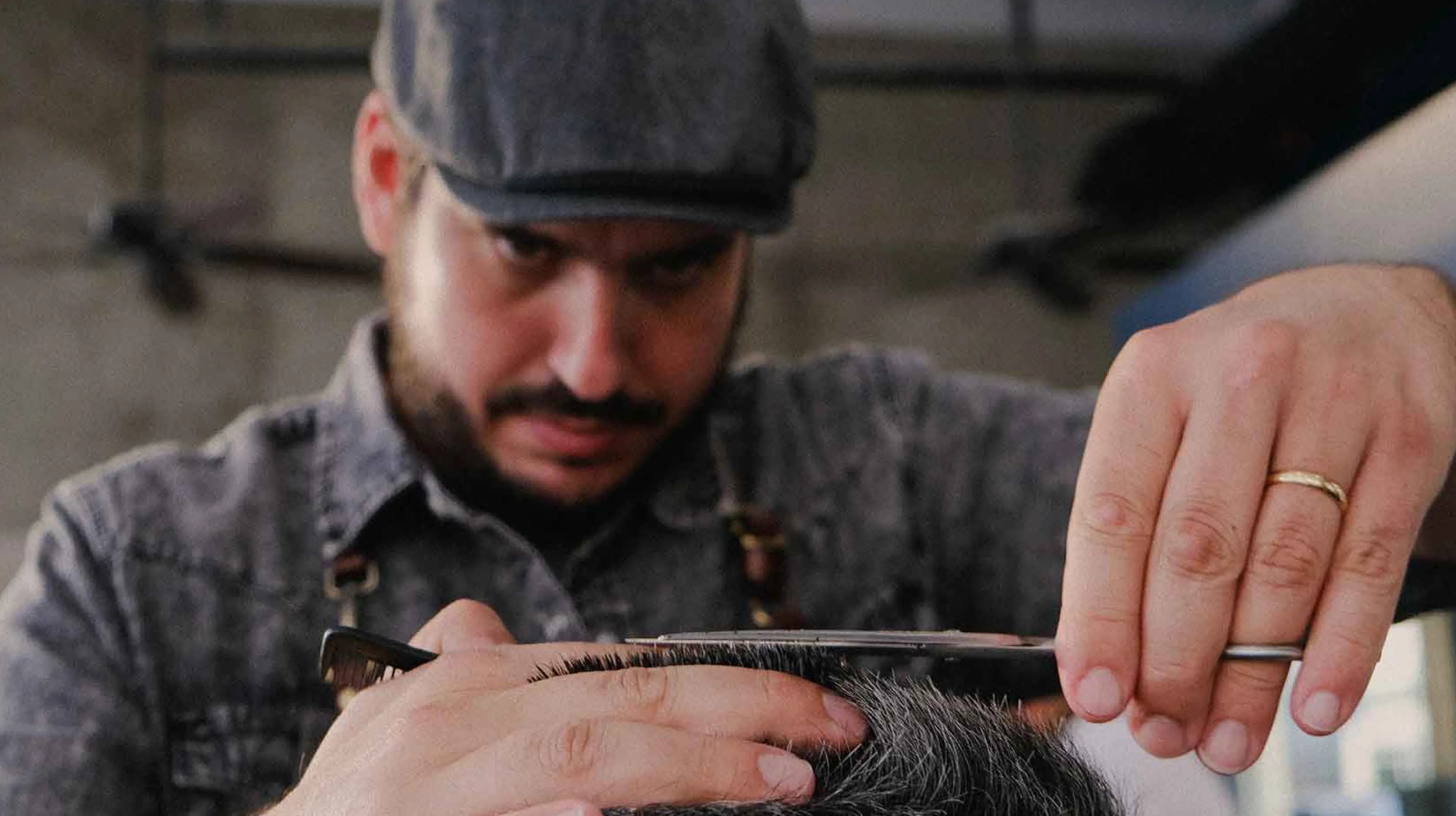
Image Nº 006—Brand Photography
The shoot was cast across age, race, and gender to give every V's franchise a photo library that reflects the actual range of people the brand serves.


Image Nº 007—25th Anniversary Monogram
The V's script integrates directly into the "25" numerals, forming an anniversary mark that reads as an extension of the primary logo rather than a separate one.
Image Nº 008—25th Anniversary Badge
The primary badge structure is preserved intact, with a silver metallic treatment and "25 YEARS" in place of "EST. 1999" marking the milestone without creating a new mark.
Image Nº 009—25th Anniversary Animations
Three Menu Board animations split the 25th anniversary campaign between brand awareness and giveaway promotion.
Image Nº 010—Anniversary Photo Composite
Archival photos from V's 1999 opening are cropped inside the "25" numerals, making the anniversary mark itself a window into the shop's first day.
Image Nº 011—Record Label Design
The vinyl format treats V's 25-year milestone as track listing, with assets placed throughout to emphasize the barbershop’s achievement.


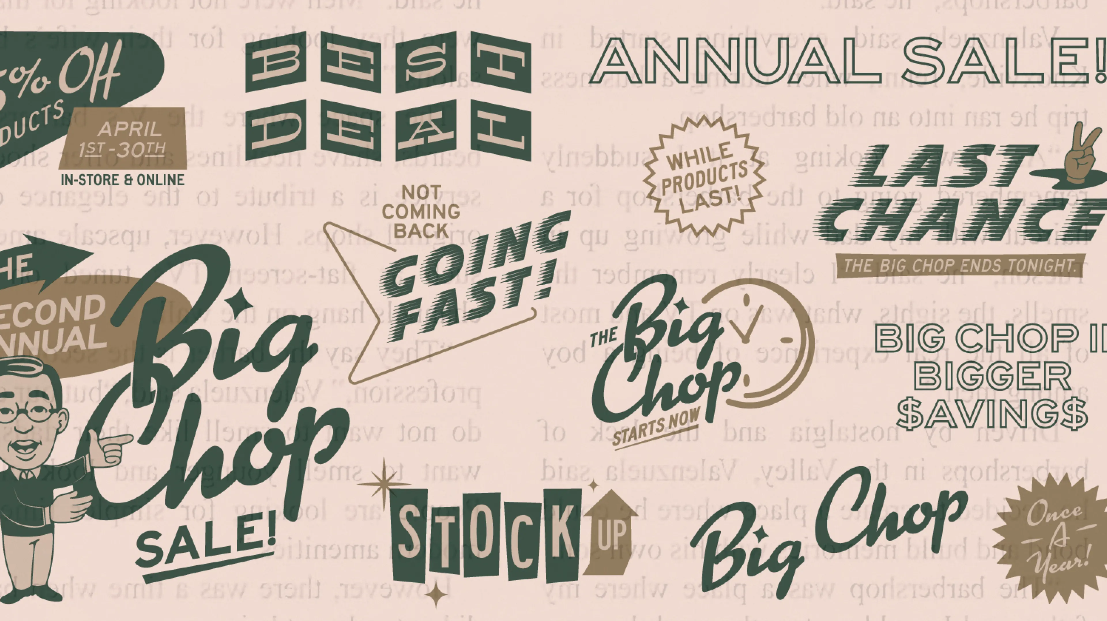
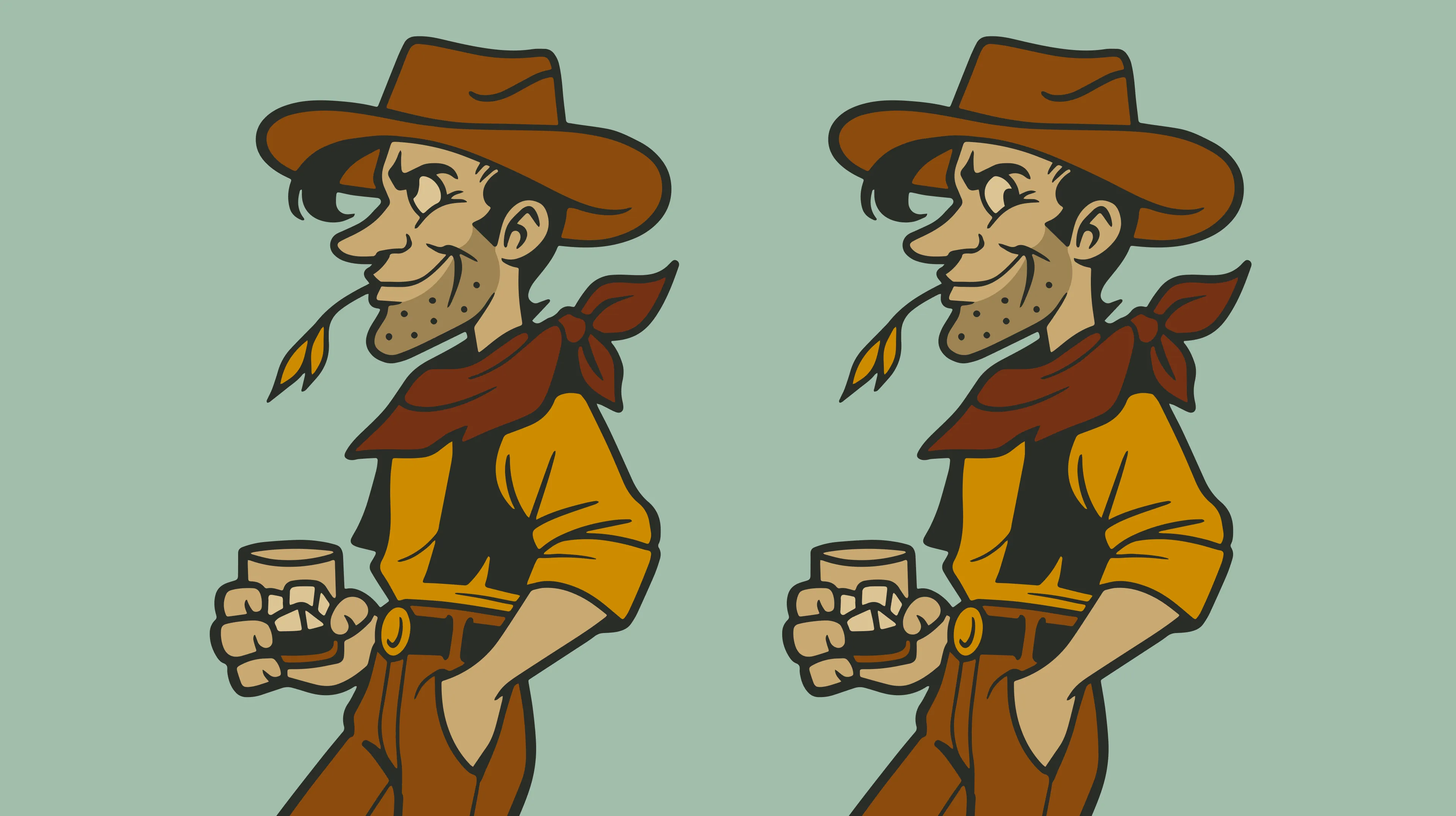
Image Nº 012—Big Chop Sale Animation
Jimmy enters here as the Big Chop Sale pitchman, framed in a mid-century marquee with mixed display typography designed to communicate clearance urgency in the following animations.
Image Nº 013—Big Chop Campaign Asset System
The campaign is built as a modular set of interchangeable callouts within the same mid-century type and color palette, so individual frames and placements can rotate messaging without losing visual consistency.
Image Nº 014—Jimmy Mascot Variations
Two color treatments of Jimmy establish that the mascot functions in both full-color digital contexts and single-color production without losing the mid-century caricature detail.

Image Nº 015—Athletic Identity Graphics
A dedicated navy, red, and white athletic palette gives V's sports identity its own graphic system, with varsity type and sports equipment motifs carrying the 1999 founding year throughout.


Image Nº 016—Athletic "V" Character
The "V" letterform is given rubber hose arms, letterman jacket details, and a pennant flag to function as a mascot within the athletic identity without introducing a separate character.

Image Nº 017—Father's Day Campaign
A poster and six die-cut floor decals form the Father's Day campaign, with each decal carrying a dad joke tied to barbershop or sports references for placement inside participating locations.


Image Nº 018—Holiday Stocking Stuffer
The animation sequences from holiday headline to service offer to product pricing, using the stocking stuffer mechanic to attach a discounted retail product to every grooming service during the holiday window.
Image Nº 019—Father’s Day Promotions
The campaign runs three concurrent assets covering a product promotion, gift card offer, and sweepstakes, each targeting a different purchase intent under the same dad-and-son theme.


Below are the results that came from a Compass session. Compass is the foundation of all the work we do at Unbound.